
It seems paradoxical, but there are instances in which the lack of detail provides more clarity than the abundance of detail. Because we just finished up the third quarter of the year, I decided to show a variety of graphs with the extremely crude granularity of one quarter per bar, which provides a very different way of looking at the market that can yield some helpful general insights.
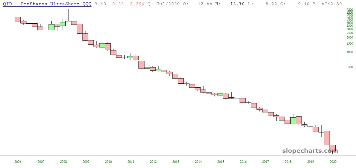
Of course, there are some charts in which there’s no surprise whatever, such as QID (the ultra-short on NASDAQ). This just goes to show you, it hasn’t been fruitful to fight the NASDAQ for about two decades.
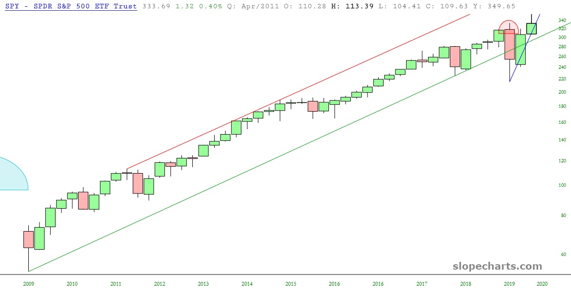
The biggest ETF of them all, SPY, reveals that 2020 is the year that finally shook things up with equities. My God, just look at the middle 80% of this chart: there are literally years where every quarter just throws off a similar-sized gain, smooth as silk. The year 2020 is when the market gods threw a grenade into everything. We hit lifetime highs this quarter, yes, but the days of steady markets are long gone.
One of my favorite markets – – and one on which I am long-term bearish – – is energy. Just look at how radically different the XOP is compared to the SPY. They are from different galaxies. And my view is energy will just keep pounding lower, no matter how weak is already seems.

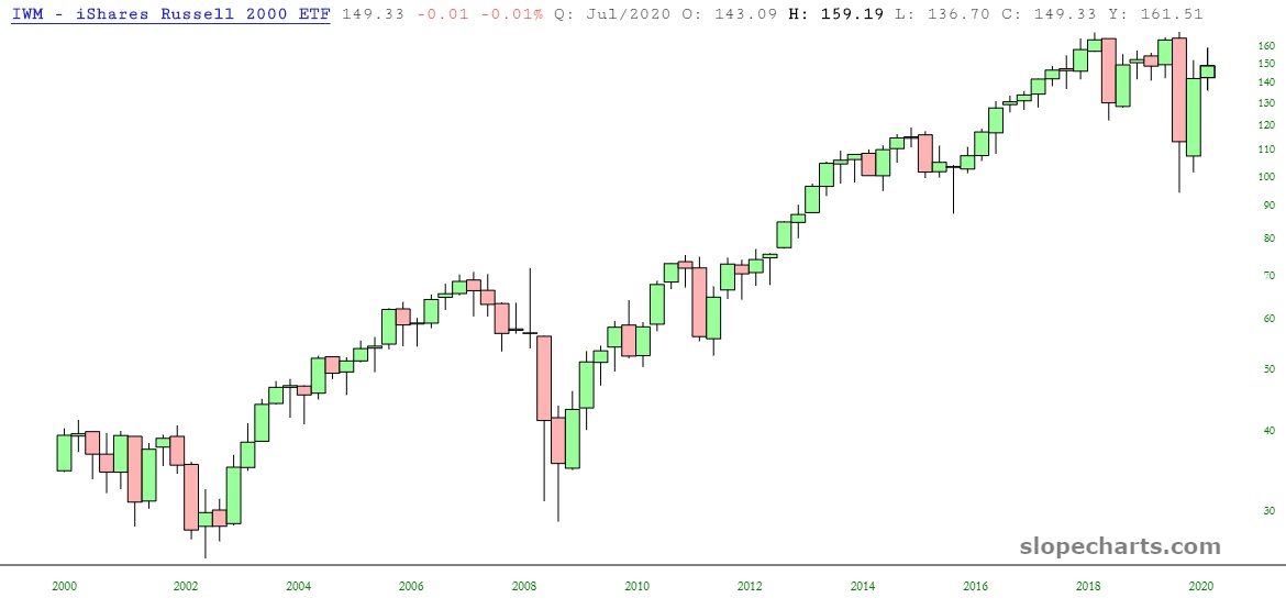
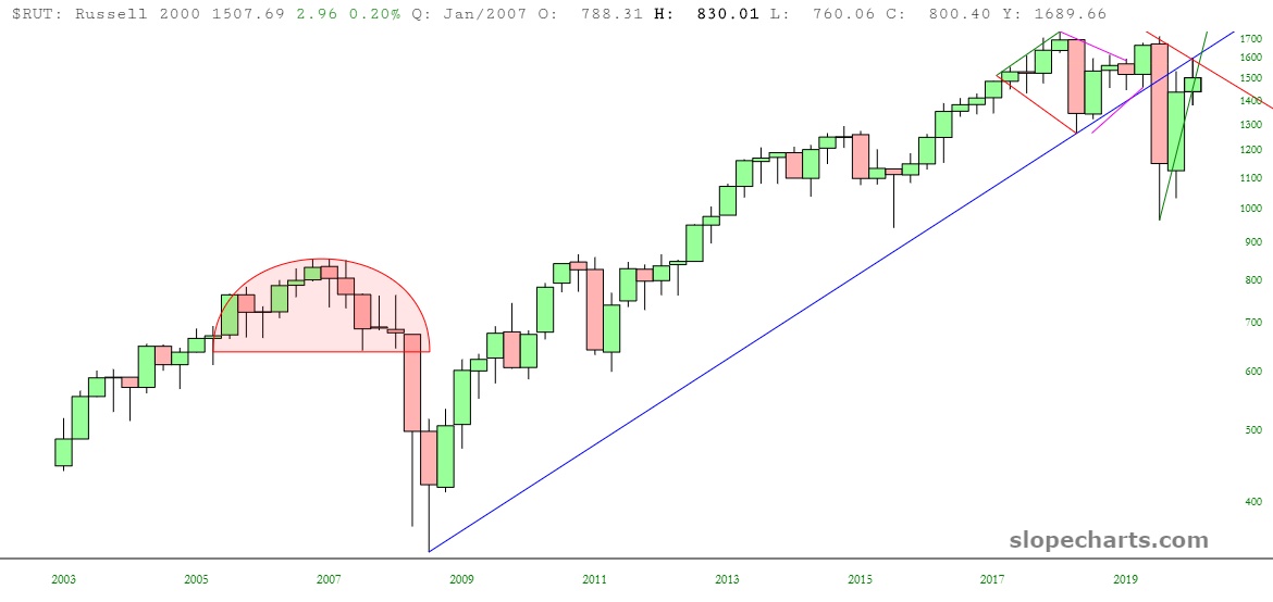
My favorite overall equity ETF remains the small caps, IWM, which peaked early this year and has actually been locked in a violent range for three years now. The IWM is vastly more vulnerable than, say, the QQQ.
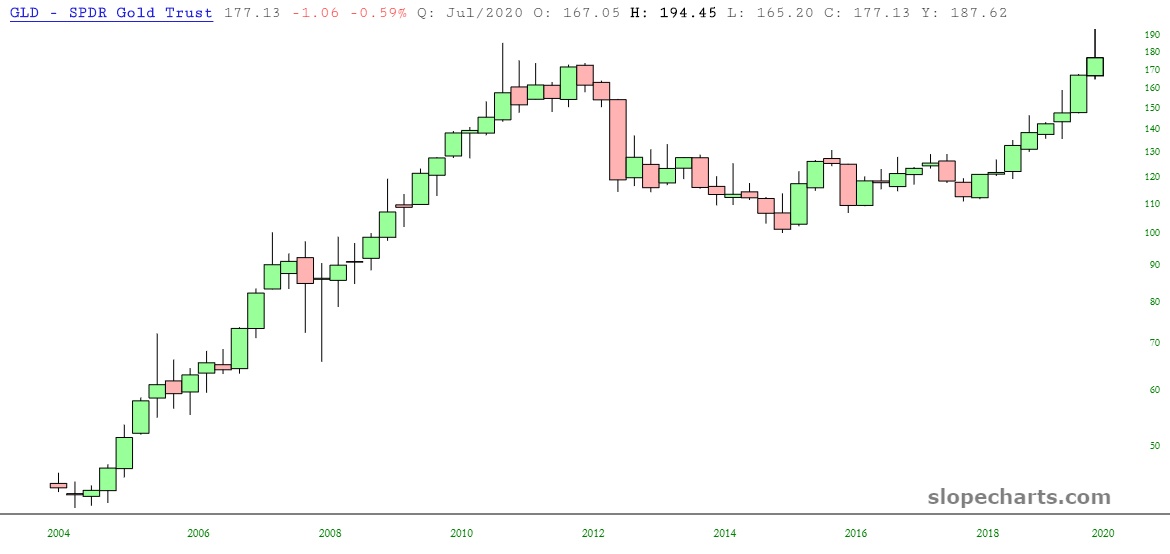
Long-term, the cleanest, most bullish pattern is our old friend gold. Just look at that saucer: classic Technical Analysis 101, straight from the textbook.
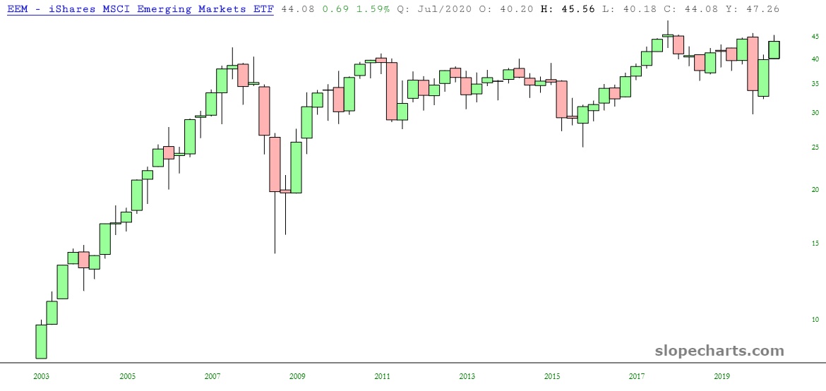
I think we can all agree the past 13 years haven’t been exactly quiet (hell, the past 13 hours haven’t been). You wouldn’t guess that from the emerging markets. We are little changed from where we were in 2007, astonishingly enough.
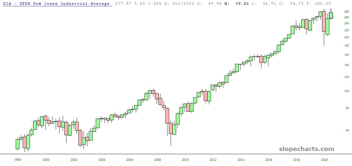
The Dow Industrials, represented by DIA, reflected the same kind of high in Q3 they had in Q1. Overall, stocks were strong in Q3, but not as dynamic as Q2, since they were recovering from a much lower zone.
I know we’ve already looked at IWM, but let’s take a longer-term view at the index itself, the $RUT. For me, the crucial bar is Q1, which absolutely shattered the dozen-year old trendline. What did Q2 and Q3 accomplish? One simple thing: to bring us right back to the underside of that same line. It’s show time.
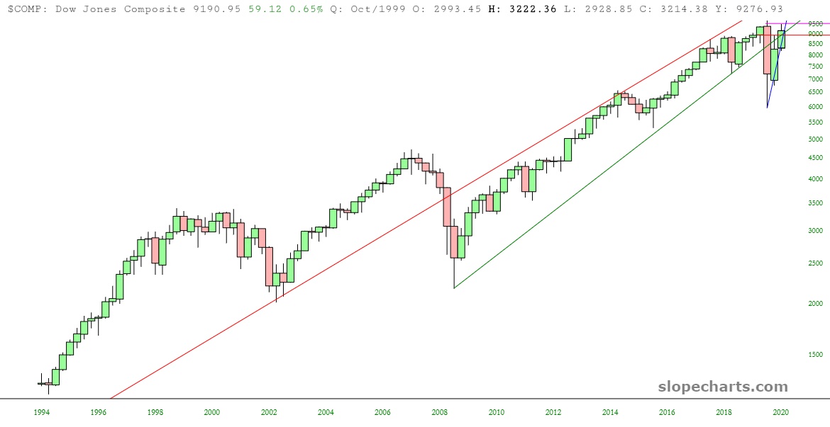
A much longer-term chart is shown here, which is the Dow Jones Composite. It’s kind of the same story: a major, broken trendline and price action which has simply mushed the Q3 peaks to the underbelly of the now-broken line (thus: resistance).
As for my end-of-Q3 portfolio situation:
- I have 50 individual equity shorts;
- Every one of them, God bless ’em, is in the green;
- I am 137% committed;
- My options portfolio, which is tiny, has these four positions:

