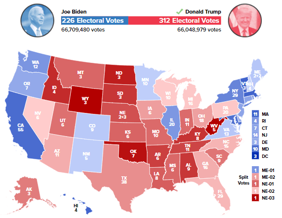
The author’s election prediction.
(more…)Slope initially began as a blog, so this is where most of the website’s content resides. Here we have tens of thousands of posts dating back over a decade. These are listed in reverse chronological order. Click on any category icon below to see posts tagged with that particular subject, or click on a word in the category cloud on the right side of the screen for more specific choices.

Each of the charts below had a clean, strong bullish setup. And in every instance, they have been breaking down. In other words, they are not doing what they are supposed to do. This, I believe, is symptomatic of the rot beneath the surface. What “should” be happening, even on the long side, simply isn’t transpiring.

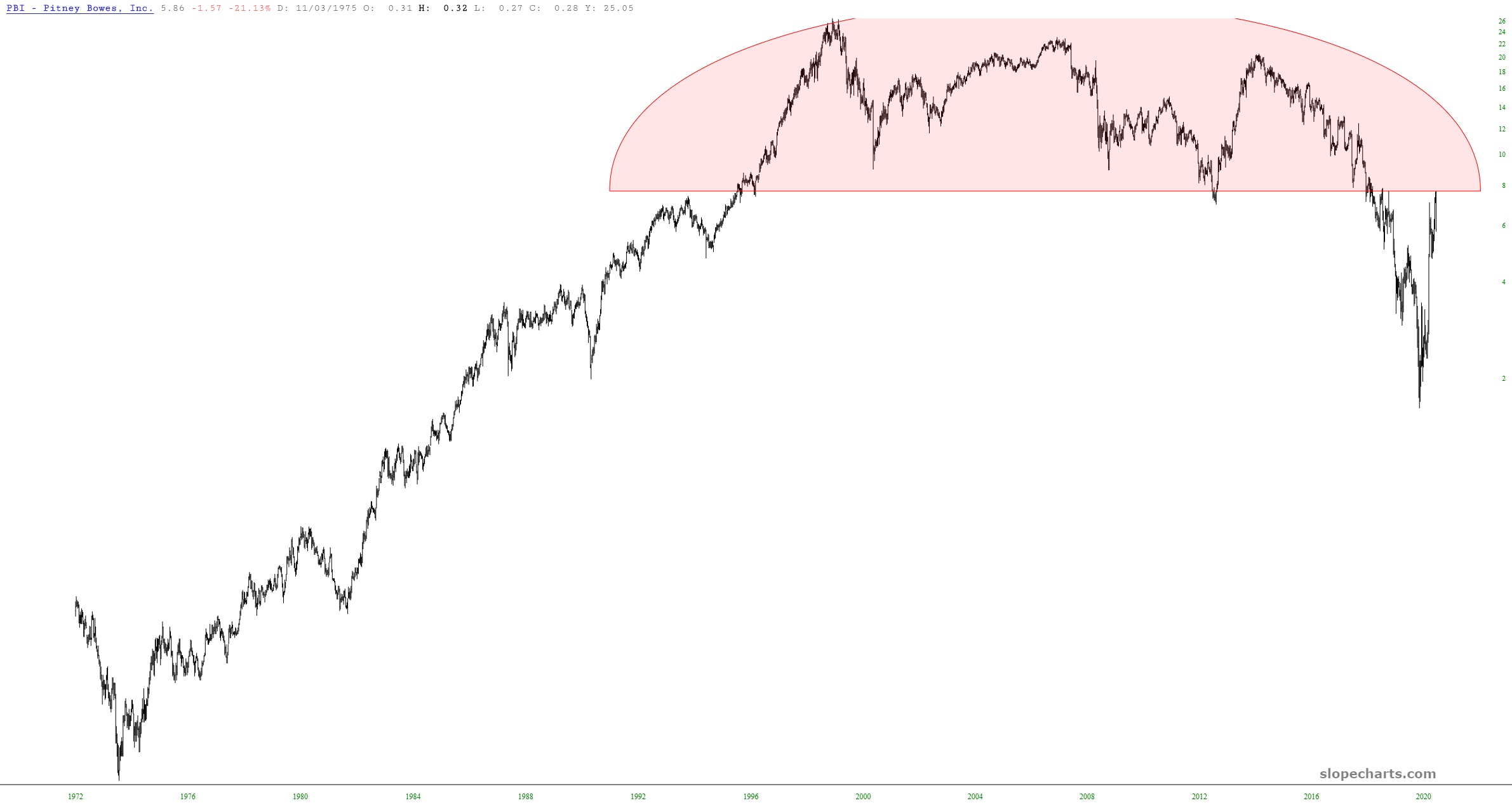
Well, this was a bit of luck. Yesterday, I took note of the insanely large topping pattern on Pitney Bowes (PBI). And when I say large, I mean large: the topping pattern literally spans a quarter of a century. So I shorted it, and today it started to fall to pieces, losing about a quarter of its value. Huzzah! Another victory for SlopeCharts.