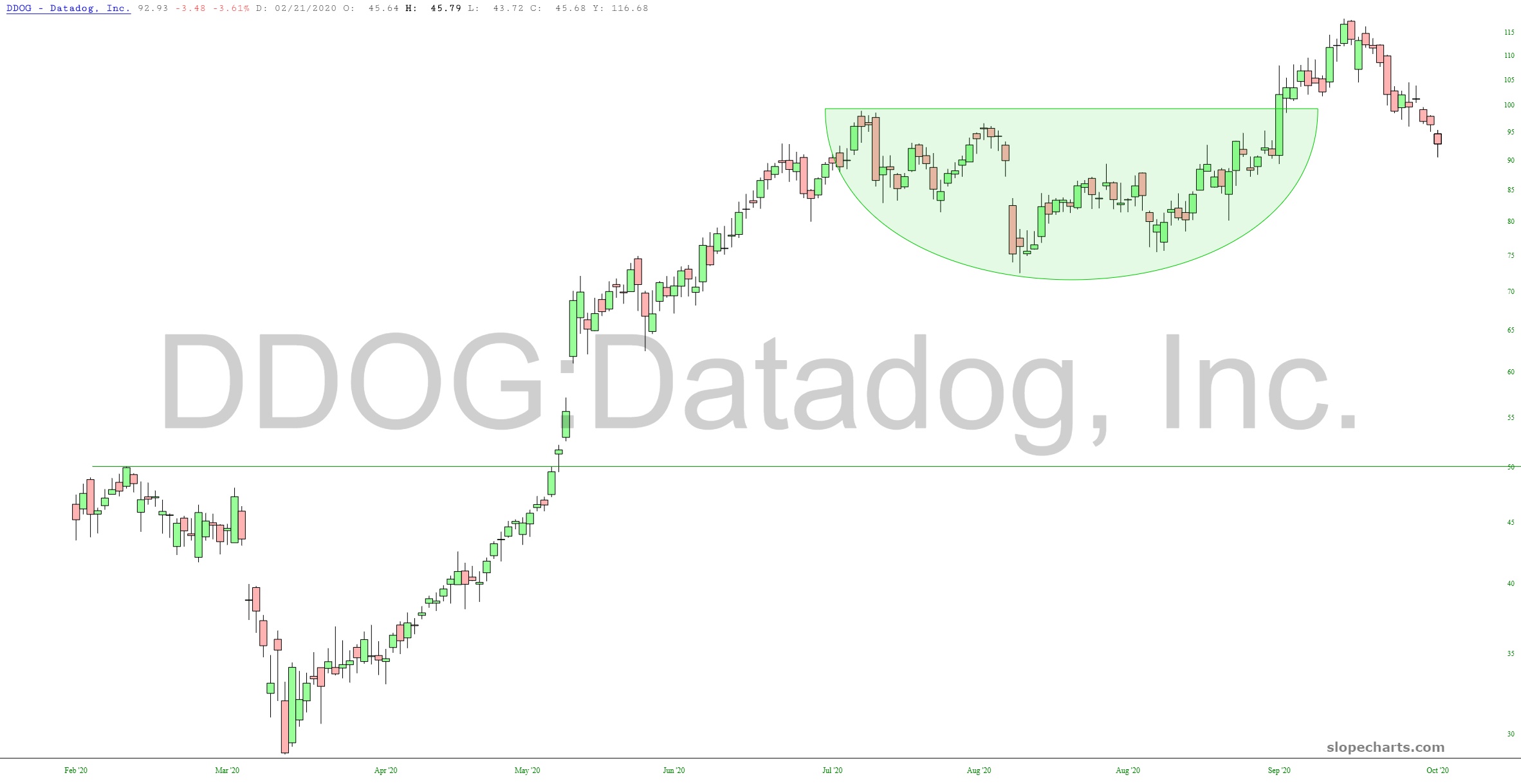
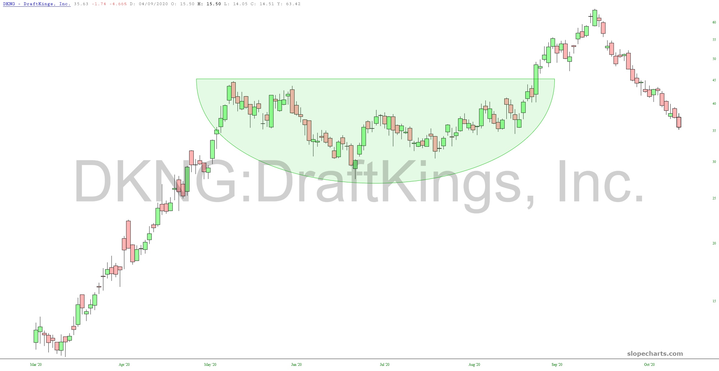
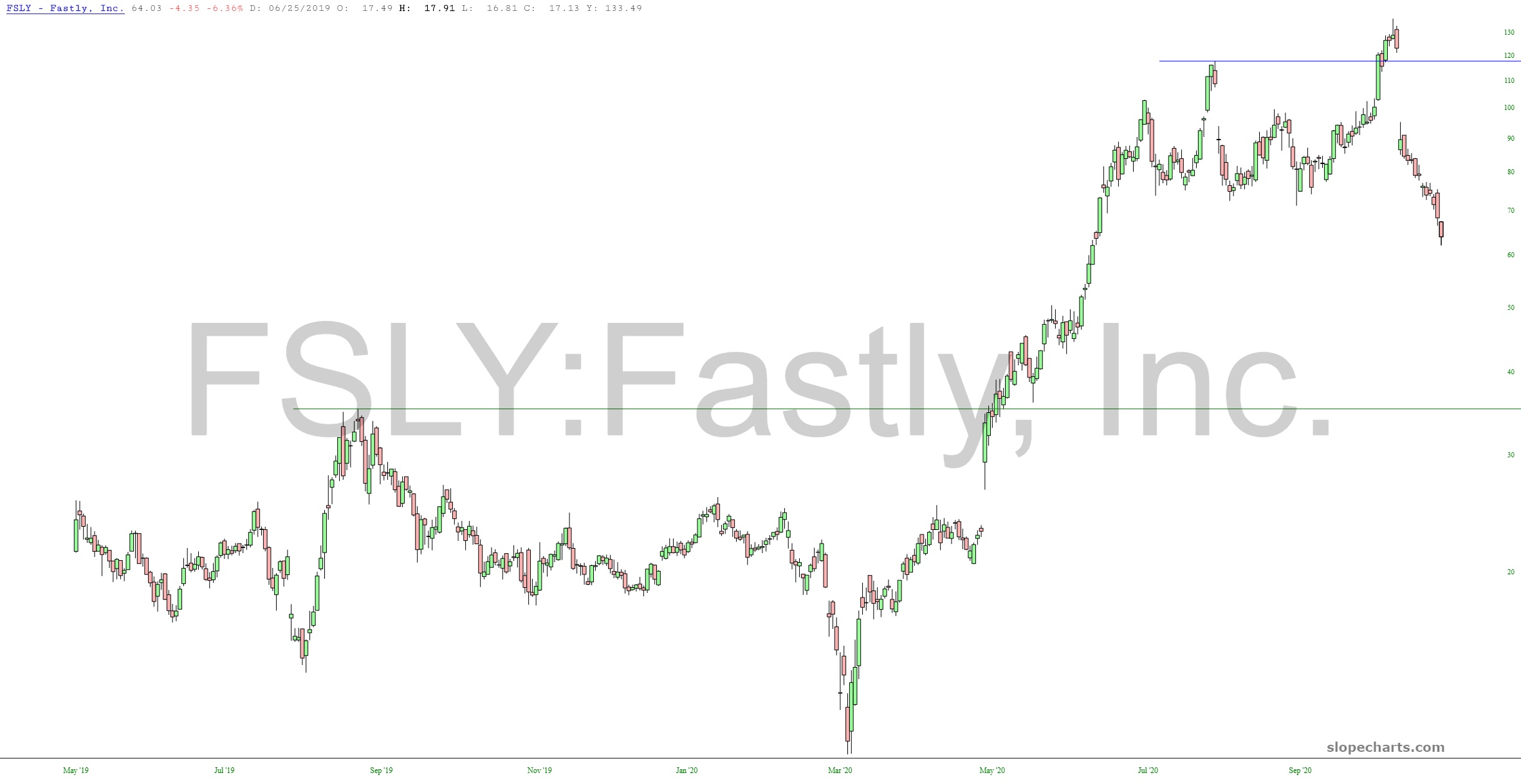
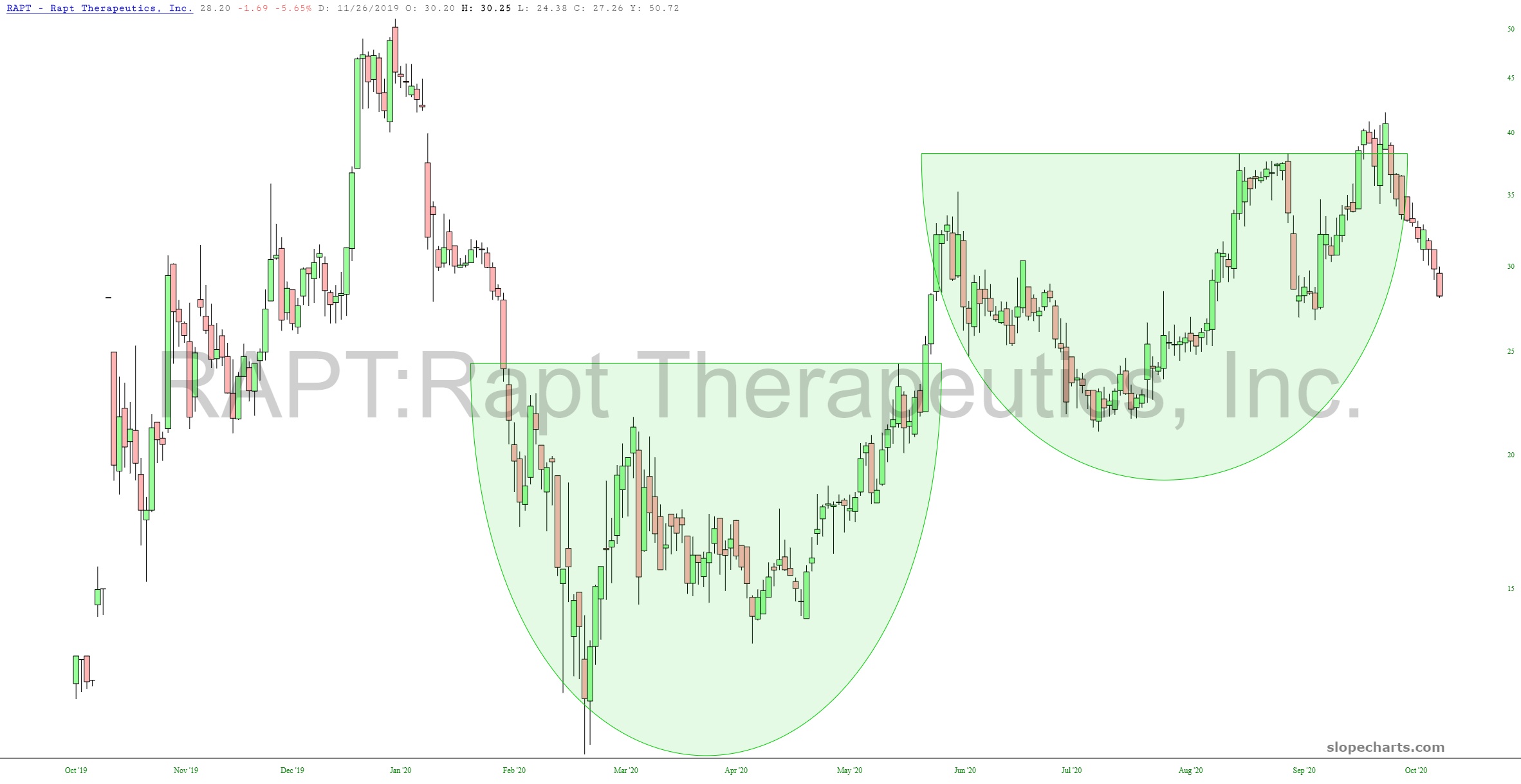
Each of the charts below had a clean, strong bullish setup. And in every instance, they have been breaking down. In other words, they are not doing what they are supposed to do. This, I believe, is symptomatic of the rot beneath the surface. What “should” be happening, even on the long side, simply isn’t transpiring.
![slopechart CHWY](https://slopeofhope.com/wp-content/uploads/2020/10/slopechart_CHWY-640x330.jpg)
![slopechart DDOG](https://slopeofhope.com/wp-content/uploads/2020/10/slopechart_DDOG-640x330.jpg)
![slopechart DELL](https://slopeofhope.com/wp-content/uploads/2020/10/slopechart_DELL-1-640x330.jpg)
![slopechart DKNG](https://slopeofhope.com/wp-content/uploads/2020/10/slopechart_DKNG-640x330.jpg)
![slopechart FSLY](https://slopeofhope.com/wp-content/uploads/2020/10/slopechart_FSLY-2-640x330.jpg)
![slopechart RAPT](https://slopeofhope.com/wp-content/uploads/2020/10/slopechart_RAPT-640x330.jpg)