Hey, folks, we’ve got one of the coolest technical indicators ever just added to SlopeCharts: the Correlation Study.
There are many ways to compare two financial instruments to one another on the Slope of Hope. You can plot two different symbols based on their price in SlopeCharts. You can plot them based on their percentage movement. You can determine their correlative relationship over a period of time you establish on the Correlations Page. Finally, you can make use of the Correlation Study within SlopeCharts.
When we speak of “correlation“, it refers to the positive or negative relationship one symbol has with another, ranging from 1.0 to -1.0. For example, if one were to compare the ETF for precious metals miners (GDX) with that of junior miners (GDXJ), the correlation would be very high, because those two instruments are comprised of companies which largely do the same thing. The correlation would tend to hover rather near 1.0, suggesting that they move closely together.
On the other hand, if one were to compare the NASDAQ 100 ETF (symbol QQQ) to the ultrashort NASDAQ (symbol QID), the symbols would be strongly inversely correlated, staying rather near -1.0.
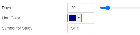
Of course, most relationships are not at these extremes, and they tend to change over time. To graph the dynamic relationship between two symbols, you can use the Correlation Study from the Technical Studies. It measures the correlation value based on the past “n” days of information (the default is 20, but you can use the slider to change it, or type in the number of days directly). You can change the line color and, most importantly, you can enter whatever symbol you like as the basis for the study.
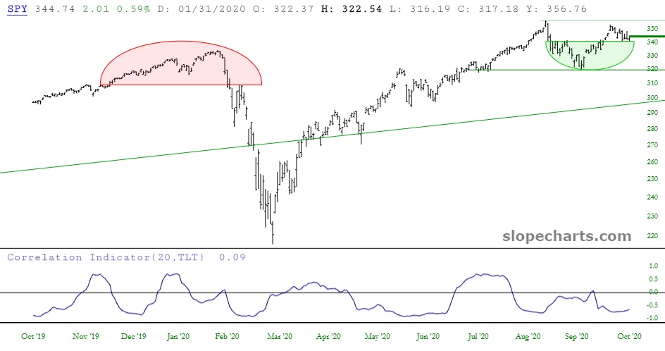
In the default example above, if you were to use these settings, every chart you entered thenceforth would have its correlation vis a vis the SPY shown in the line chart. (Of course, if you looked at SPY, you would simply see a flat line at the 1.0 level, since SPY is perfectly correlated to SPY).
A common pair of items to examine is the SPY (representing the S&P 500) and TLT (representing U.S. Treasury Bonds). This relationship tends to drift into positivity and negativity with some regularity. Being able to discern the path of correlation can create trading opportunities.
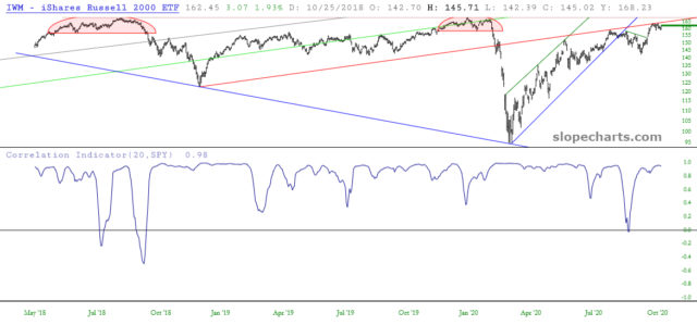
You may also want to compare baskets of equities to one another. For instance, below is the small caps ETF (symbol IWM) with its correlation to the SPY shown. The naïve observer might assume the correlation clings to 1.0, since both of these symbols represent diverse bundles of U.S. common stocks. However, you can see that the correlation changes constantly, sometimes even briefly establishing a negative relationship.
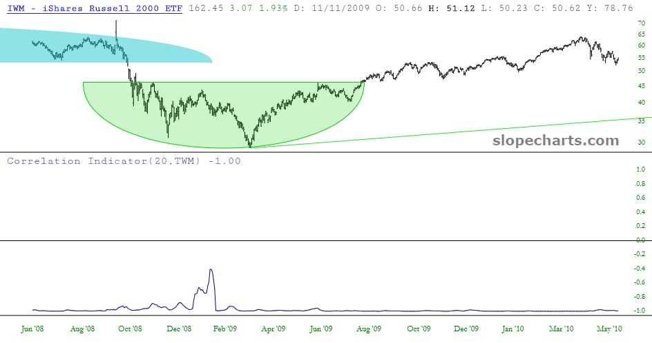
There are even some instances during market extremes that relationships that seem utterly reliable completely break from the norm. As an example, below is the chart of the IWM compared against the ultra-short on small caps symbol TWM. As you might suppose, this correlation is almost always -1.0, since the symbol is designed to do just that. In certain periods of extreme market movements, even this tight relationship can break its reins, thus creating another potential trading opportunity (albeit a brief one).