
It seems hard to believe, but we’ll be celebrating Slope’s 16th birthday in just a few months. In advance of that, me team and I are focusing on infrastructure improvements. In the midst of doing so, I’m looking to improve the navigation of Slope to make sure as many people know of all the helpful tools and features available to them here. With so much on the site, it’s easy for things to become forgotten.
I made an attempt toward this goal earlier this year, by making some pages specific to kinds of user. There’s a home page for equity traders. There’s a home page for options traders. And, of course, there are the home pages for the different levels of service, like Sloper, Gold, and so forth. But none of these are going to win any international design awards.
I actually don’t know if people even use these home pages. For all I know, folks just wander around the menus freestyle. But that’s why I wanted to ask you directly – – and please do make your voice heard, because it will help guide our decision – – what kind of navigation do you want to see on the site?
I have three ideas in general.
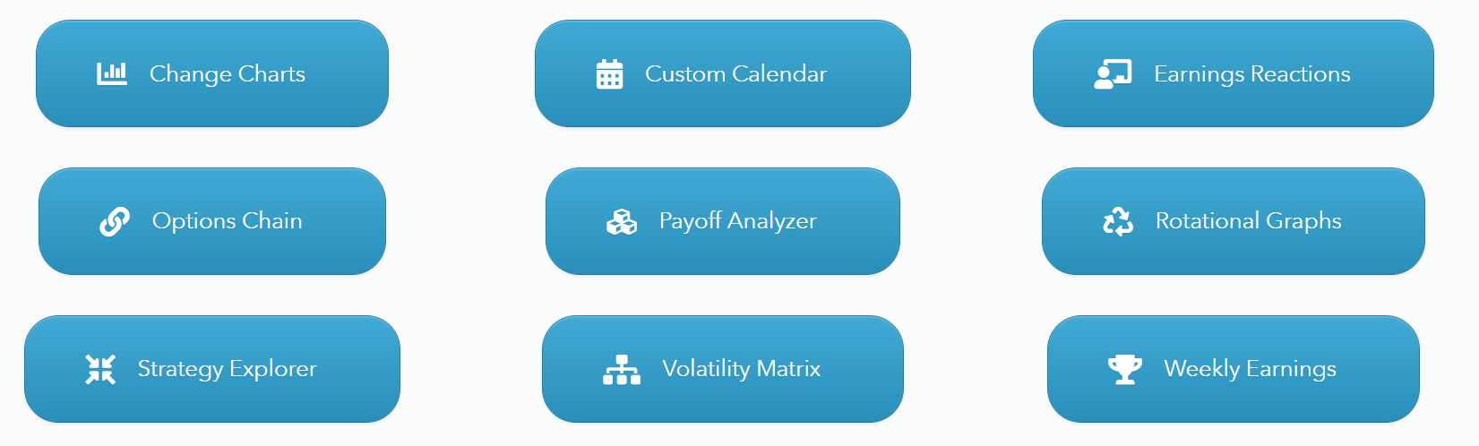
- A custom-made home page, in which you basically have, for instance, 9 “tiles” you can populate with any particular pages you like. That puts you in control of what’s important. I’m not sure if this is really feasible, but I’m offering it as a hypothetical idea.
- Use the same home pages we’ve already got, except make them more aesthetically pleasing. They look like crap at the moment.
- Use nothing. Don’t waste any menu space on ANY home pages. Just let people directly access what they want.
So please take 1.5 seconds to let me know. Thank you.
