Slope of Hope Blog Posts

Slope initially began as a blog, so this is where most of the website’s content resides. Here we have tens of thousands of posts dating back over a decade. These are listed in reverse chronological order. Click on any category icon below to see posts tagged with that particular subject, or click on a word in the category cloud on the right side of the screen for more specific choices.

Best of 2020: Part 7 of 8

By -

Preface to all eight parts: This year was an extraordinary one for the world and an amazing one for Slope. Our user base has grown, our site has dozens more features, and we are poised for a great 2021, which will be our sixteenth year in business. Out of the thousands of posts this year, we have picked some we believe you will enjoy re-reading the most.

If you want access to more of Slope’s content and features (or if you simply want to support the site, since subscriptions are our sole revenue source), please consider taking advantage of these special lifetime discounts:

  • Bronze at 9.95/month (33% discount)
  • Silver at 19.95/month (33% discount)
  • Gold at 34.95/month (33% discount)
  • Diamond at 39.95/month (50% discount)

2024
Looking ahead to the next election, believe it or not

Too Soon
The great ideas of the Internet bubble, finally come to life

Oh Hi Mark to Market
The utterly unreliable data from Zillow

Black Girls Code
If I worked at an actual publication they would never print this one

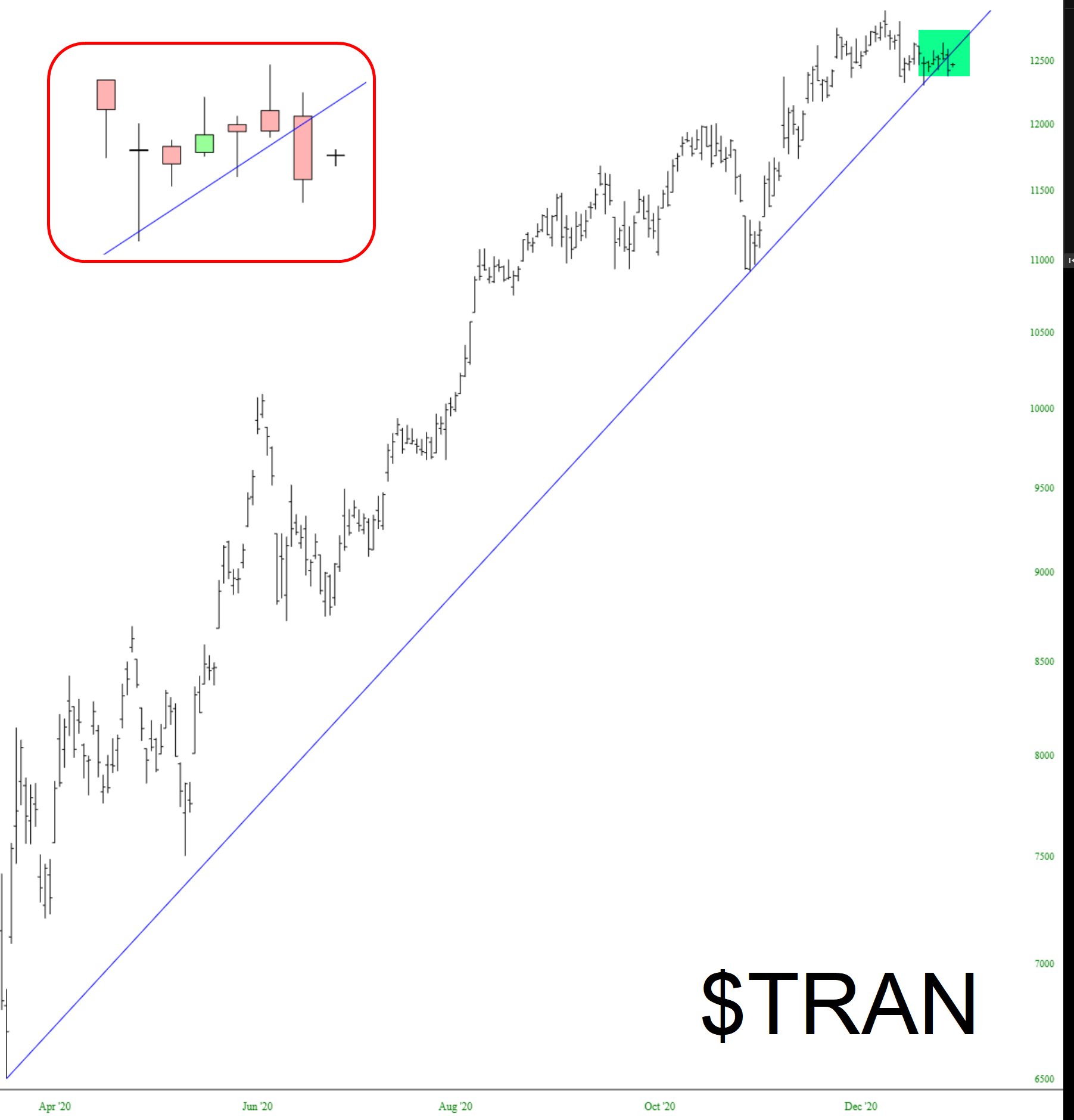
Defying the Rotation
Why I think small caps are in worse long-term trouble than anyone else

The Influence of Fed Balance Sheet Growth
A deep dive into why the Fed’s shenanigans push the markets around

Why Crypto Is Better
Bitcoin beats gold, hands down

Complacency to Fear and Back
An exploration of sentiment better than any we’ve seen before

The Carrington Event
The sun could snuff out modern civilization instantly

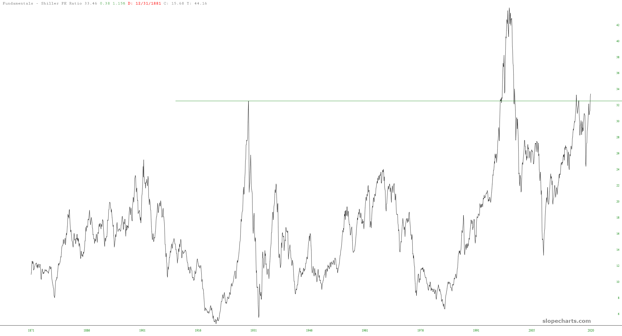
Flatten the Funhouse Mirrors
Why it is important to look at charts through the lens of money supply

A Most Interesting Year

By -

Tomorrow is the last trading day of 2020 and with New Year’s Day on Friday we get another long weekend into the start of 2021 next week. This has been a really interesting year, though a very hard one for many, and will leave a legacy for economies and markets that will likely ripple through the next few years. We’ll see how that develops in 2021.

At the end of every year we like to do a free public webinar or two at theartofchart.net looking at where we see markets going over the next year, and we are doing the ones for next year tonight and tomorrow. All are welcome and the first  webinar we are running is at 5PM EDT tonight (Wednesday 30th January) looking at equity indices, FAANG stocks and key sector ETFs and, if you’d like to attend, you can register for that here. The second webinar is at 5PM EDT tomorrow (Thursday 31st January) looking at commodities including metals, energies, softs, meat and grains and, if you’d like to attend, you can register for that here. As always all webinars are linked from our monthly free webinars page at our blog, currently December.

(more…)

A Revolutionary 2021

By -

As I look forward into 2021, I want to paint a broad picture of what to look for directionally, as well as key turning points to be aware of.  I will focus on the two main trades I am most excited about, SPX and crude oil.  As we examine the below charts and analogs, consider them as a rough guide, using crayon not pencil.

SPX Forecast
Let’s begin by taking a look at the broader market via SPX.  To gain a big picture forecast view of SPX I prefer to utilize the 10 year crude oil to SPX analog.  This analog was discovered by Tom McClellan, and looks back to see what crude oil was doing ten years ago to give us a glimpse of what to expect with the broader market now.  A note on this analog, and the other analogs I will discuss in this post; they will look to show you direction and key turning points to be on the lookout for.  They do not reflect the magnitude of the move to expect.

(more…)

Hot Stats

By -

You know the market is sky-high when the comments section over at ZH has permabulls chastising the regulars there and are getting no flak in return. Twelve years of a straight-up market has left the normal ZH crew speechless.

There are other data points, of course, to illustrate our nosebleed levels. The Schiller P/E Ratio, for instance, shows the only time we’ve been higher is during the Q1 2000 peak. (And it’s funny to consider just how relatively tiny the national debt was back then).

slopechart MULTPL SHILLER PE RATIO MONTH
(more…)