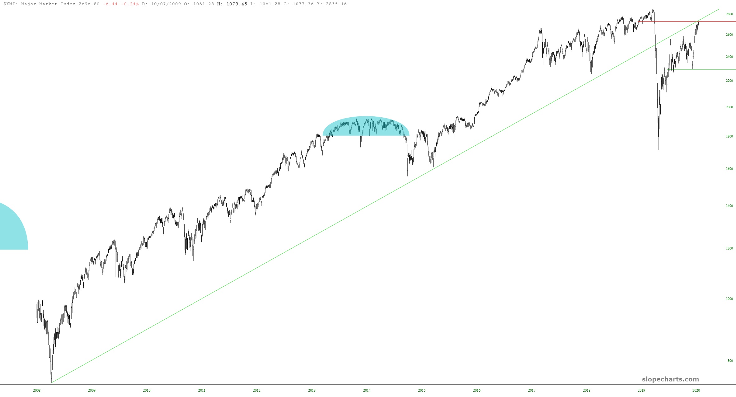
The chart below is of the Major Market Index (symbol $XMI). Click on it for a big version, and take special note of the long-term trendline in green.
Slope initially began as a blog, so this is where most of the website’s content resides. Here we have tens of thousands of posts dating back over a decade. These are listed in reverse chronological order. Click on any category icon below to see posts tagged with that particular subject, or click on a word in the category cloud on the right side of the screen for more specific choices.
The chart below is of the Major Market Index (symbol $XMI). Click on it for a big version, and take special note of the long-term trendline in green.
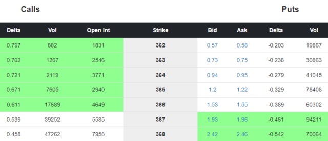
I wanted to mention a couple of minor tweaks to the options chain page. First off, we’ve tidied up the aesthetics of the page so things are easier to read:

We have made a nice improvement to the Data Panel feature in SlopeCharts.
We have long had the “Big Movers” data panel with the biggest gainers and losers of the current day.
We have now added the Volume Leaders, which shows the top ten highest volume issues for a given day. Some are household names (like AAPL) whereas others, as this example shows, can be surprising newcomers (like CRIS).
As a reminder, click the left and right arrows flanking the name of any data panel to navigate to other panels. You can also control which panels are available by way of the Preferences, which you access by clicking the gear icon in the lower-left portion of SlopeCharts.
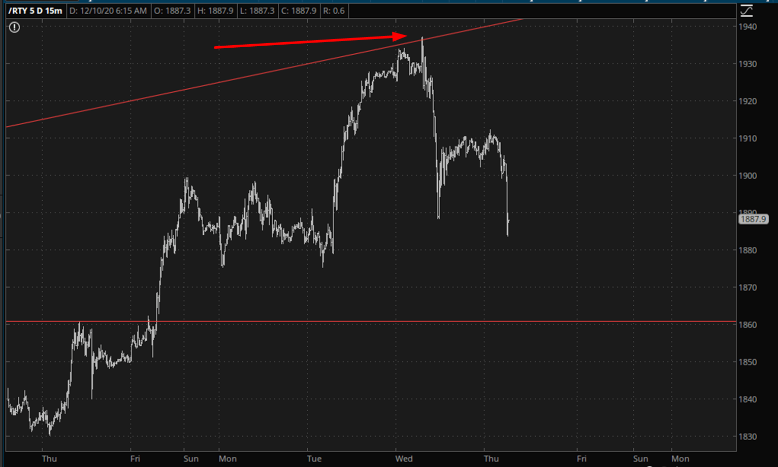
Is there a chance we could see two down days in a row? It seems inconceivable. Anyway, the trendline bounce from yesterday was pitch-perfect. The bulls fought back late yesterday, but this morning has unwound that bounce on the /RTY:
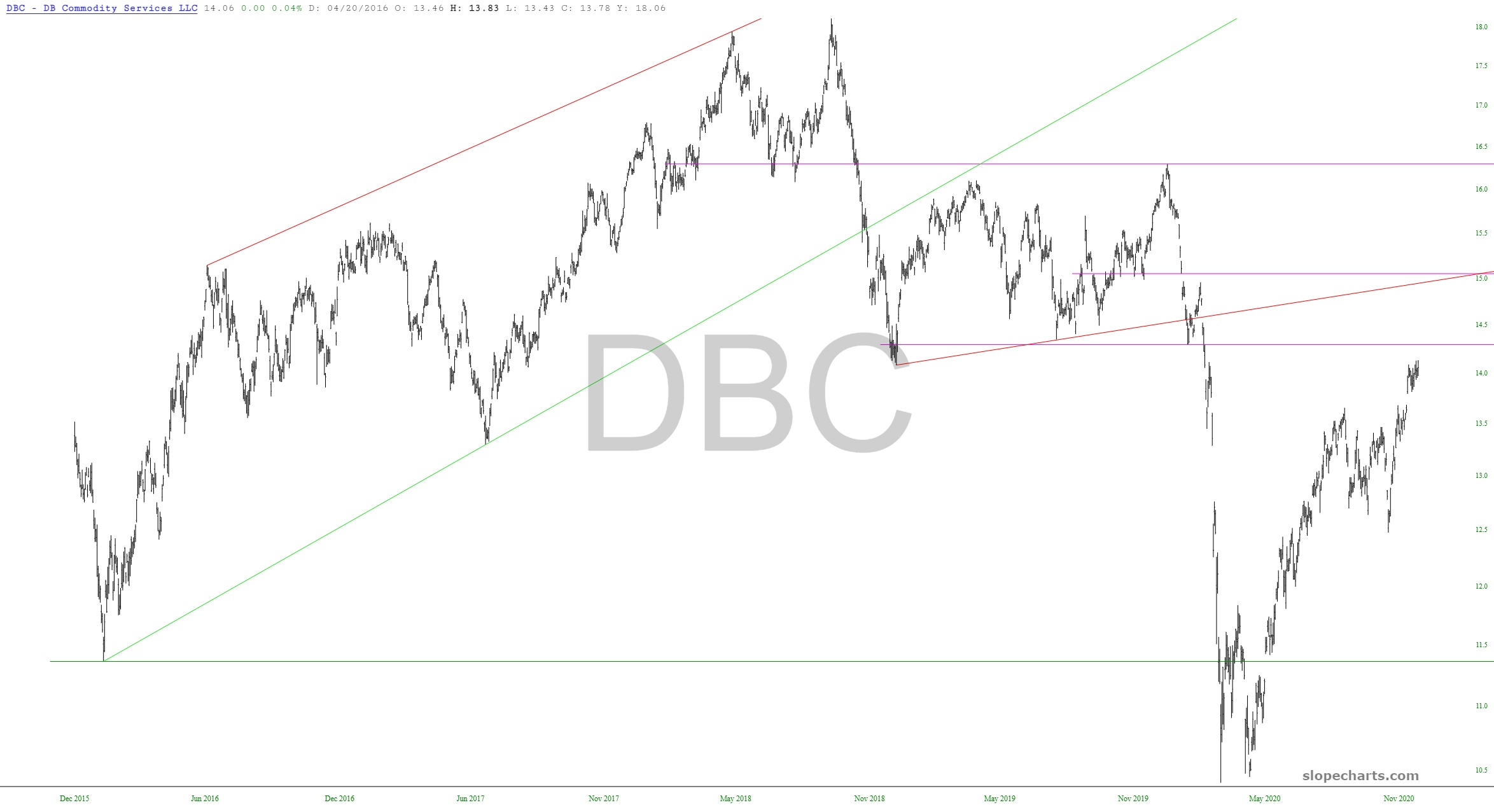
When things get quiet – – and they have become SO quiet lately, as if people have decided just to call the entire year a “wrap” at this point – – I like to trot out the ETFs and speak in general terms about what I’m seeing. So that’s what we’ll do this with post. Below are ten exchange traded funds, with some commentary in the caption of each. As usual, click on any chart for a much larger version.