
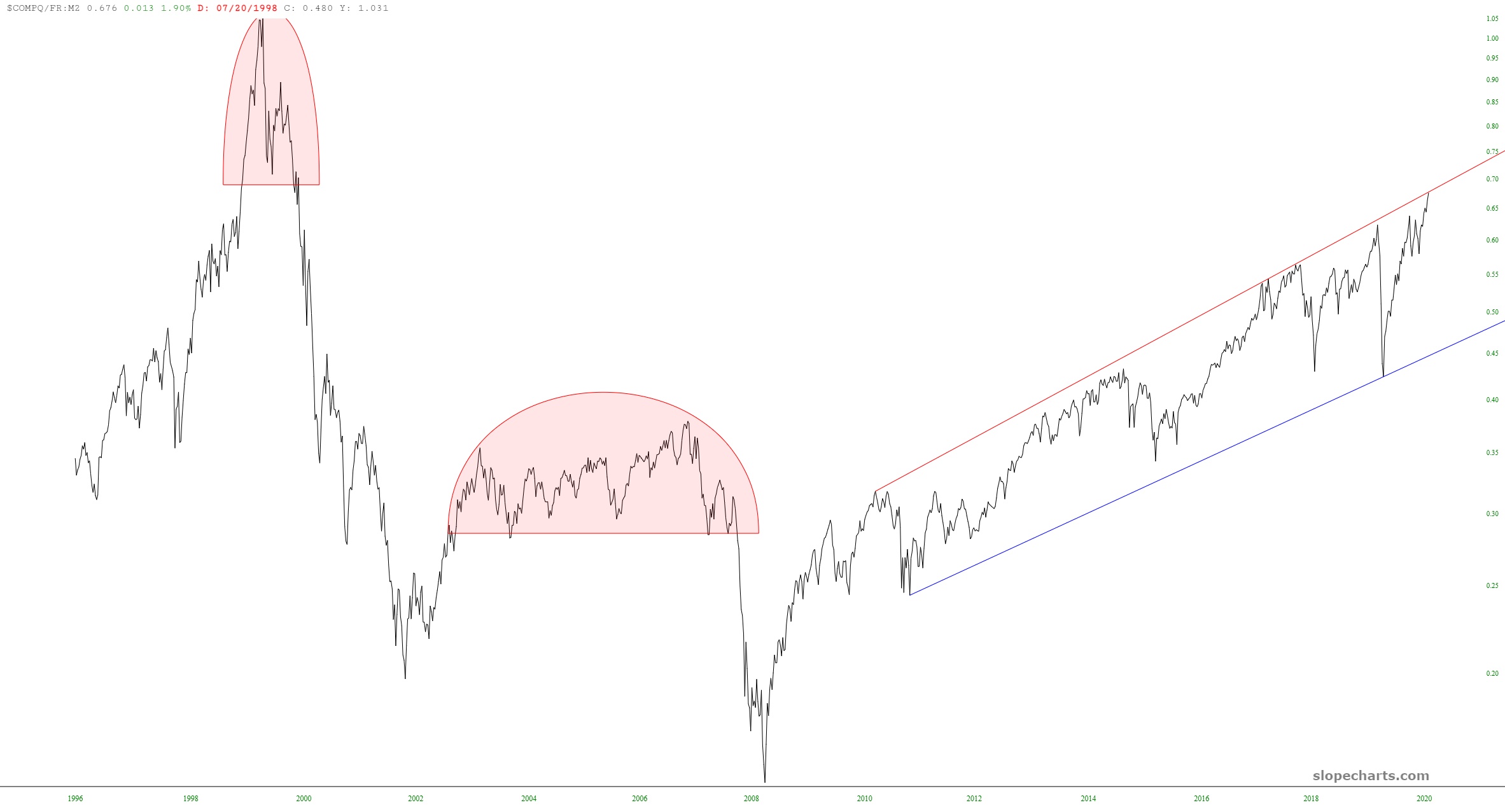
My fondness for ratio charts is unbounded. Allow me to share three of them with you that I believe illustrate how prone the market is right now to a sell-off.
The first is the Dow Jones Composite divided by the M2 money supply. The nature of the current bull market is different than the prior two. In those – – during what were relatively normal times- – – the market ascended, carved out a topping pattern, and then plunged.
Since the Fed has taken their manipulation up to “11”, the market doesn’t have the opportunity to create a rounded top. It does, however, yield a fairly clean channel, and we are mushed at the top of that channel right now.
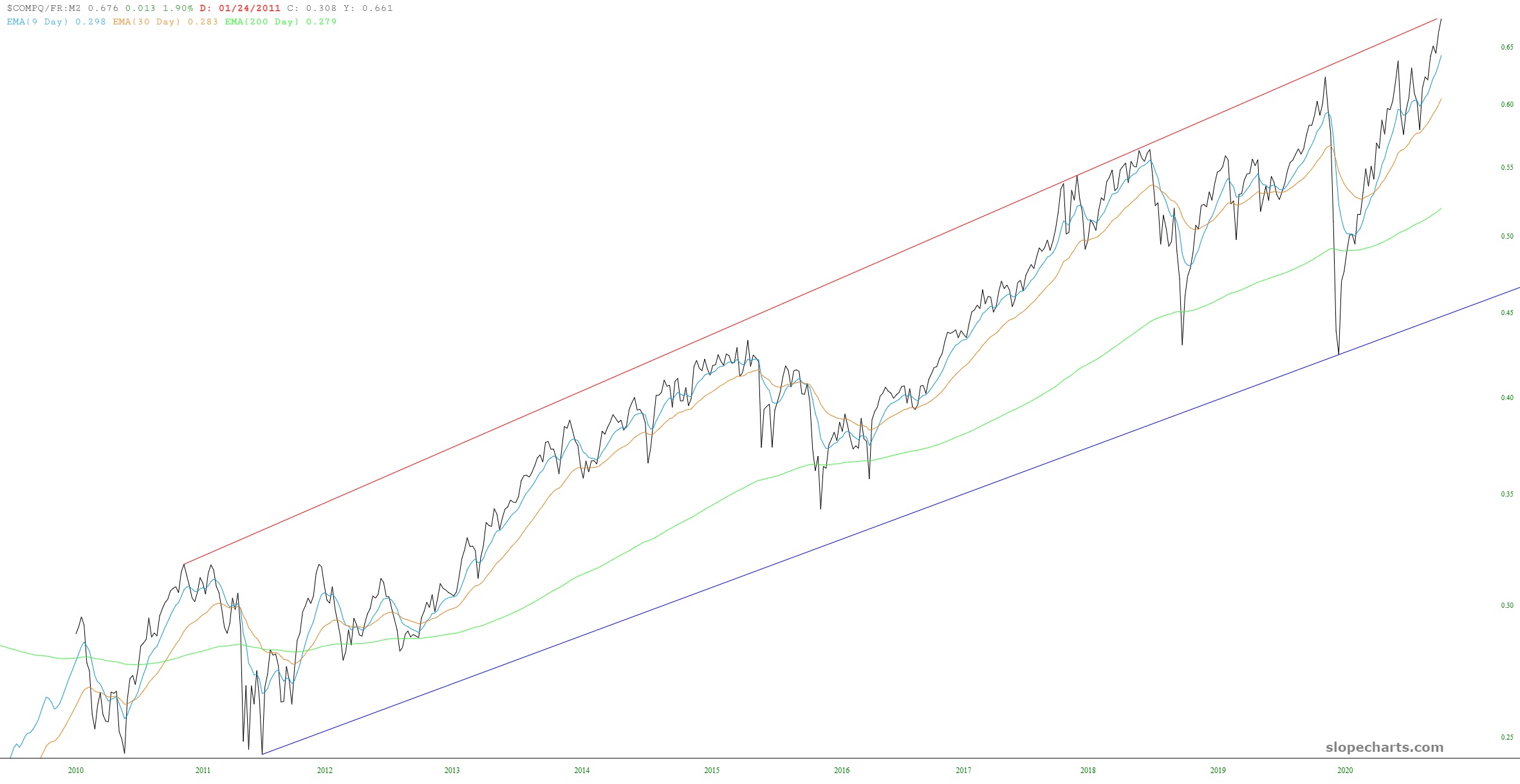
A closer examination of this channel, augmented with a trio of exponential moving averages, shows the picture more plainly. There is far more opportunity on the downside than the upside. Perhaps the looming earnings season will kick things into gear – – – or a reality check that a new administration doesn’t necessarily mean that everything is peaches and cream all of a sudden.
Similarly, here is the SPY ETF divided by the M2. We see the same two prior topping instances (each followed by a wonderful bear market), and the same evidence that “it’s different this time.” The uptrend was very cleanly broken, and the present elevated market is clinging to the underside of that now-broken trendline, waiting to slip free and succumb to financial gravity.

