
The headline over at ZeroHedge pretty much says it all…………
So here we’ve got the one-two punch that our ($SPX/FR:DGS10) ratio chart has been anticipating: on the one hand, soaring equity prices (since, ya know, bargain) and on the other hand, falling interest rates. Put the two of them together, and the ratio chart is destined to rip higher. Given the well-formed top as well as the perfect touch of the channel’s midline, it’s an agonizing work of art:
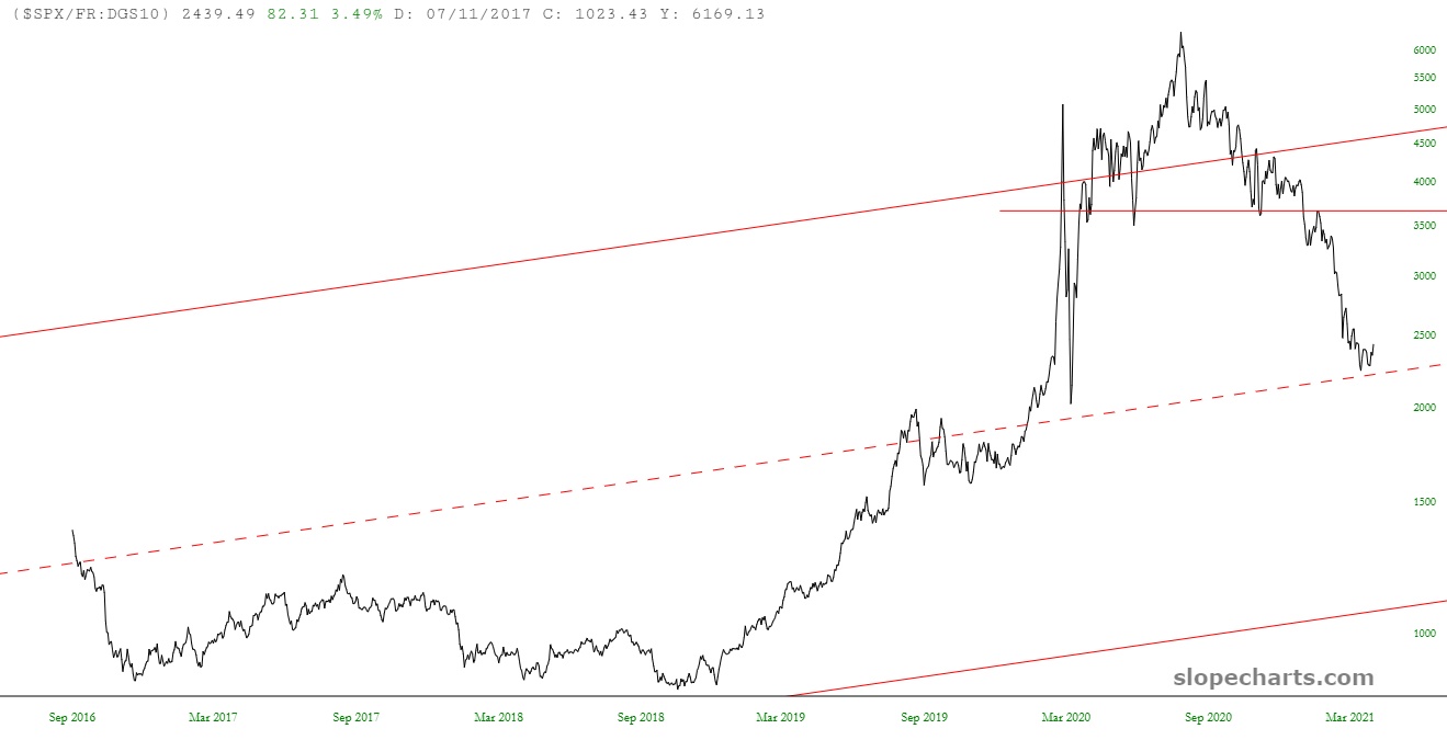
Look closer and you can see the steady series of lower lows and lower highs that has been taking place since the ultimate peak in early August of last year (which, incidentally, was precisely the top of precious metals as well). If the ratio were to climb back to its neckline, the ascent would be a jaw-dropping 50% from the midline-tag point.

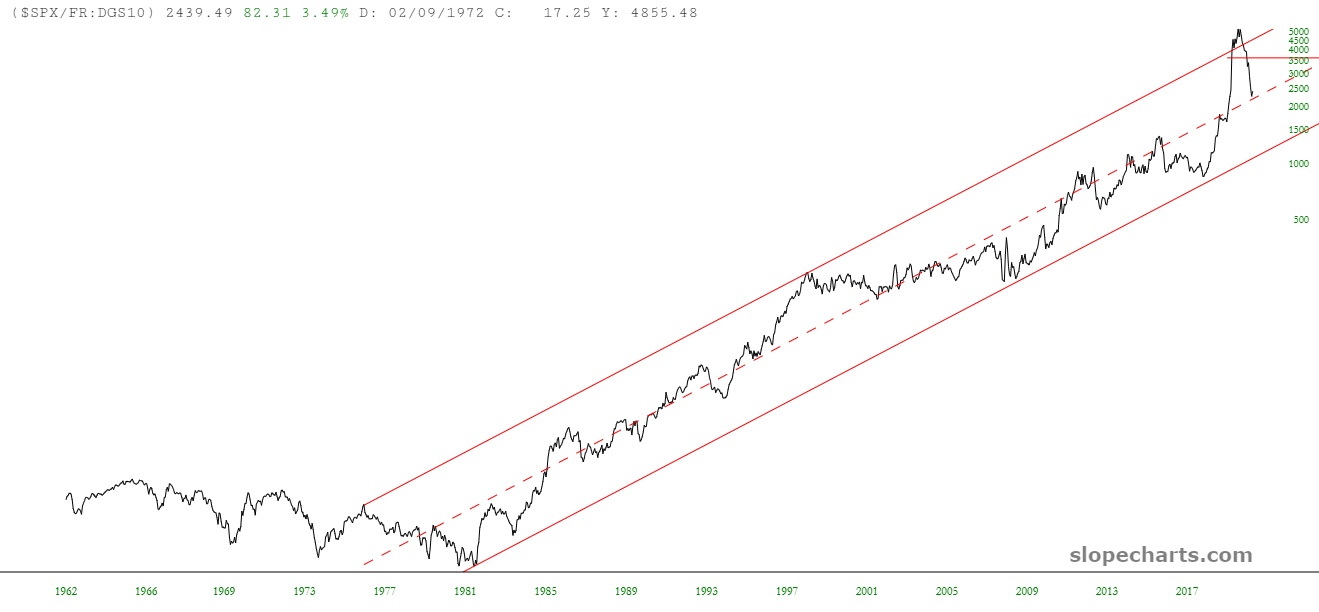
Take a big step back, and you can see that even with a chart going back half a century, the plunge and prospective recovery are very visible.
Incredible, isn’t it? Some of the biggest tax hikes in history are slated for both people and businesses, yet the public simply is feeling absolutely no fear at all. Could we get to 5,000 on the S&P 500 this year? Absolutely.
