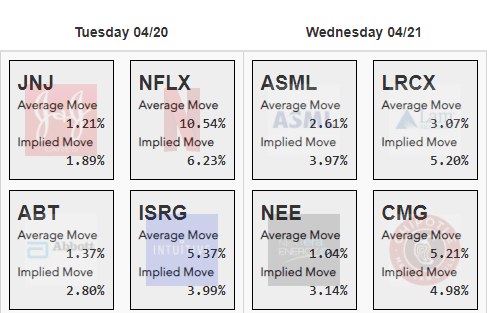
We are delighted to let you know about yet another Slope creation – – a new page dedicated to showing you, in an easy-to-read, attractive format, an earnings calendar focused on volatility data. The page is very similar to the existing Graphical Earnings Calendar, but it has two vital pieces of information beneath each symbol:
- the Average Move that the stock makes between the day prior to earnings and the day after;
- The Implied Move based on the implied volatility data of the options values.

Each of these data points is useful and interesting in itself, but of course the comparison of the two is equally interesting. For instance, as shown above, the average move for Netflix is actually substantially larger that the move the options are implying, which is indicative of just how muted options have become compared to Netflix’s wild days of years gone by.
You can navigate forward and backward in time by clicking the left and right arrows which flank the date:

Clicking the right arrow, for example, presents information for next week, which is by far the heaviest earnings week of the quarter. Indeed, the timing couldn’t be better for the introduction of this cool new page.

As always, I am very eager to hear your ideas. Right now, I have it so that clicking a symbol invokes a new tab with the options chain for that symbol. Would you options traders prefer something else, like the Payoff Analyzer, the Super Summary, or some other page? I’d like to know.
I also think perhaps adding a sort dropdown might be useful, to present the symbols in different ways. But if I don’t hear much in the way of fervent suggestions, what you see is what you get! But if I can tell people feel strongly about an improvement, you know that I’ll make it. Regardless, we’ve got plenty more to create, but I wanted to push hard on this new feature since earnings season is starting to heat up. I hope this new page serves you well. Click here to check it out!

