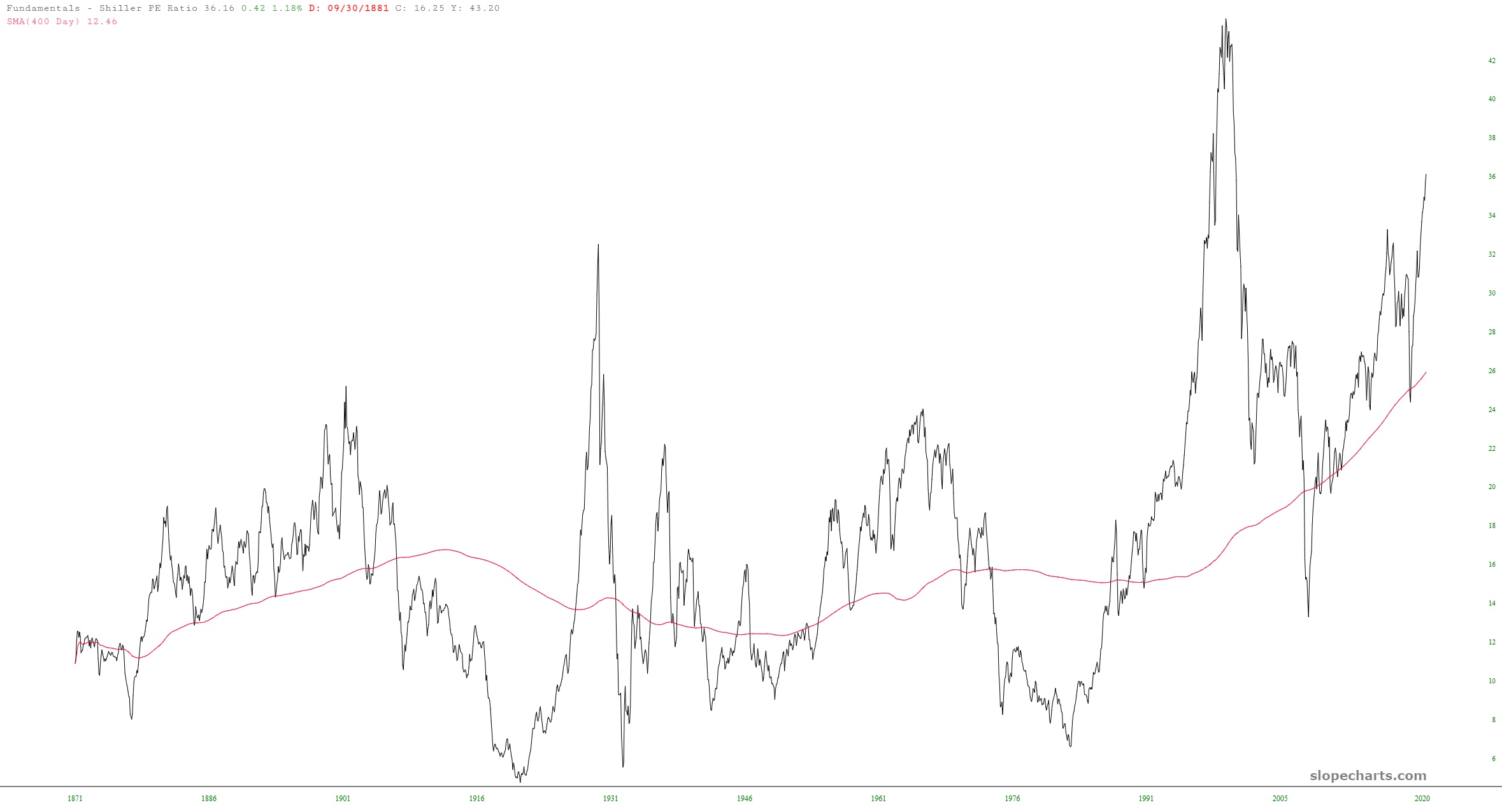
The economic data from the Fed comes tumbling in rather late, but the 4/1 data has been freshly served, and there are a couple of charts I wanted to share. The first one is the Schiller P/E ratio. Not surprisingly, we are at extremely elevated levels right now (bested only by the early 2000 peak). What I added here as a bit of a twist was a 400-day moving average. Check out the relationship that smoothed line has with decades of P/E data. It gives you a good sense of just how stretched we are.
Speaking of stretched, the chart below is created with Slope’s own home-grown data, and it illustrates the percentage of stocks above their 200-day moving average. By definition, this chart tends to be cyclic, and as you can plainly see, we are mashed up in the upper 90s right now, about as high as it can possibly go.

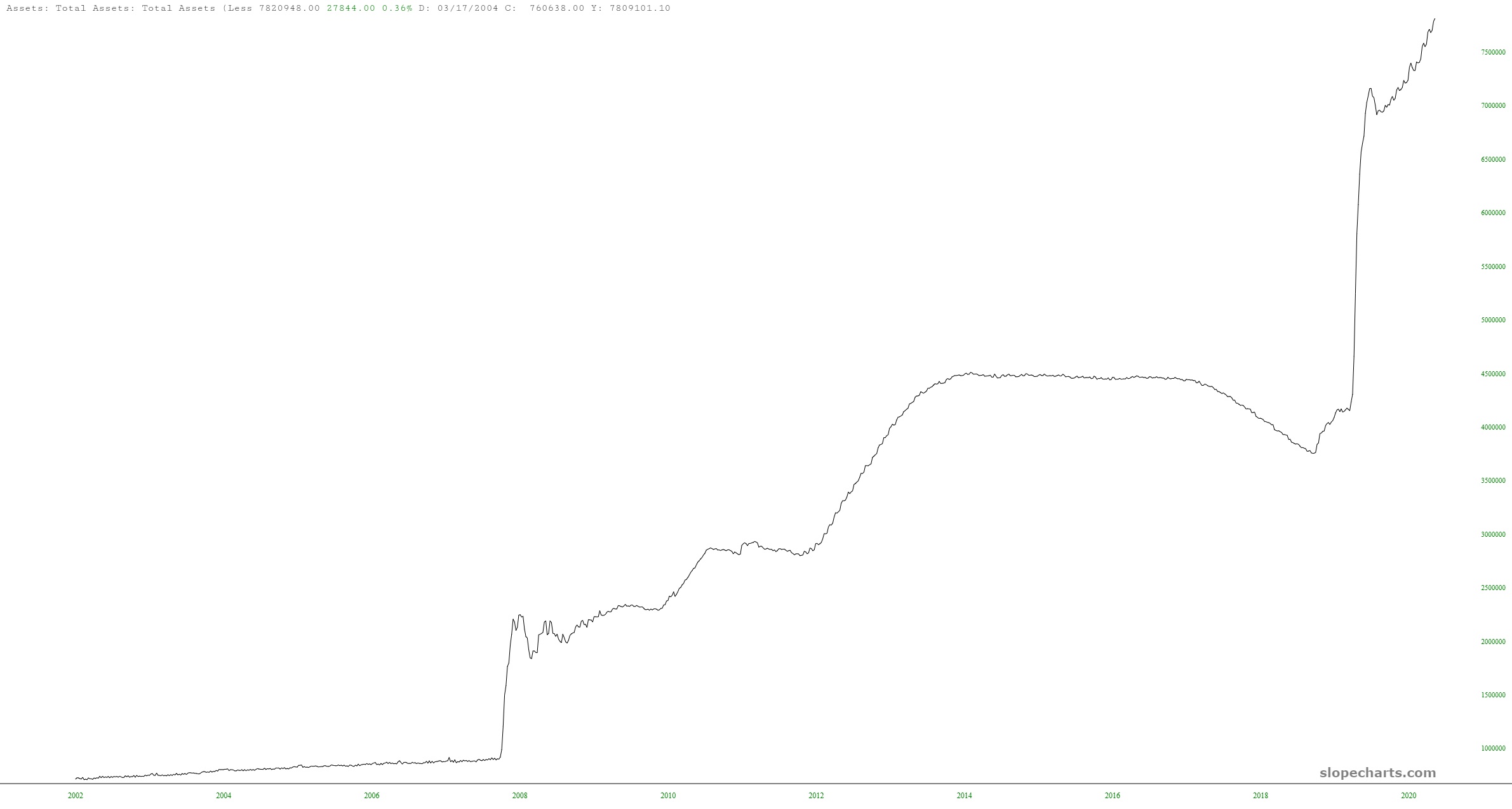
I wonder why.