I started Slope when I was in my thirties. I’m in my fifties now (scary, isn’t it?) Maybe the ol’ eyeballs aren’t what they used to be, but I became increasingly perturbed that Slope’s menus were tough to read. I therefore have changed the menus to be a more brutal black & white contrast for better readability. In fact, I cannot believe I waited this long to make this change, because I find it so much easier to read.

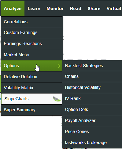
The other item – – and I am embarrassingly excited about this one – – is we now have sub-menus.
You see, Slope has over 200 functional and informational pages, and I’ve felt very constricted in terms of how many of these I could put in our menus. The consequence is that a lot of our features got buried and forgotten. No more! I’ve gathered up much more information about the site and its feature set in these new menus, and it’s much better-organized. I hope you benefit from this new structure. I’ve actually only just started rearranging menus, because you would find it pretty disturbing to learn how much I enjoy doing this kind of thing.