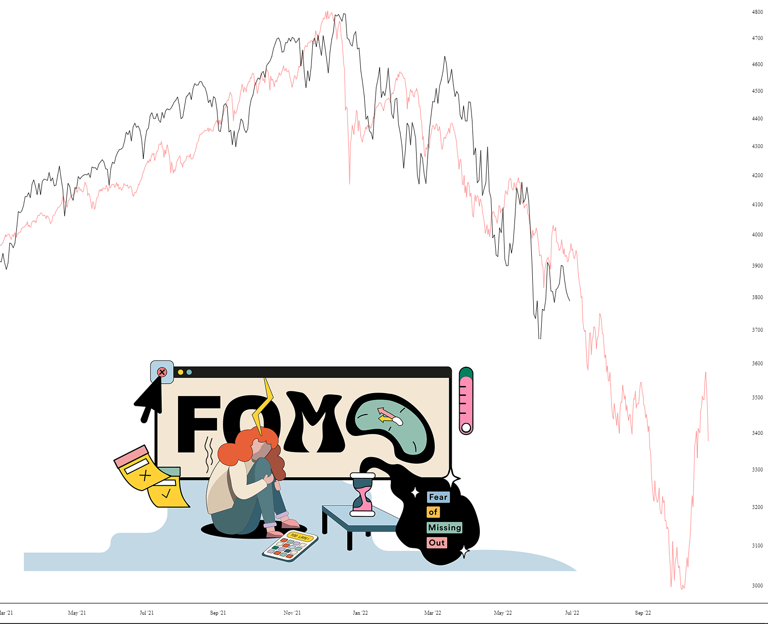
I came out of the pool feeling like doing an analog with layered charts (yes, it’s a strange impulse). Here ya go – – it’s the S&P 500 comparing the Great Depression (red chart) with right now.
Slope initially began as a blog, so this is where most of the website’s content resides. Here we have tens of thousands of posts dating back over a decade. These are listed in reverse chronological order. Click on any category icon below to see posts tagged with that particular subject, or click on a word in the category cloud on the right side of the screen for more specific choices.
I came out of the pool feeling like doing an analog with layered charts (yes, it’s a strange impulse). Here ya go – – it’s the S&P 500 comparing the Great Depression (red chart) with right now.

I was born in the same year as Star Trek, which gives me a cosmic connection to Gene Roddenberry’s creation. I remember seeing the first Star Trek movie (with the breathtakingly clumsy title of Star Trek: The Motion Picture, which I guess is a notch above Star Trek: We Recorded This On Celluloid Filmstock) and being bored and incredibly disappointed. I just stumbled across this trailer, and my God, was everyone on Quaaludes in the 1970s? This is absolutely languorous!
Your math formula of the day is Thursday=Wednesday.
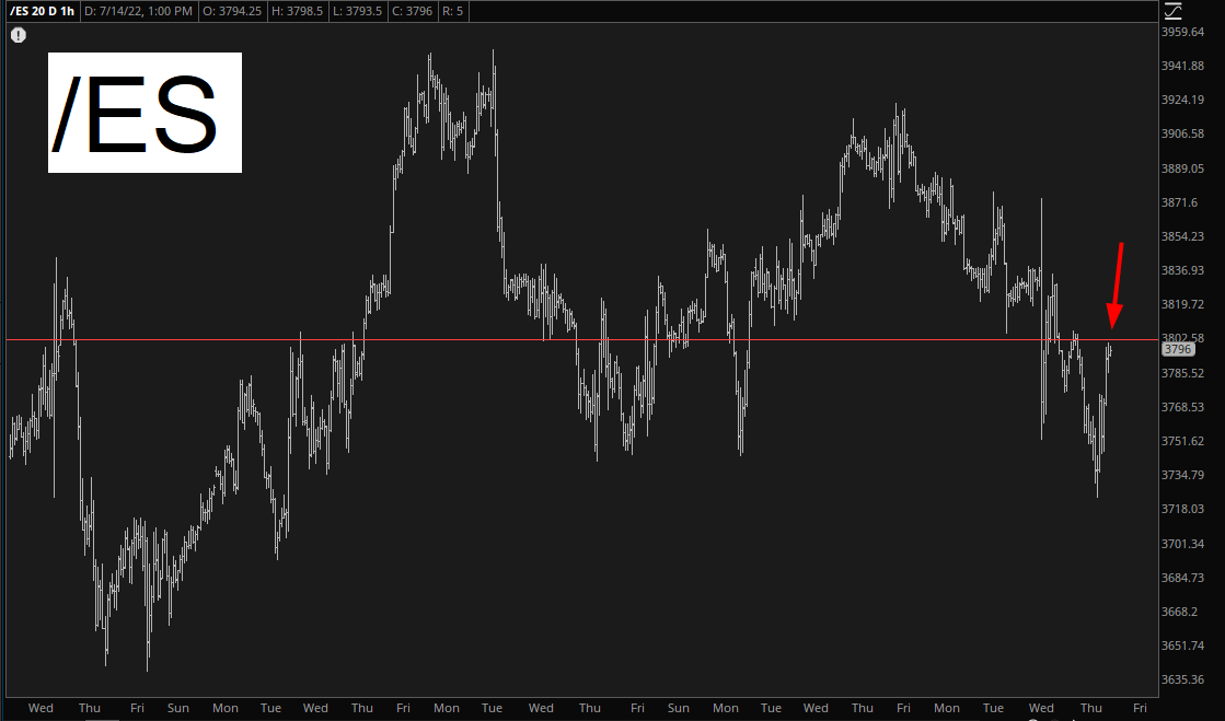
It was honestly identical. Red futures in the morning. Red-hot inflation report. Futures sink. Then, half an hour into the trading day, it was straight-up from there. NQ ended the day bright green. All the same, my portfolio gained value yesterday and today, so blow me, P.T.B.
One flicker of hope is that the /ES closed precisely at its Fibonacci (and on the correct side, which is to say, beneath it).
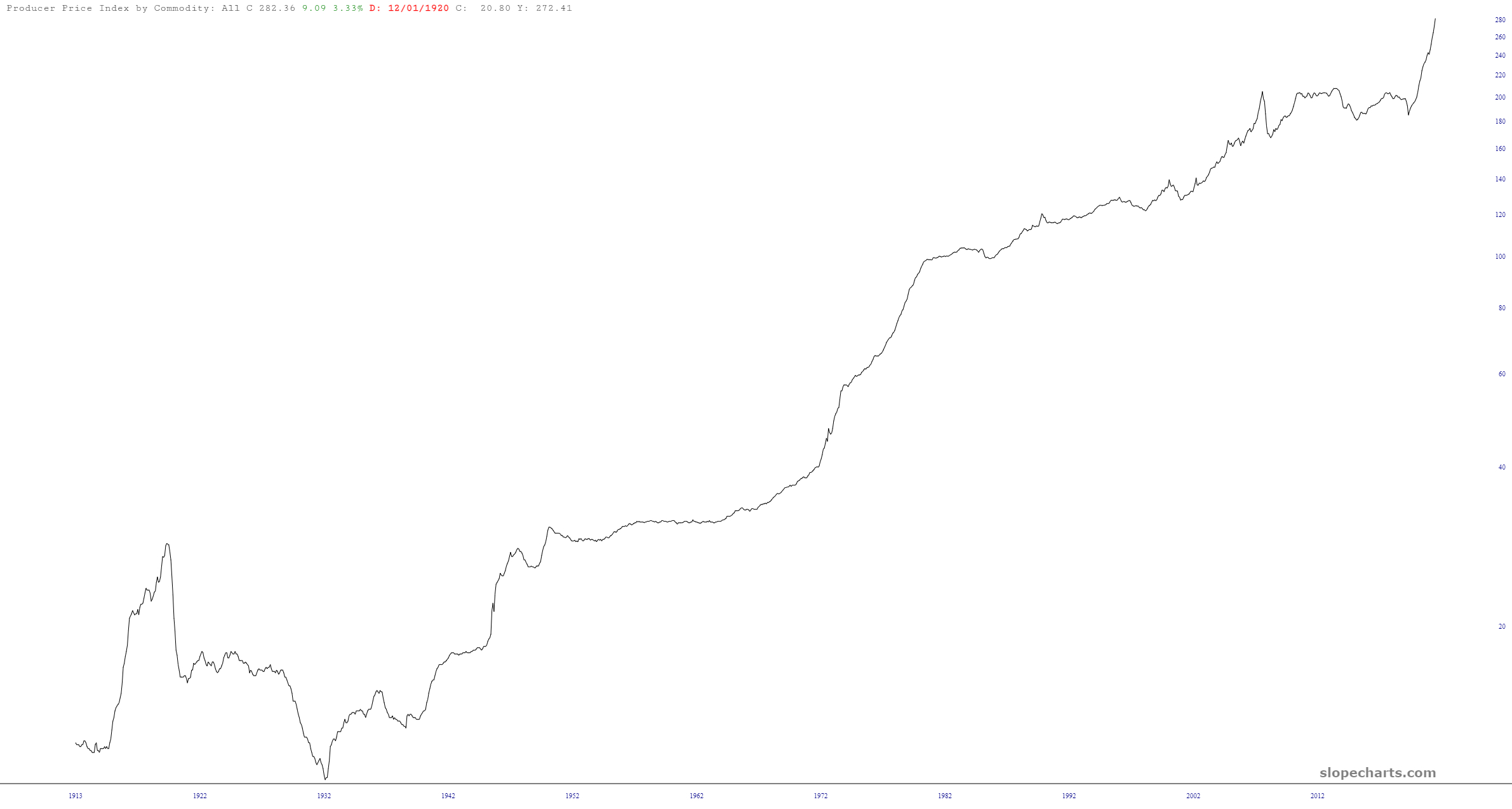
The economic database in SlopeCharts is positively vast, and I was curious what we had in terms of Produce Price Index. Well, it goes back to 1913! Check it out: