You wrote a book on the subject of financial panics, so here’s a question: should bears use linear charts for help with predicting eventual bear market lows? Not necessarily for a price target, but more to understand the scale of what’s coming.
I thought of this when looking at Home Depot after your post, because it looks like a perma-riser chart about to break support (huge event by itself) , but when I changed the view to linear, it looks like an obvious bubble since maybe 2009 with a possible stretch target of $22. The $50 area looked like the biggest support area after Covid lows until I saw the linear chart.
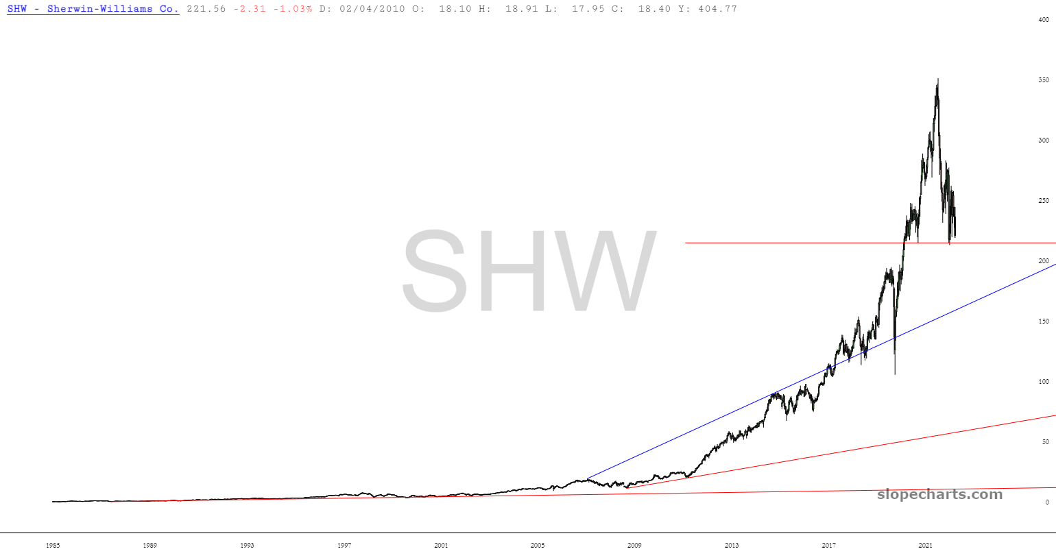
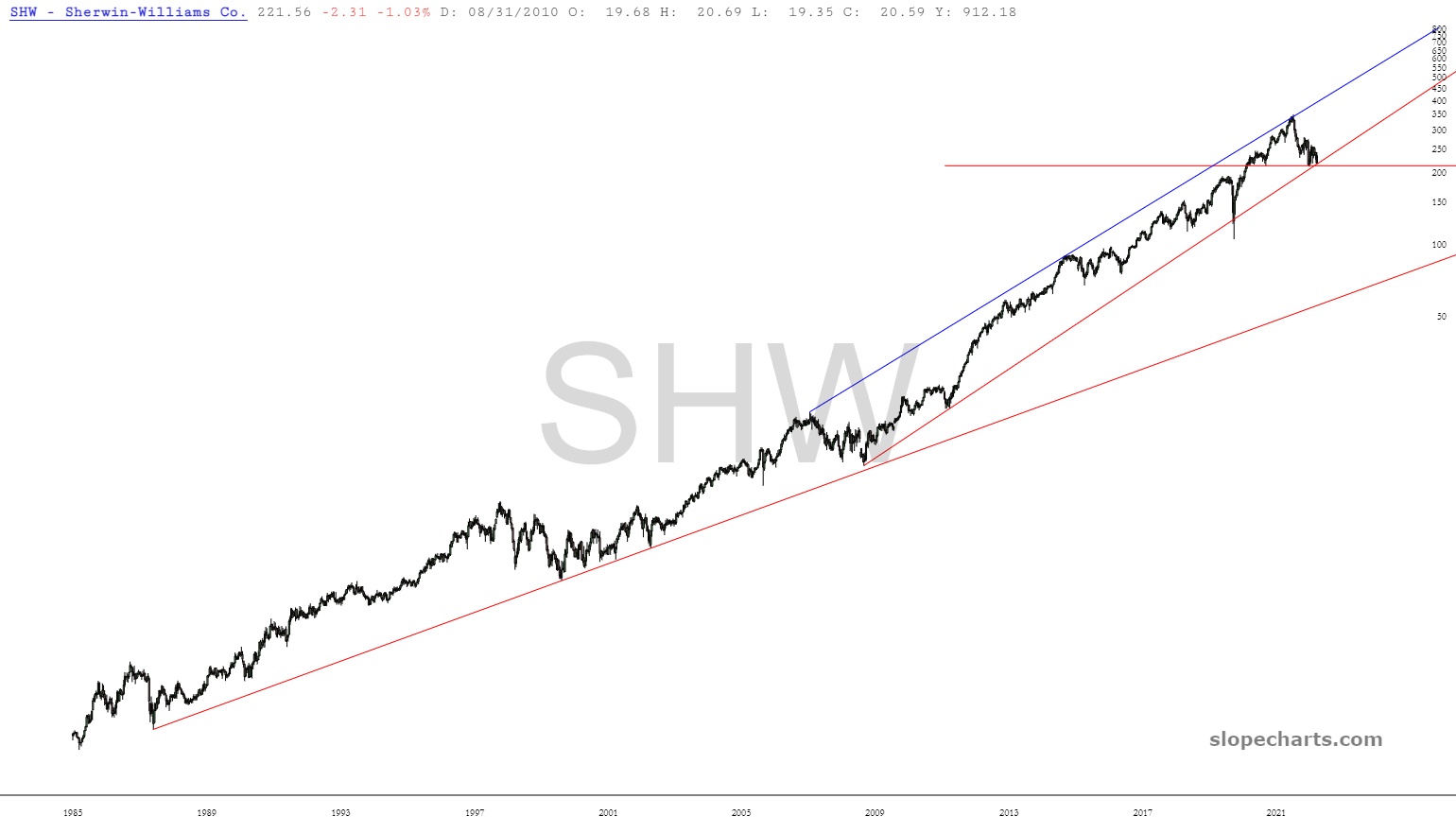
Look at SHW, that was a permariser too. There’s a clear bubble in the log chart, but the linear…
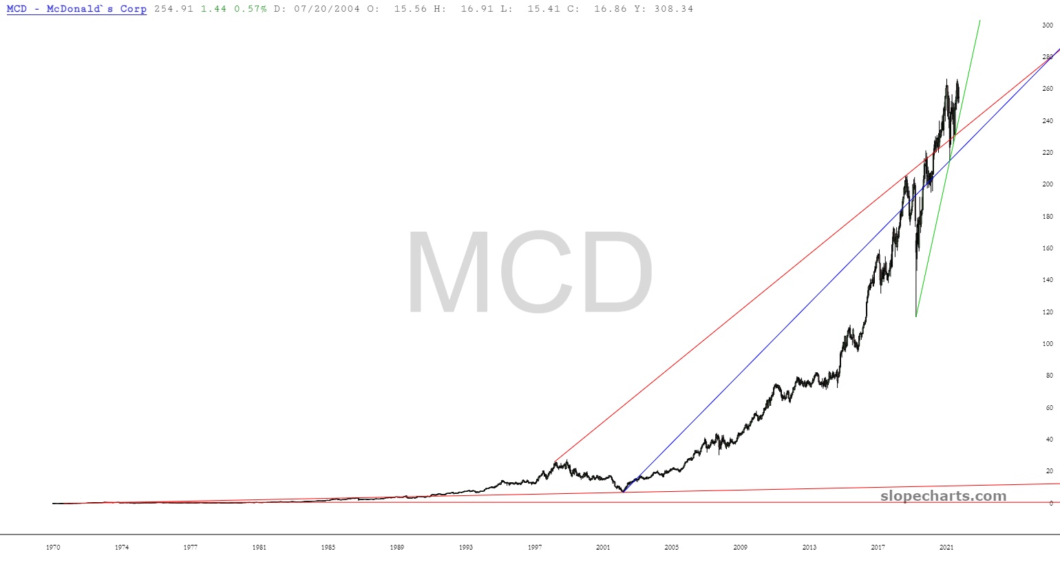
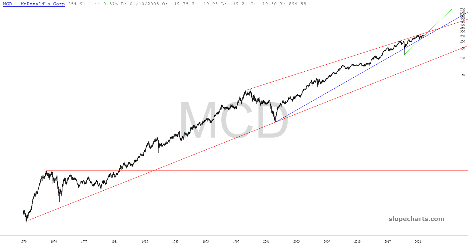
I looked at MCD and I see $100 as an obvious support level on the log chart. Yet look at the touches at 12 cents and $7..that the linear chart points to something more like $20 area doesn’t look crazy.
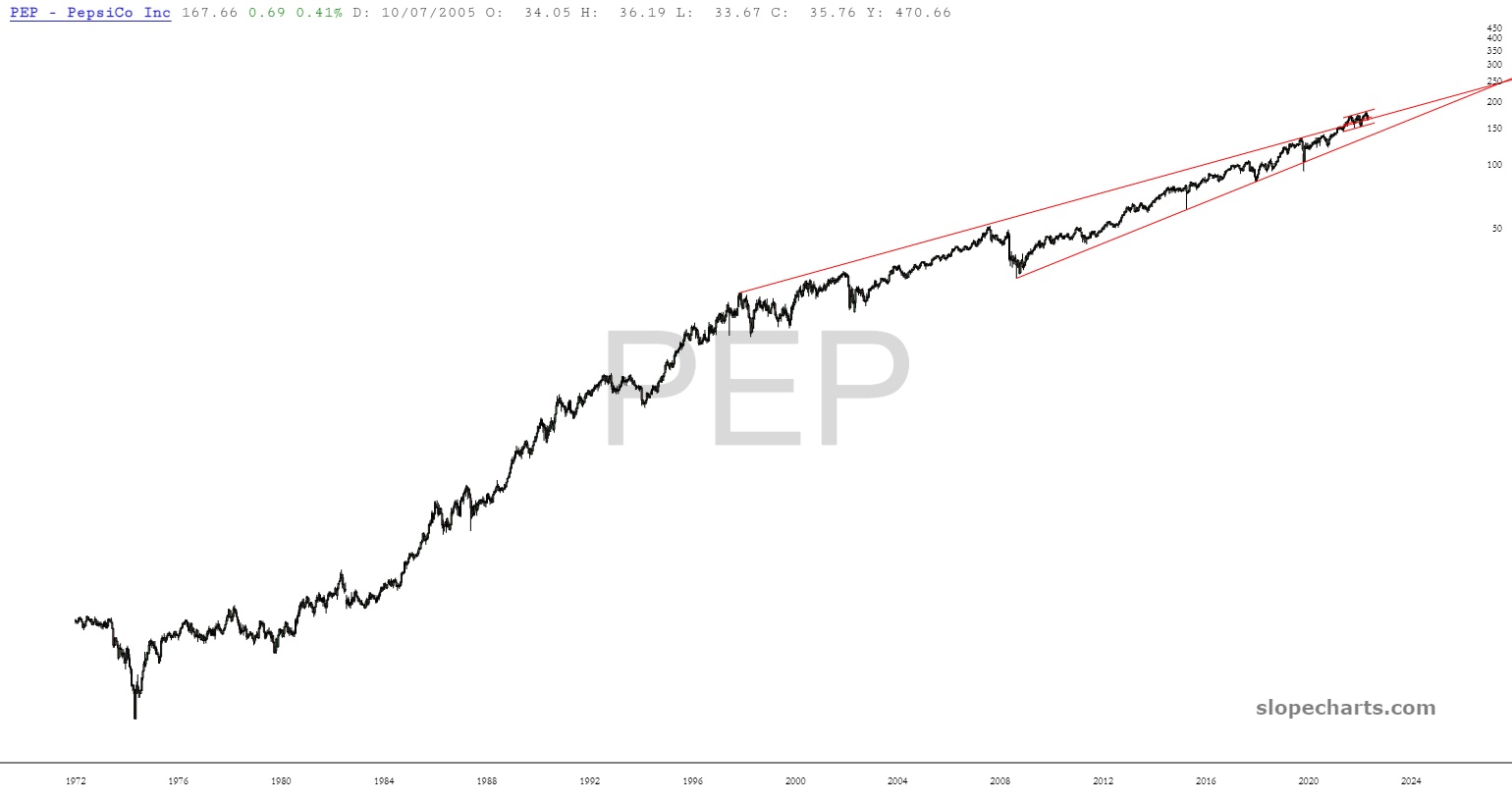
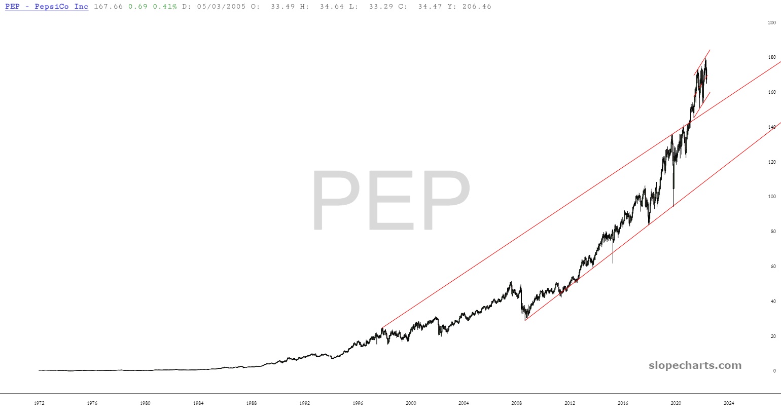
Pepsi as been a expanding since 2009.
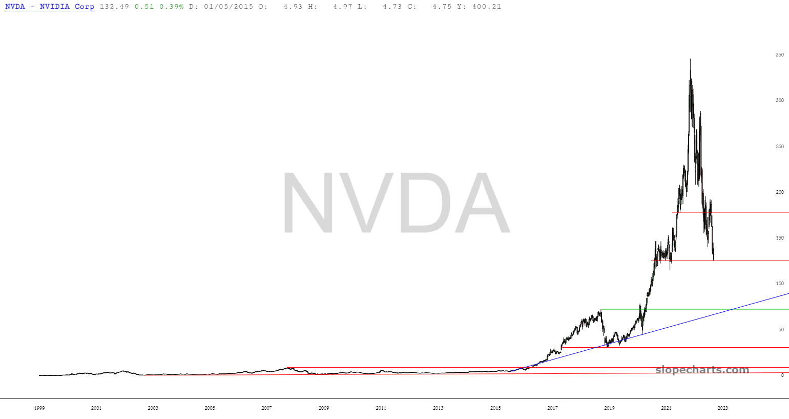
NVDA even bears probably think the business is great, but that chart…
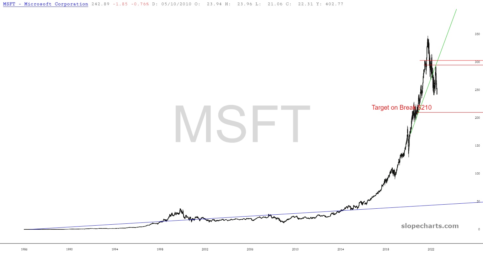
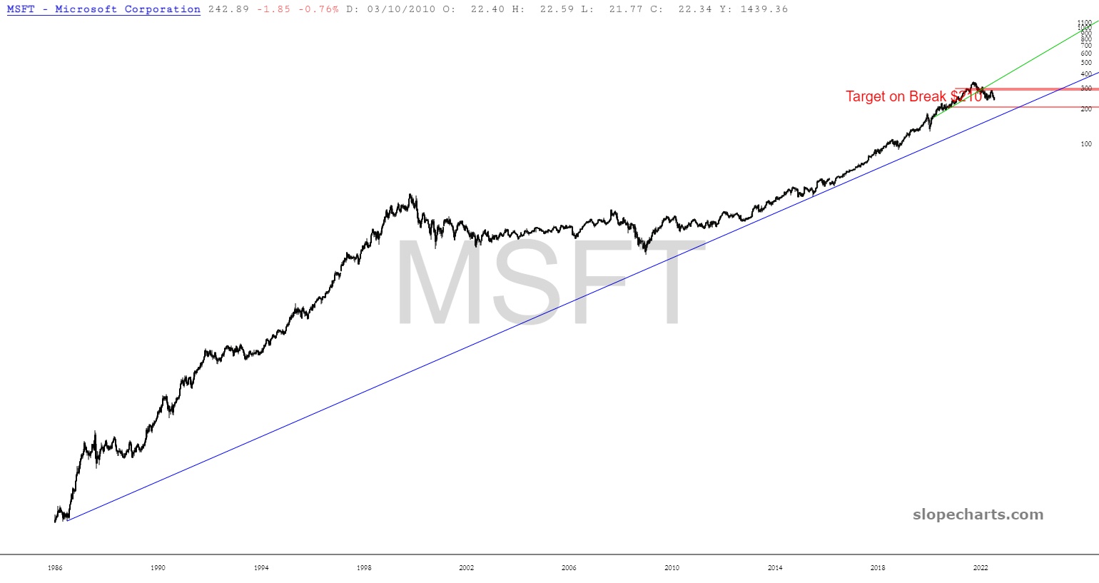
MSFT!
“This time is different” would mean these charts don’t behave like every other chart we’ve seen, no? I’m looking at these charts thinking 1929, 1989 Nikkei, 2000 Nasdaq.
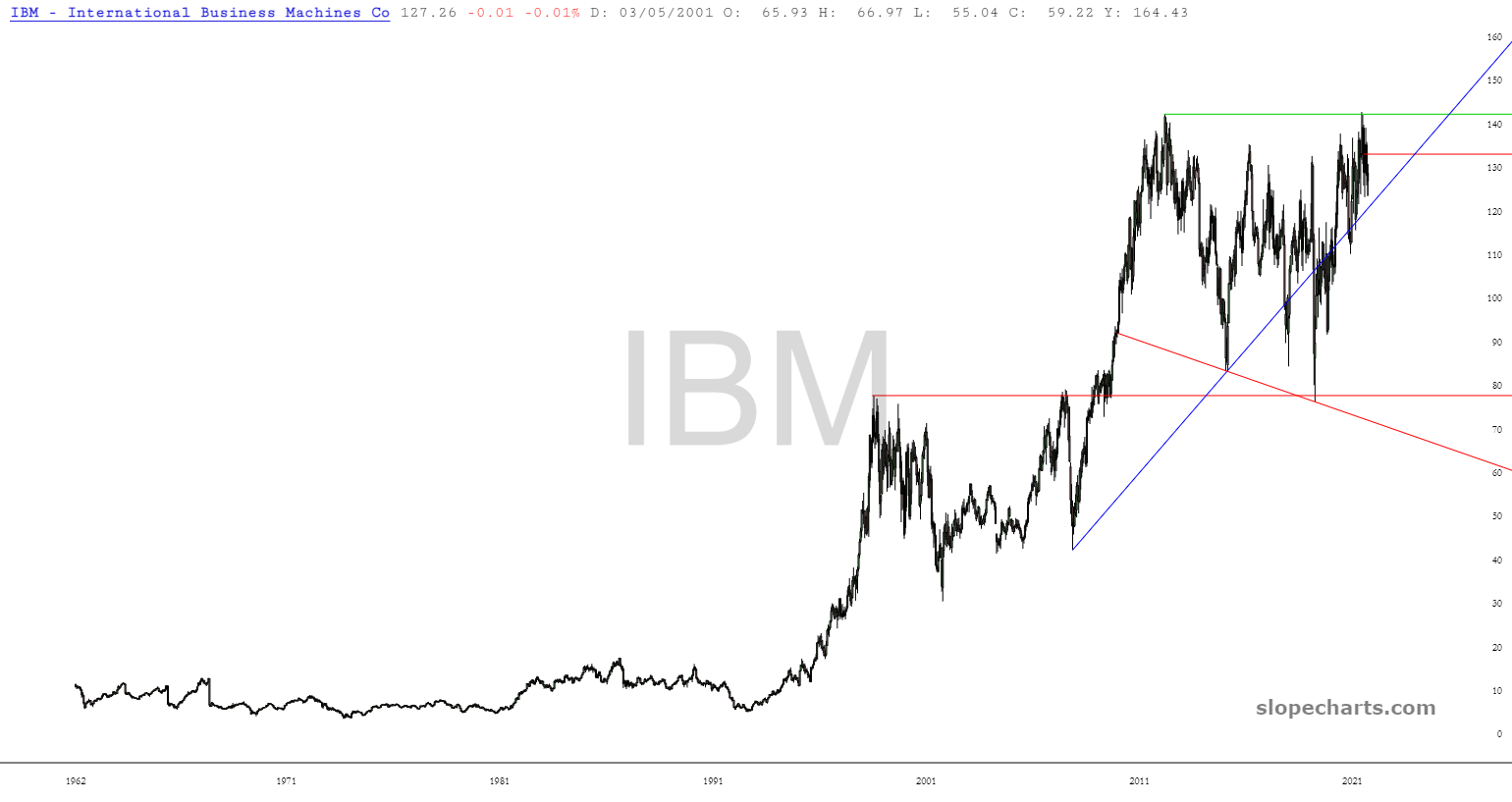
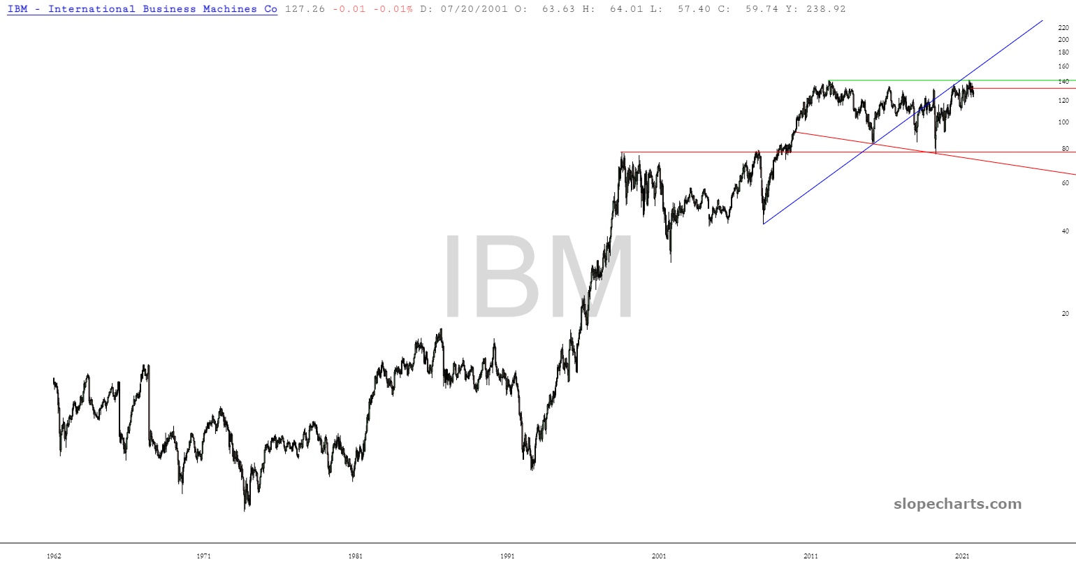
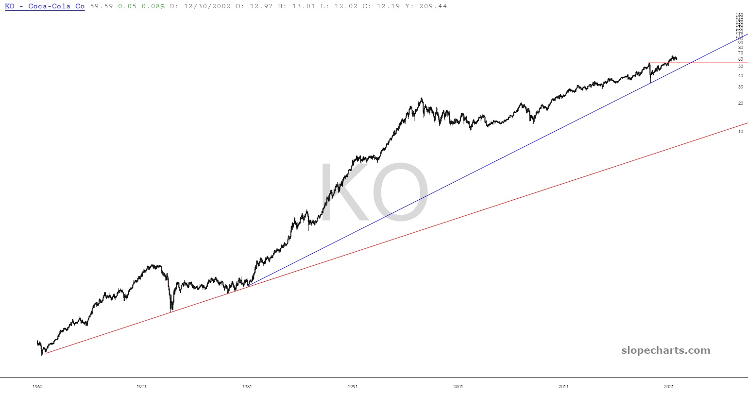
I went looking for counter-points and found a couple quickly: IBM and Coca-Cola KO both went through bubbly advances and never fully retraced what looks like the whole bubble. They do retrace to the start of smaller bubbles though.
Sorry for rambling, but I don’t know what to make of it. On the one hand, many charts look like obvious bubble’s bursting with crazy low targets. A 2×4 to the face saying “short everything.” On the other hand, I know Prechter saw the same thing in 1999. It made sense for Nasdaq, but the broader market mostly held at long-term support. In 2008, financials/housing implode, but broader market holds at long-term support.