
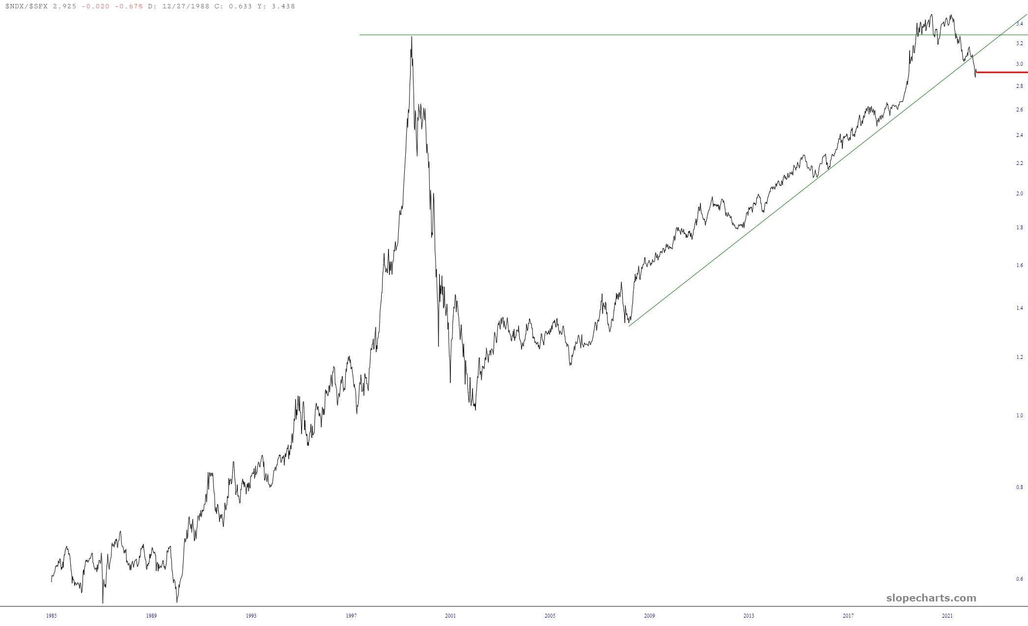
Let’s take a fresh look at three pairs charts. The first one is the NASDAQ 100 divided by the S&P 500. The message here is plain as day: that, yes, tech lead the way for many, many years, but it’s done now. It peaked one year ago (precisely the time that stuff like TSLA was peaking) and it has been breaking down ever since. Reality finally caught up with those insane valuations.
Next up is the NASDAQ Composite divided by the money supply, which basically normalizes the index chart to take into account growth in all the dollar bills the Fed churns out. Please note this data is monthly, and therefore lags, so that chart is through Halloween. You can see that it’s no surprise tech stocks have been recovering in November, since we had “bottomed out” on the trendline as of the end of October.

The last one is Slope’s own MICE (Most Important Chart Ever, although it actually isn’t anymore) which is the S&P 500 divided by the 10-year interest rate. This chart peaked in August 2020 (when interest rates were the lowest they’ve been in human history) and then fell with such strength that it didn’t just transit the entire channel, it actually broke it (which is a big deal, since the channel goes back literally for decades). This is obviously a cataclysmic sea-change in the world economy, and frankly I’m not sure where this channel failure is leading us.

