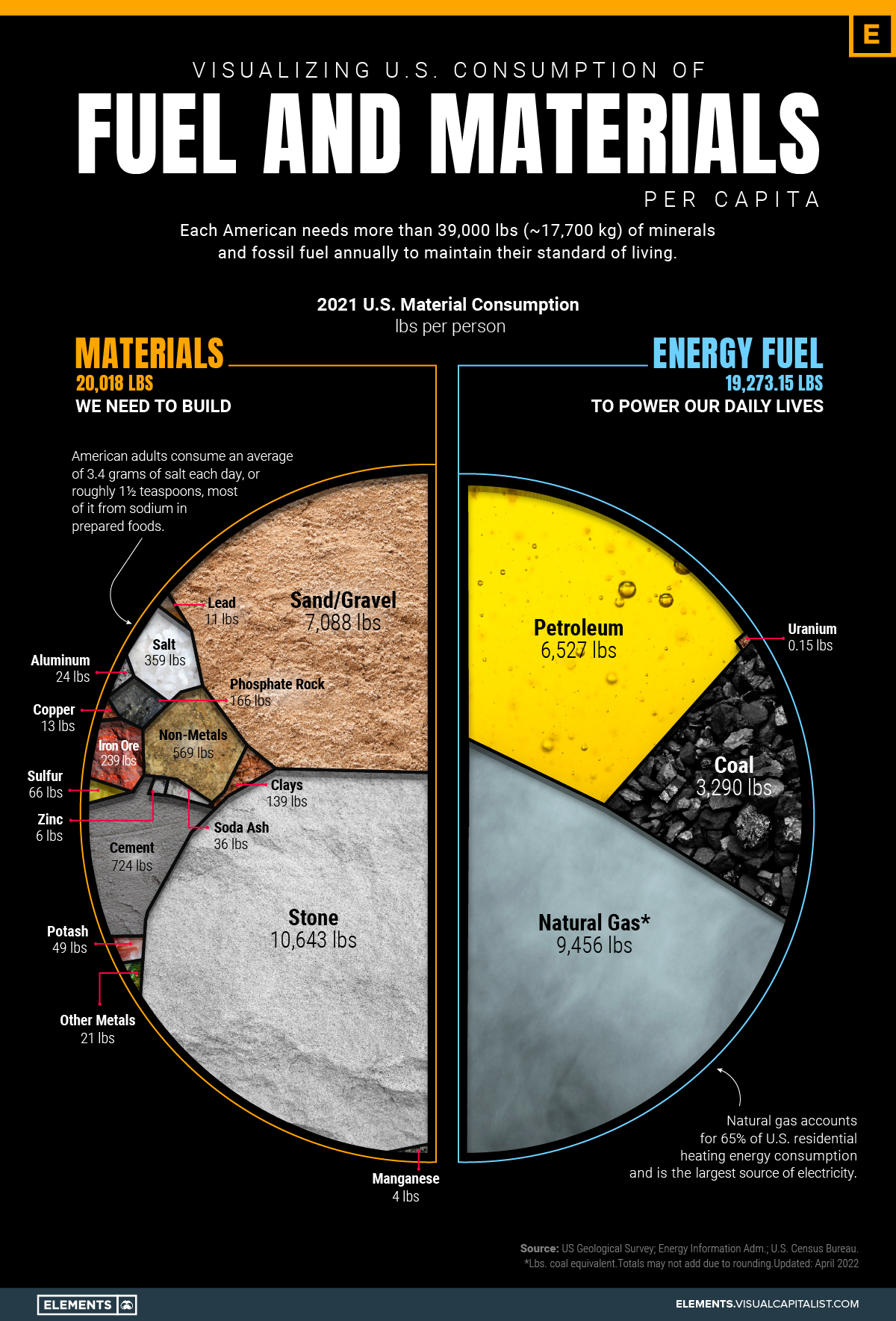
Material World
Slope initially began as a blog, so this is where most of the website’s content resides. Here we have tens of thousands of posts dating back over a decade. These are listed in reverse chronological order. Click on any category icon below to see posts tagged with that particular subject, or click on a word in the category cloud on the right side of the screen for more specific choices.
Yet another cool feature in this ever-expanding product. Anytime anyone uses the $ prefix in order to designate a symbol, it not only lets you click it to see a Super Summary page, it also automatically presents to you an up-to-date daily chart. Sweet, huh? Here’s the link to SlopeTalk. Remember to hit Shift-F5 to refresh it to the latest version!

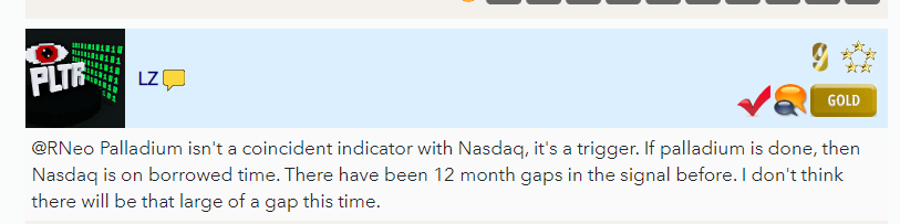
Completely by chance, early today I saw this remark by LZ:
I was intrigued, so I fired up the ol’ Layered Charts. Here is what I saw when I placed Palladium (blue chart) on top of the QQQ (black chart). The long-term correlation is clear, and there are certainly instances in which the NASDAQ has to “catch up” with Palladium.
(more…)