
Completely by chance, early today I saw this remark by LZ:
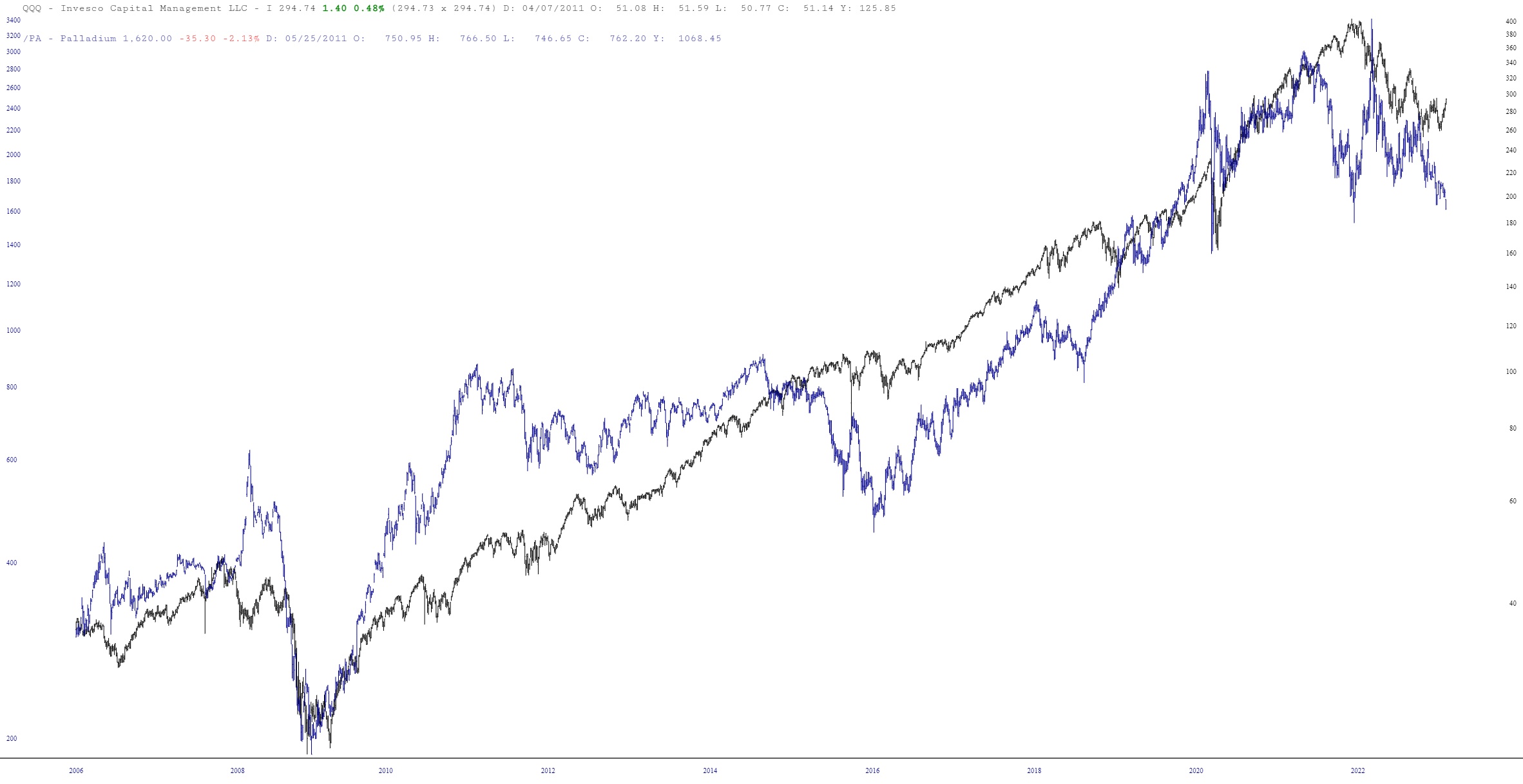
I was intrigued, so I fired up the ol’ Layered Charts. Here is what I saw when I placed Palladium (blue chart) on top of the QQQ (black chart). The long-term correlation is clear, and there are certainly instances in which the NASDAQ has to “catch up” with Palladium.
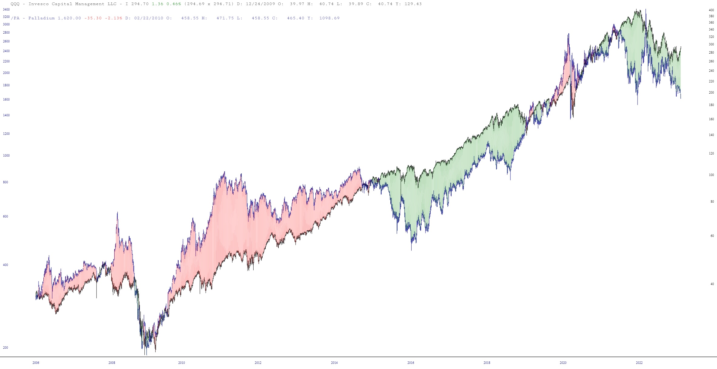
Here is the same chart, enhanced with the spread shown in color. The green portion illustrates that NASDAQ is “overvalued”, so to speak, versus Palladium.
And here’s a closer look, illustrating how these two parted ways eighteen months ago.

Please leave your own thoughts (especially you, LZ!) about this potential relationship.
