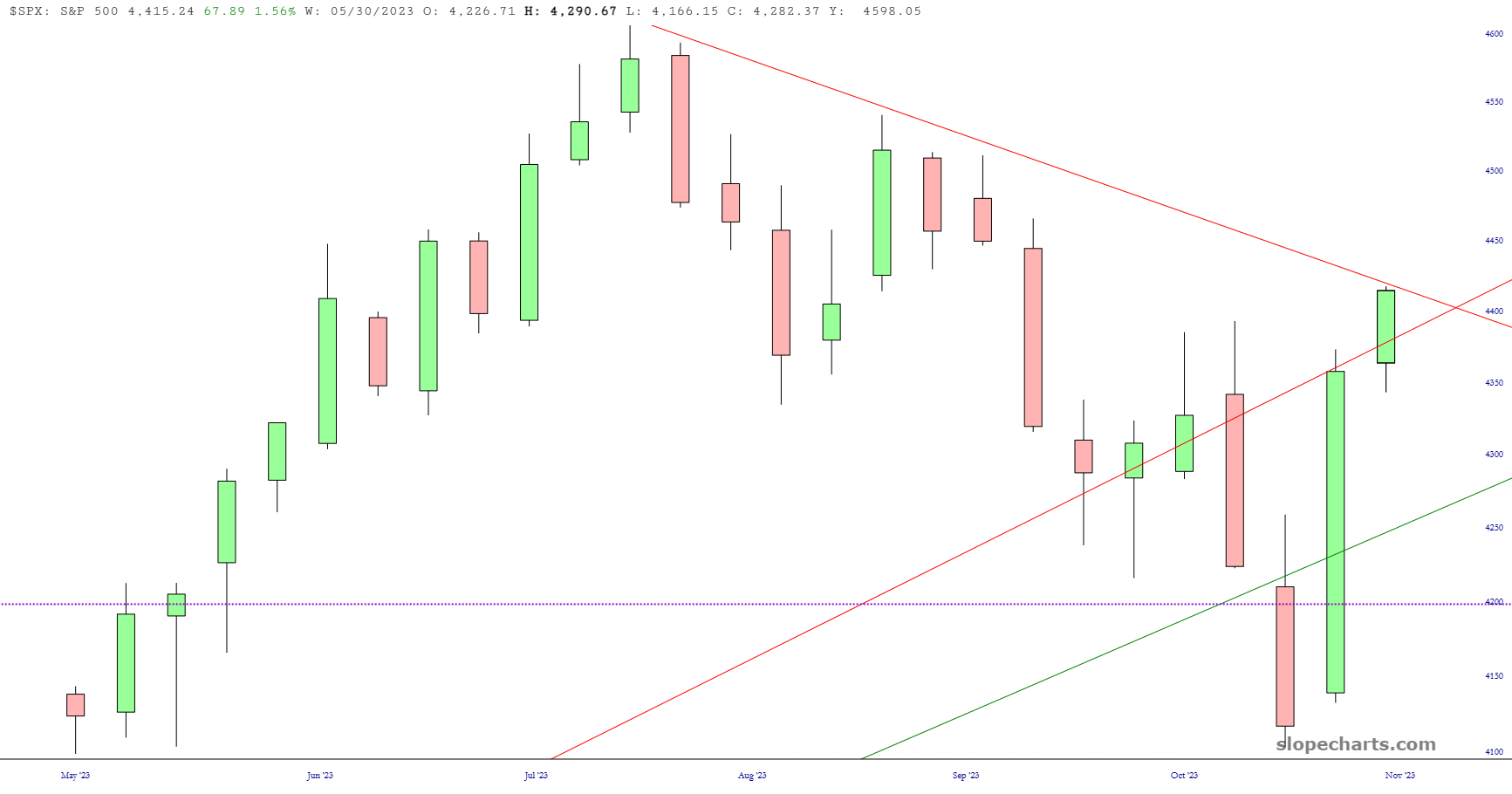
If I had been provided these weekly charts last Friday to show what the S&P 500 and the NASDAQ were going to do during my vacation, I would have assumed things were going to be pretty bad.
Slope initially began as a blog, so this is where most of the website’s content resides. Here we have tens of thousands of posts dating back over a decade. These are listed in reverse chronological order. Click on any category icon below to see posts tagged with that particular subject, or click on a word in the category cloud on the right side of the screen for more specific choices.
If I had been provided these weekly charts last Friday to show what the S&P 500 and the NASDAQ were going to do during my vacation, I would have assumed things were going to be pretty bad.
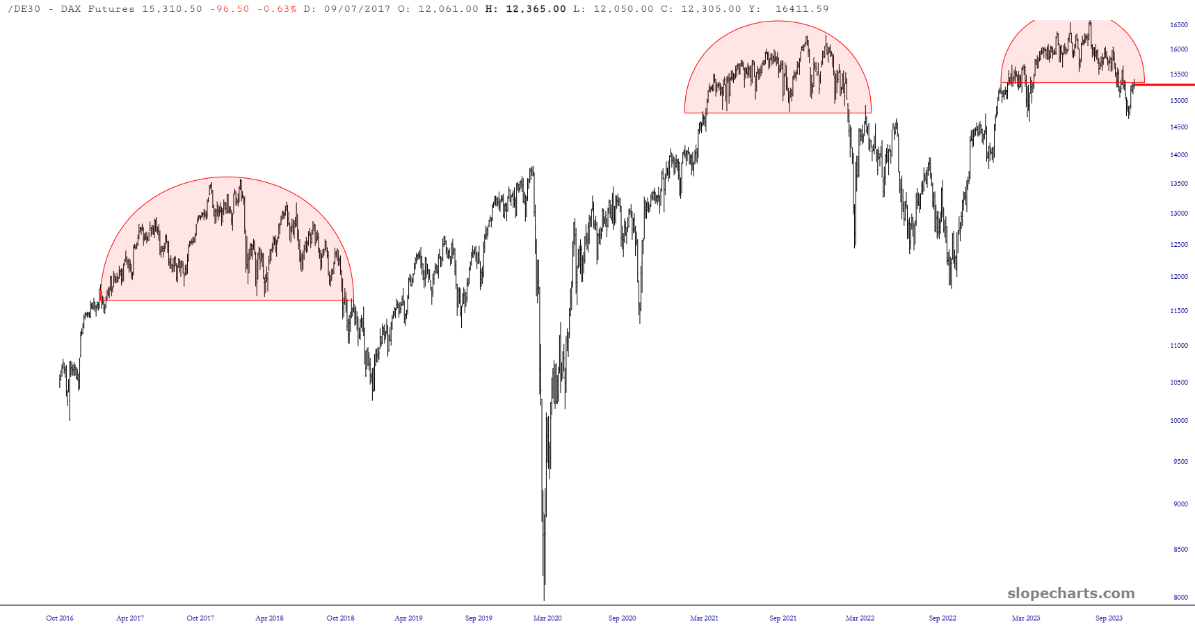
Here is the DAX, which has formed a clean, rounded top:

Dude.
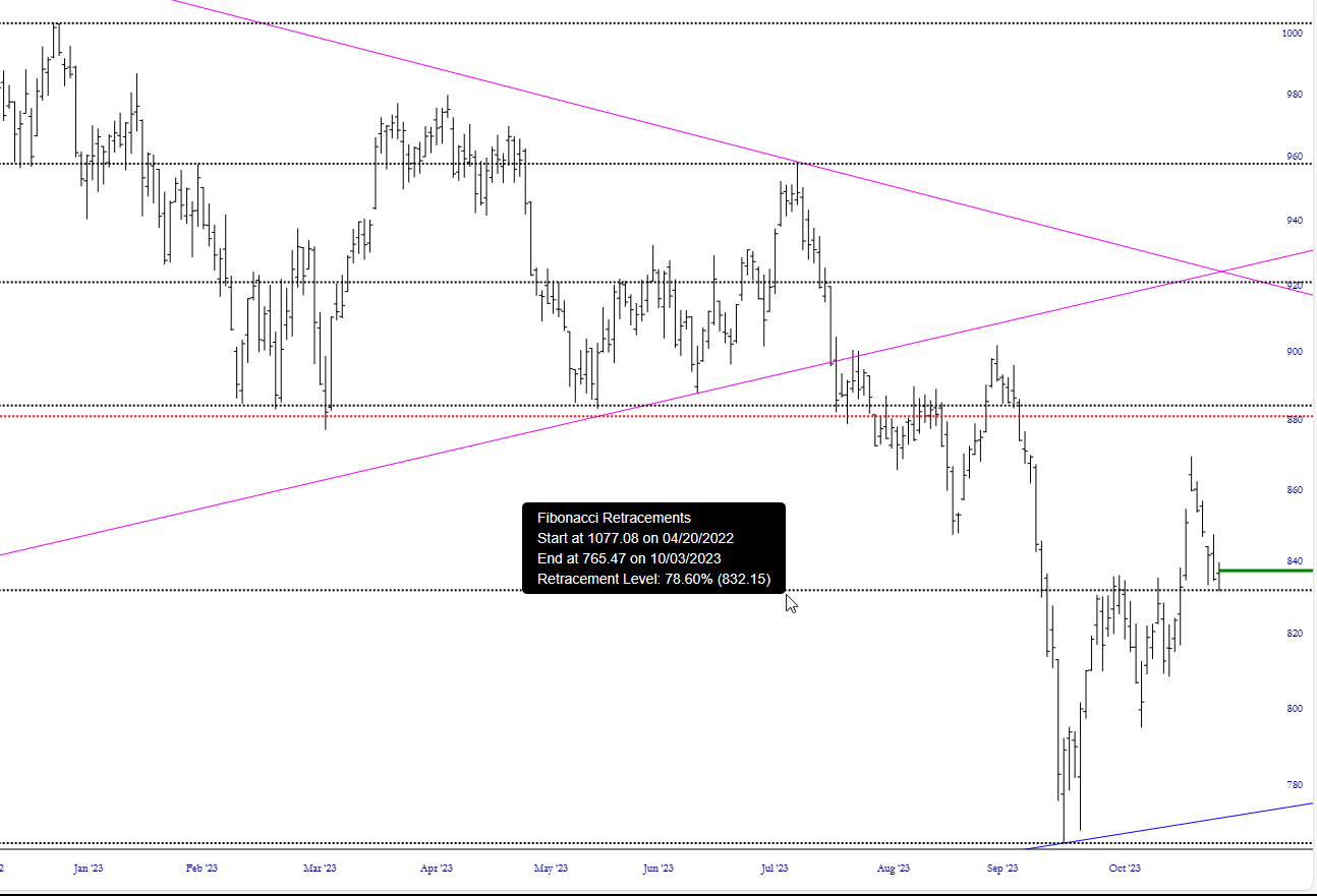
Keep an eye on the Fibonacci level with respect to the Utility $UTIL index to see if that provides firm support.