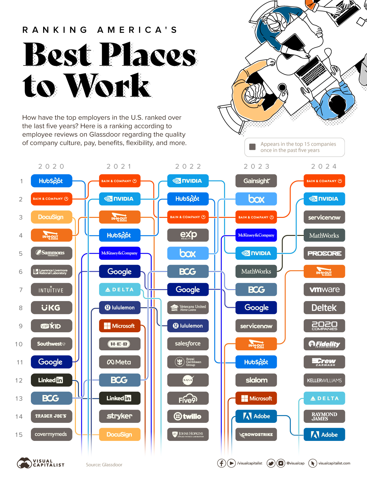
Here are the favorite places to work (oddly, In-n-Out Burger has been pushed aside by Nvidia. Maybe it has something to do with the stock, which goes up 10% every day). Anyway………….
Slope initially began as a blog, so this is where most of the website’s content resides. Here we have tens of thousands of posts dating back over a decade. These are listed in reverse chronological order. Click on any category icon below to see posts tagged with that particular subject, or click on a word in the category cloud on the right side of the screen for more specific choices.
Here are the favorite places to work (oddly, In-n-Out Burger has been pushed aside by Nvidia. Maybe it has something to do with the stock, which goes up 10% every day). Anyway………….
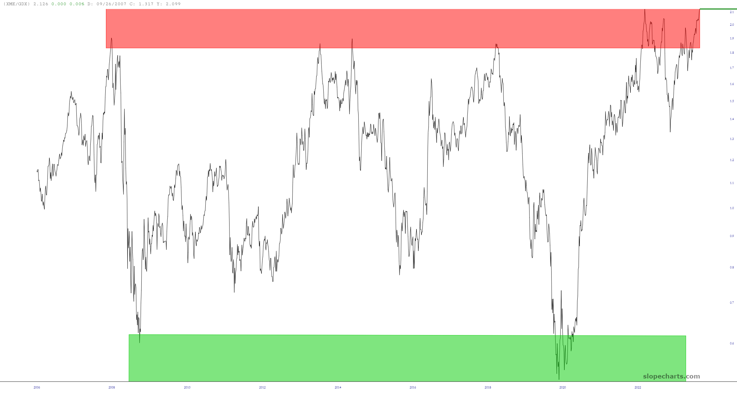
Below is the ratio chart of the XME divided by the GDX. This chart spans decades, and as you can plainly see, it has never, ever been higher. Thus, we are either (a) entering a whole new era in which this ratio chart goes into the stratosphere or (b) it’s an intriguing pairs trade, suggesting shorting XME and going long GDX.
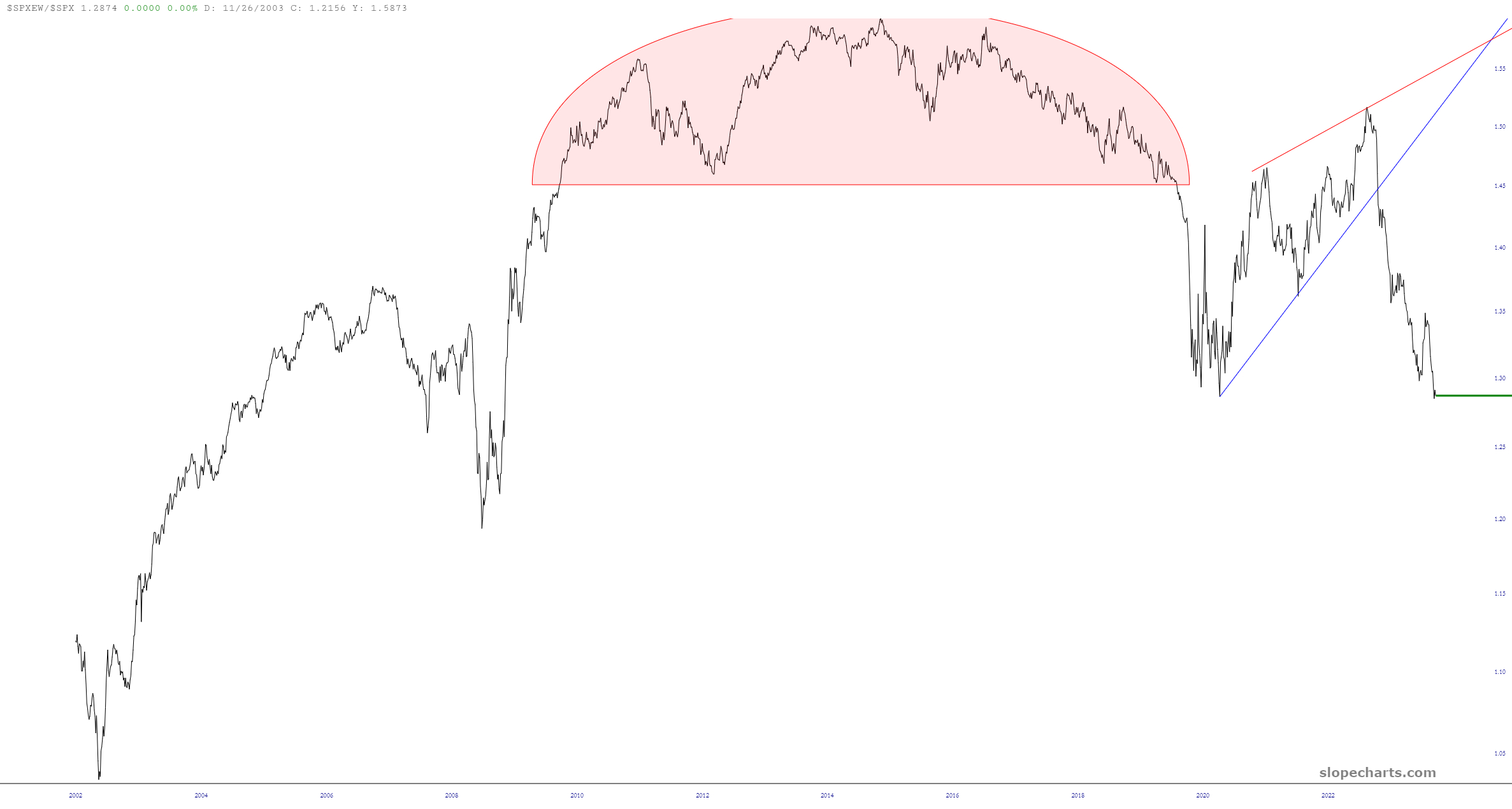
It’s been a while since we looked at the ratio chart of the equal-weighted S&P 500 as compared to the normal S&P value, but here it is. As you can see, it’s a complete train wreck, which illustrates, once again, how a tiny handful of mega-caps are providing ALL the nominal strength to the headline numbers. People who read USA Today aren’t going to tell the difference between one S&P or the other, so it makes everyone chipper to see lifetime highs every day, even with all the rot beneath the surface.
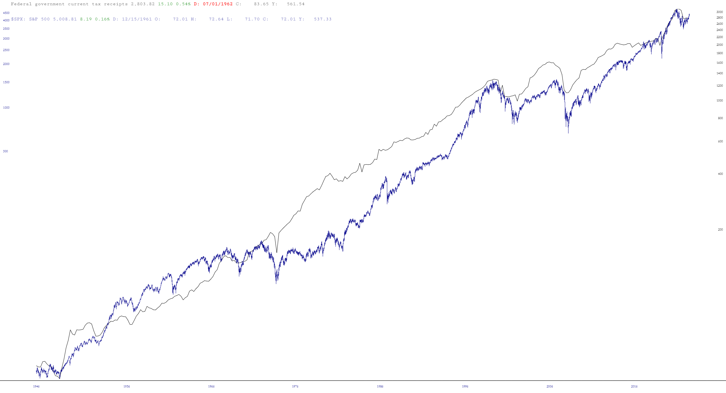
Insufferable data dork and chart nerd that I am, I was curious about the correlation between federal tax receipts and the stock market. Let’s just say they are pretty much joined at the hip:
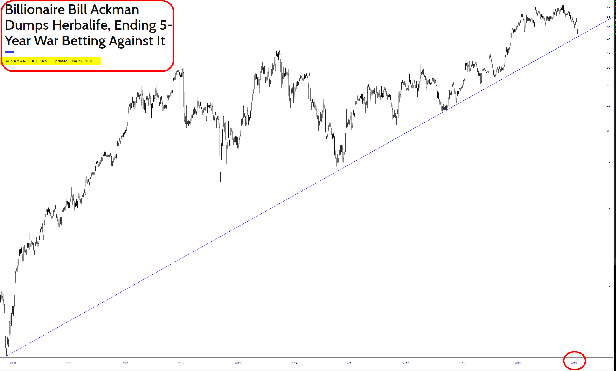
Remember the dreadful Bill Ackman/Carl Icahn feud back in the day? Ackman was a big HLF bear, and he had a monster short position, whereas Icahn was a HLF bull and mercilessly taunted Ackman all the way up. Ackman had this short going from 2012 until 2019, but he couldn’t take it anymore, so he got out at a huge loss around June 2019.