Although it is evidently illegal for stocks to lose value, I still offer to you some charts which seem quite toppy. As always, clicking a chart will create a screen-filling version.

Slope initially began as a blog, so this is where most of the website’s content resides. Here we have tens of thousands of posts dating back over a decade. These are listed in reverse chronological order. Click on any category icon below to see posts tagged with that particular subject, or click on a word in the category cloud on the right side of the screen for more specific choices.
Although it is evidently illegal for stocks to lose value, I still offer to you some charts which seem quite toppy. As always, clicking a chart will create a screen-filling version.

On Sunday, we did something we very rarely do, which is visit the nearby city of San Francisco. This may seem hard to believe, but San Francisco was once the most-visited city on the entire planet of Earth. In recent years, as has been incessantly reported, it has diminished in terms of overall quality of life, particularly in certain parts of town including, ironically, this one:
Well worth a listen!
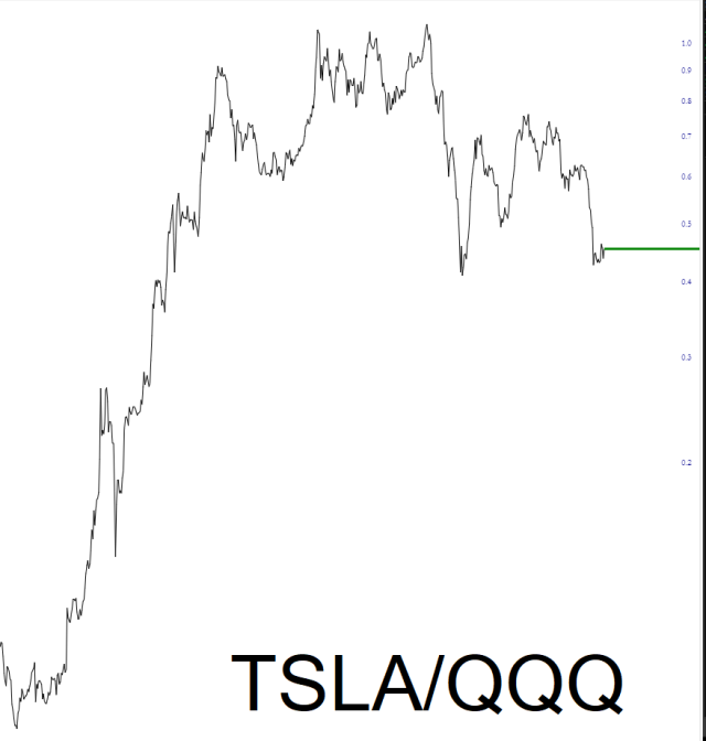
It has been no secret that Tesla, which was heralded as the greatest stock in the universe until 2021 (and which I highlighted as a long position in 2012 before anyone else was talking about it) nas become a total dog. The Magnificent Seven is now merely Six, and the relative strength of TSLA versus the QQQ makes its demise as plain as day.
