
Here’s a very interesting little chart: it shows how correlated equities are over the span of years. When the level is high, correlation is very high, which means you might as well just buy the SPY and forget it. When the level is low, it means stocks are all over the place, and it pays to be a good stock picker (using, let’s say, SlopeCharts).
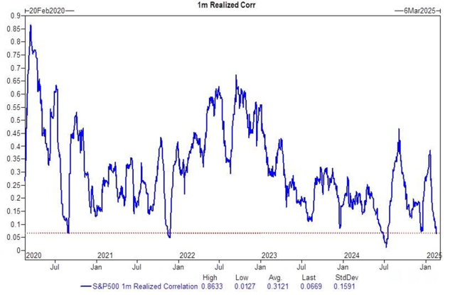
In this instance, we are at incredibly low levels, suggesting that we’ve finally got a market which is amenable to good old-fashioned charting!
