I stumbled upon this video, and it’s a terrific listen (feel free to skip the 7-minute introduction, which isn’t key):
Slope of Hope Blog Posts
Slope initially began as a blog, so this is where most of the website’s content resides. Here we have tens of thousands of posts dating back over a decade. These are listed in reverse chronological order. Click on any category icon below to see posts tagged with that particular subject, or click on a word in the category cloud on the right side of the screen for more specific choices.
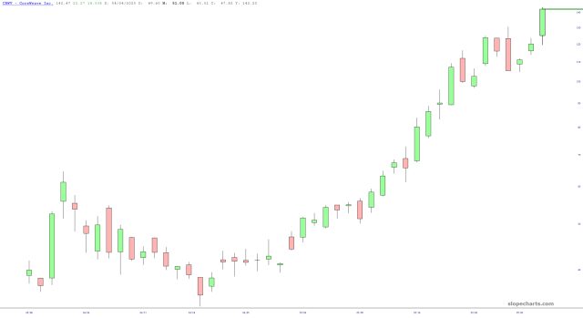
SoarMoreWeave
As a follow-up to my post from last month………another huge pusher higher, and remember, when you’re dealing with lifetime highs on young stocks, there’s really no meaningful way to define resistance. Everyone’s just racing around the chairs, listening carefully for the music to stop.
Homecoming Queen
Long-time readers know I’m not really into travel, not even when it’s for vacation. I had kind of been bracing myself for a series of trips over a period of weeks, and I was gritting my teeth with anticipation to get to the other side of them and get back to normal.
Well, I made it, and THIS is the welcome home I get!

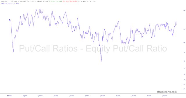
A New Angle with PCRs
I read an article from our friends in Gainesville that gave me an idea to share. What the boys at EWI do is take the put/call ratio (which we now have in SlopeCharts) and do two things to it: (1) they create a 10-day moving average to smooth it out (2) they invert the scale so that a chart basing and curling up indicates a bottoming market overall, and a chart topping and starting to curl down means just the opposite.
I have made these modifications, and hidden the raw data used to compute it, in the five charts below. Enjoy!
Amerasian
Here’s a map showing which counties in the U.S. have Asian populations greater than 10%. Some regions are no surprise, such as the San Francisco Bay Area, but I bet there are some interesting stories behind the scattered dots here and there across the land, since 10% is a pretty high threshold.

