Here are the various attempts for people to swim across the English Channel. The disturbing ones are the lines that end in the middle.

Slope initially began as a blog, so this is where most of the website’s content resides. Here we have tens of thousands of posts dating back over a decade. These are listed in reverse chronological order. Click on any category icon below to see posts tagged with that particular subject, or click on a word in the category cloud on the right side of the screen for more specific choices.
Here are the various attempts for people to swim across the English Channel. The disturbing ones are the lines that end in the middle.
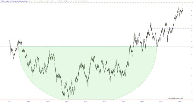
The post title speaks for itself: my long-held price target for the physical silver ETF PSLV has been achieved. Huzzah!! My target for SLV itself has just a little more to go.
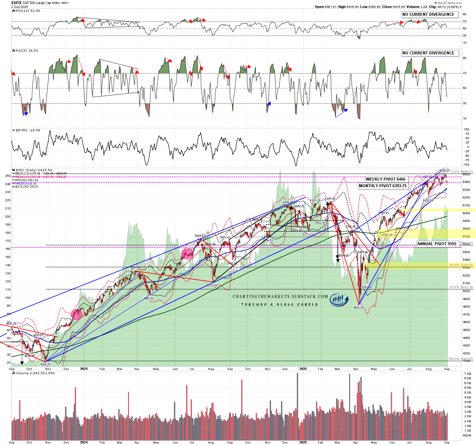
September is the weakest month of the year historically on SPX, and started yesterday with a significant show of weakness, with SPX gapping below the daily middle band and closing below it. This is the third close below the daily middle band in the last few weeks and, as with the other two, we may see a rejection back up into another marginal higher high, but these are significant signs that SPX may be topping out for at least a larger retracement here.
SPX daily chart:
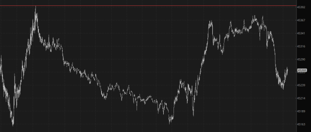
Red equities and green metals. That’s all I really ask! And, at the start of Wednesday (which still feels like Tuesday, thanks to another stupid holiday), that’s what I’ve got. Here we see /YM slightly in the red, pre-open:
I’ve just finished an exhaustive review of over a thousand charts. Here are seven items in which I presently have no position but am seriously considering shorting in the near future. (Note: I am going to be dialing back even more on how much content I show for free, so all seven charts are visible to paying subscribers only).
(more…)