Liquid Assets
Slope initially began as a blog, so this is where most of the website’s content resides. Here we have tens of thousands of posts dating back over a decade. These are listed in reverse chronological order. Click on any category icon below to see posts tagged with that particular subject, or click on a word in the category cloud on the right side of the screen for more specific choices.
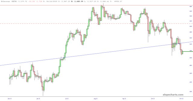
This quick chart shows how $ETH has been degrading since it peaked about ten weeks ago. It seems like a modest reversal, but the loss is approaching 40% of its, ummm, “value“. This whole crypto thing could wind up as one of the biggest financial wipeouts in human history. We shall see soon enough, but one thing’s for sure: the crypto bros aren’t going down without a huge fight.
Here are all my short positions from one (of two) principal portfolios. As always, I’ve zoomed in on the most relevant portion, and you can click any chart for a bigger version.

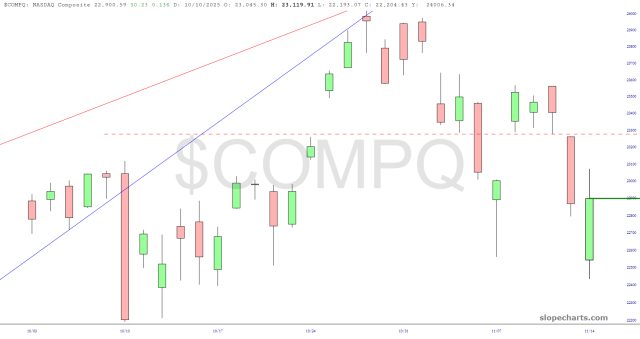
The past couple of weeks have created a thrilling change in the tone and structure of the entire equity market. I see it illustrated with:
The NASDAQ Composite illustrates all three of these beautifuly.
Have you heard the news?

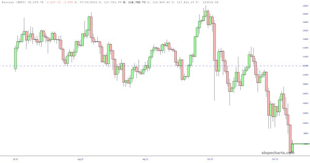
Now, if she “slashed” her prediction for $BTC five years hence from $50 to $37, I’d have a certain amount of respect for that. However, her slashing was from $1,500,000 to merely $1,200,000. In other words, an over twelve-fold explosion in value. Five years might as well be five hundred, but for the moment, it’s not exactly moving the right direction.