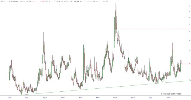
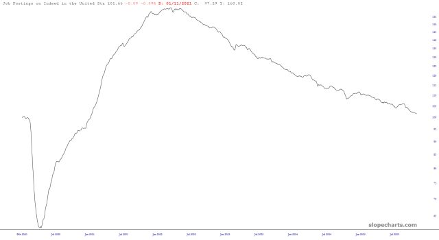
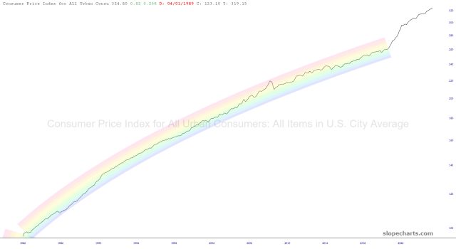
Just a few charts from the marvelous Slope economic library to illustrate what a bad direction we’re all going. Don’t believe what they want you to believe. You’re smarter than that. You’re HERE, right?
Slope initially began as a blog, so this is where most of the website’s content resides. Here we have tens of thousands of posts dating back over a decade. These are listed in reverse chronological order. Click on any category icon below to see posts tagged with that particular subject, or click on a word in the category cloud on the right side of the screen for more specific choices.
Just a few charts from the marvelous Slope economic library to illustrate what a bad direction we’re all going. Don’t believe what they want you to believe. You’re smarter than that. You’re HERE, right?
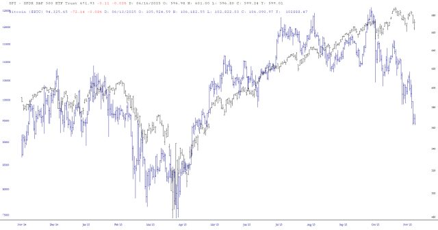
Bitcoin and Equities have been quite closely correlated for the past half-decade. I’m typing these words many hours before the futures open, so I have no idea what those look like by the time you read this, but as I sit here on early Sunday morning, Bitcoin continues to slide. The spread between these two is getting pretty big.