Here is a map which shows how must it costs (with New York City clocking in at 100 as an anchor point) to live in different places on the planet. Hel-loooooooo, Syria!

Slope initially began as a blog, so this is where most of the website’s content resides. Here we have tens of thousands of posts dating back over a decade. These are listed in reverse chronological order. Click on any category icon below to see posts tagged with that particular subject, or click on a word in the category cloud on the right side of the screen for more specific choices.
Here is a map which shows how must it costs (with New York City clocking in at 100 as an anchor point) to live in different places on the planet. Hel-loooooooo, Syria!
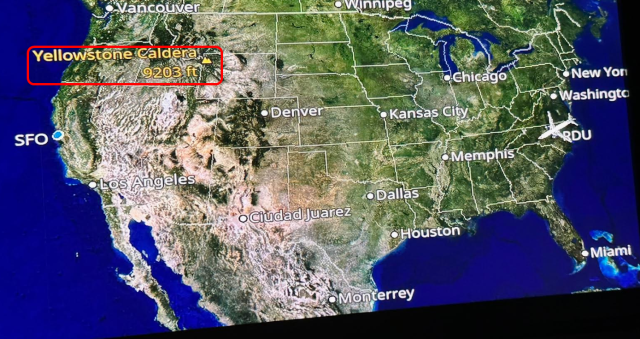
I flew United to and from North Carolina over the past few days, and I’ve always noticed something about their in-flight map that puzzles me: the only, and I mean the only, thing shown on the map that isn’t a city is the Yellowstone Caldera.
Wow. I can seriously be a dope at times. Allow me to explain!
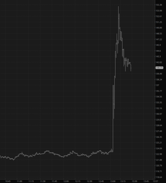
I stumbled upon a stock today I had never traded before called Credo (CRDO). I became instantly enamored of the pattern, and I did a post about it shortly after I acquired some June $125 puts.
Unbeknownst to me, the stock was slated to report earnings after the close, and the moment it did, the stock EXPLODED higher by over 20%!
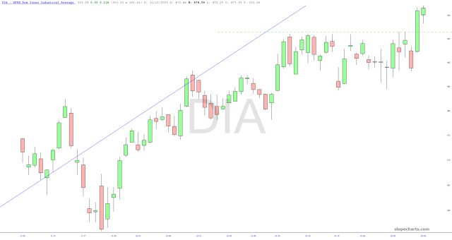
Now that my stew is, well, stewing, I’d like to share a few thoughts about seven ETFs during this very green Monday. I have placed these remarks in the caption area of the charts below, and the symbols are watermarked.