I’ve been watching a lot of Olympics lately, which reminds me of this favorite old SNL sketch:
Slope of Hope Blog Posts
Slope initially began as a blog, so this is where most of the website’s content resides. Here we have tens of thousands of posts dating back over a decade. These are listed in reverse chronological order. Click on any category icon below to see posts tagged with that particular subject, or click on a word in the category cloud on the right side of the screen for more specific choices.
Making the Grade

A Disinflationary Path……
……….to the Next Inflation Problem
The near-term path is disinflationary, but the macro is now clearly inflationary
With Treasury bonds firming up lately, it is time to review the game plan NFTRH has been working to since 2023. After the macro not so subtlety obliterated its decades-long trend of disinflationary signaling in favor of inflationary signaling by the Treasury bond market, a cool down was in order.
To review, our “Continuum” chart was primary in keeping NFTRH, its writer, and its subscribers on the right side of the macro since the service was born in September, 2008 (into the teeth of a major macro liquidity event).
For example, you may recall the “Great Rotation” hype of 2013. That was when a bond market bear was supposedly brewing and a rotation into stocks would be at hand. Well, that second thing happened, but it was not at the expense of the bond market, as the 30yr Treasury yield rose to the EMAs 100 & 120, smashed against them, and reversed. That was one of several instances over 4 decades that the Continuum was tested, but remained in disinflationary lockdown.
(more…)Economic Chart Highlights
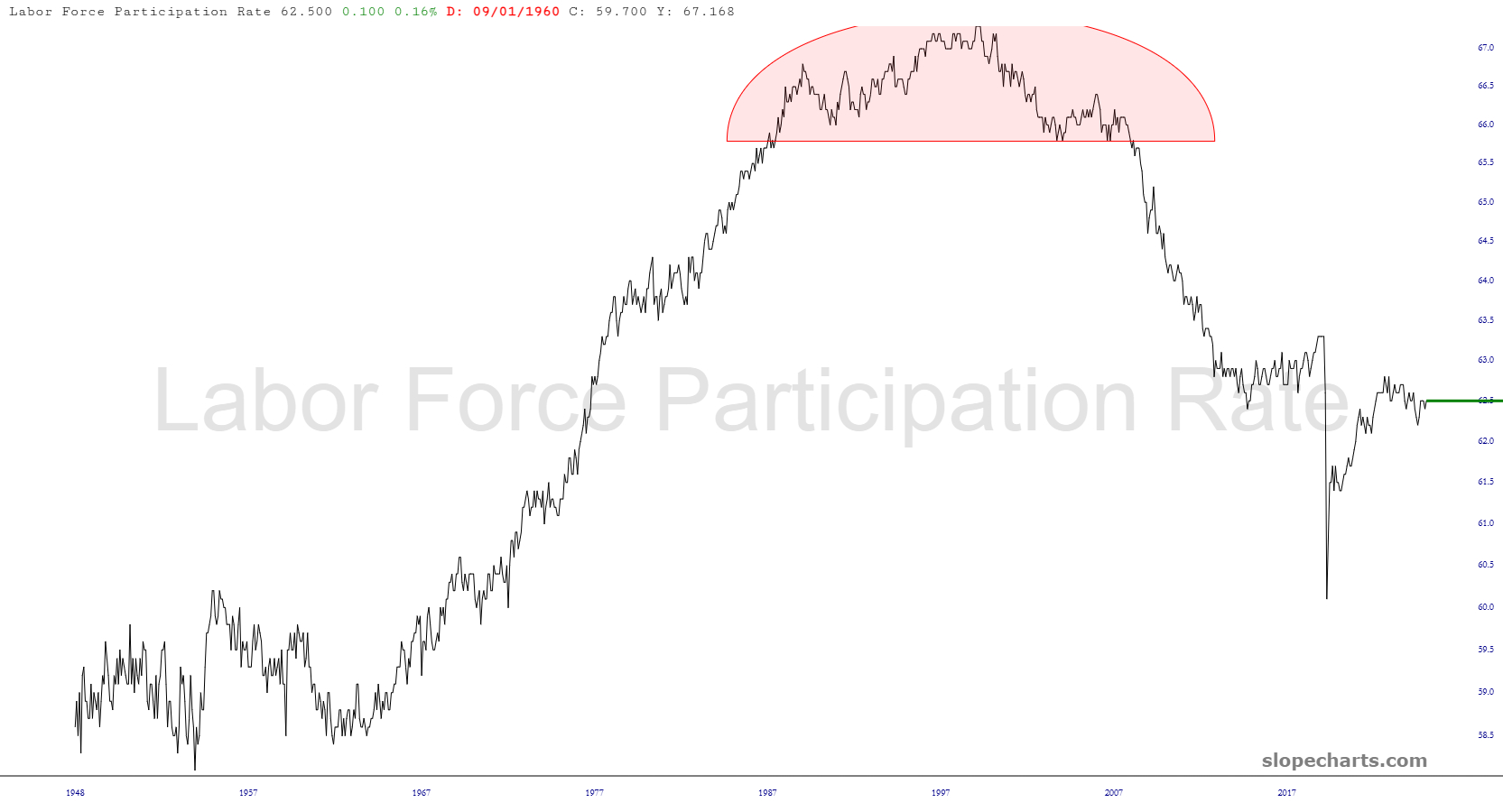
Here are a few updated charts of interest from Slope’s wonderful economic database.
Here is the labor participation rate, which in my opinion illustrates the actual unemployment rate is 35%, since that’s the portion of the adult population that isn’t working, for whatever reason.