Here are a few updated charts of interest from Slope’s wonderful economic database.
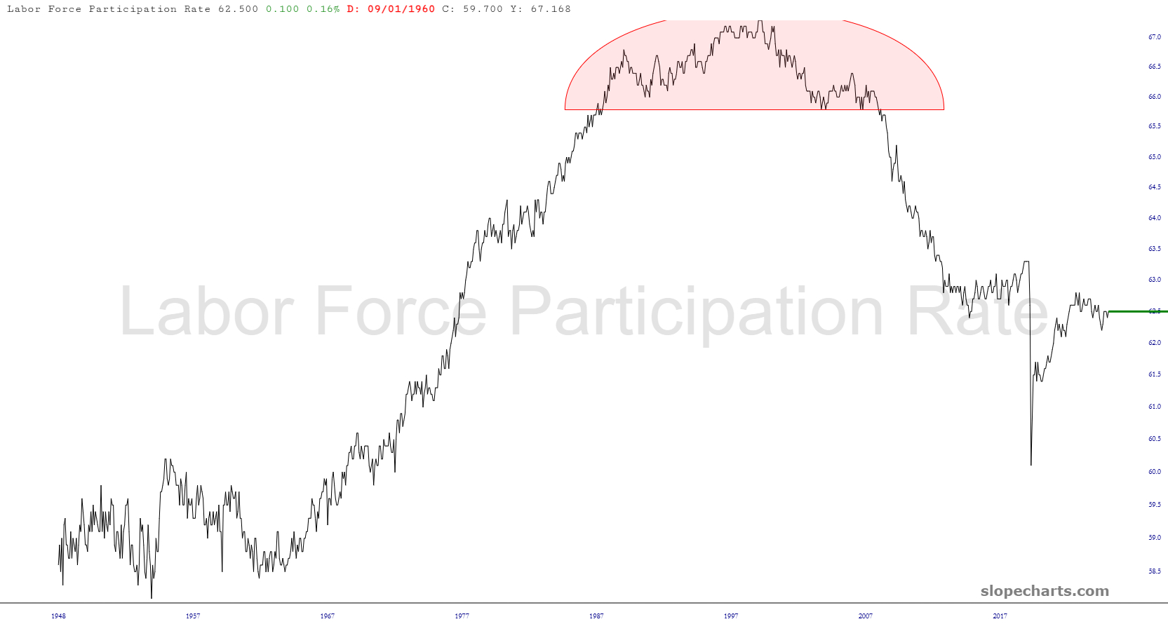
Here is the labor participation rate, which in my opinion illustrates the actual unemployment rate is 35%, since that’s the portion of the adult population that isn’t working, for whatever reason.
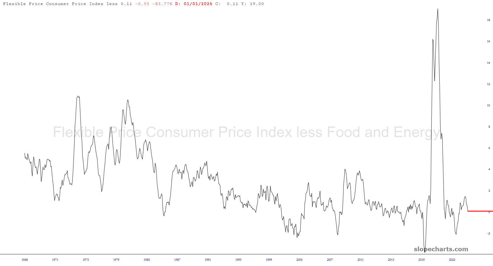
The CPI (less the luxury items of food and energy) nicely shows the mega-spike that took place when trillions were hurled into the economy for Covid “relief”.
The federal government ran a quite modest deficit for many, many decades until around 1980, after which we have convulsed ourselves into irrecoverable bankruptcy.
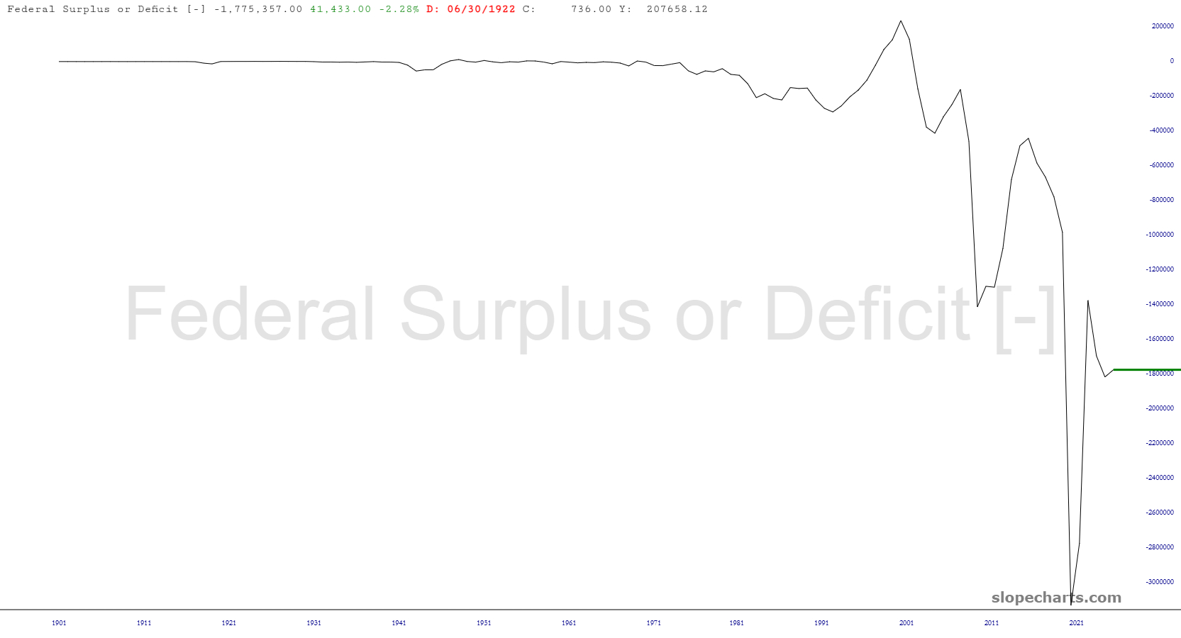
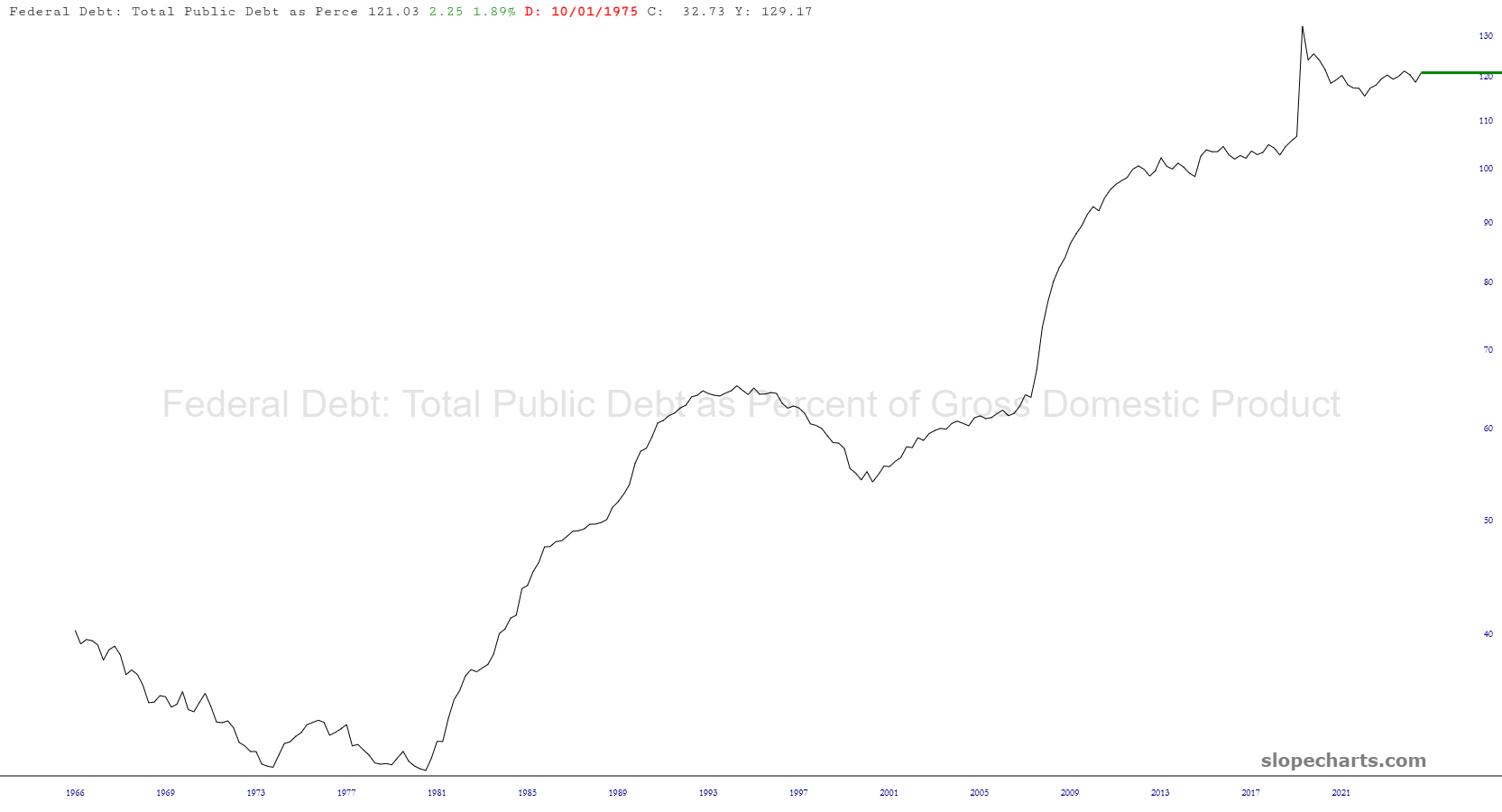
Of course, measuring nominal dollars can be misleading since they are worth less all the time. A more useful metric is the percentage of GDP which the public debt represents. We are around 125%, which is absolutely shameful.
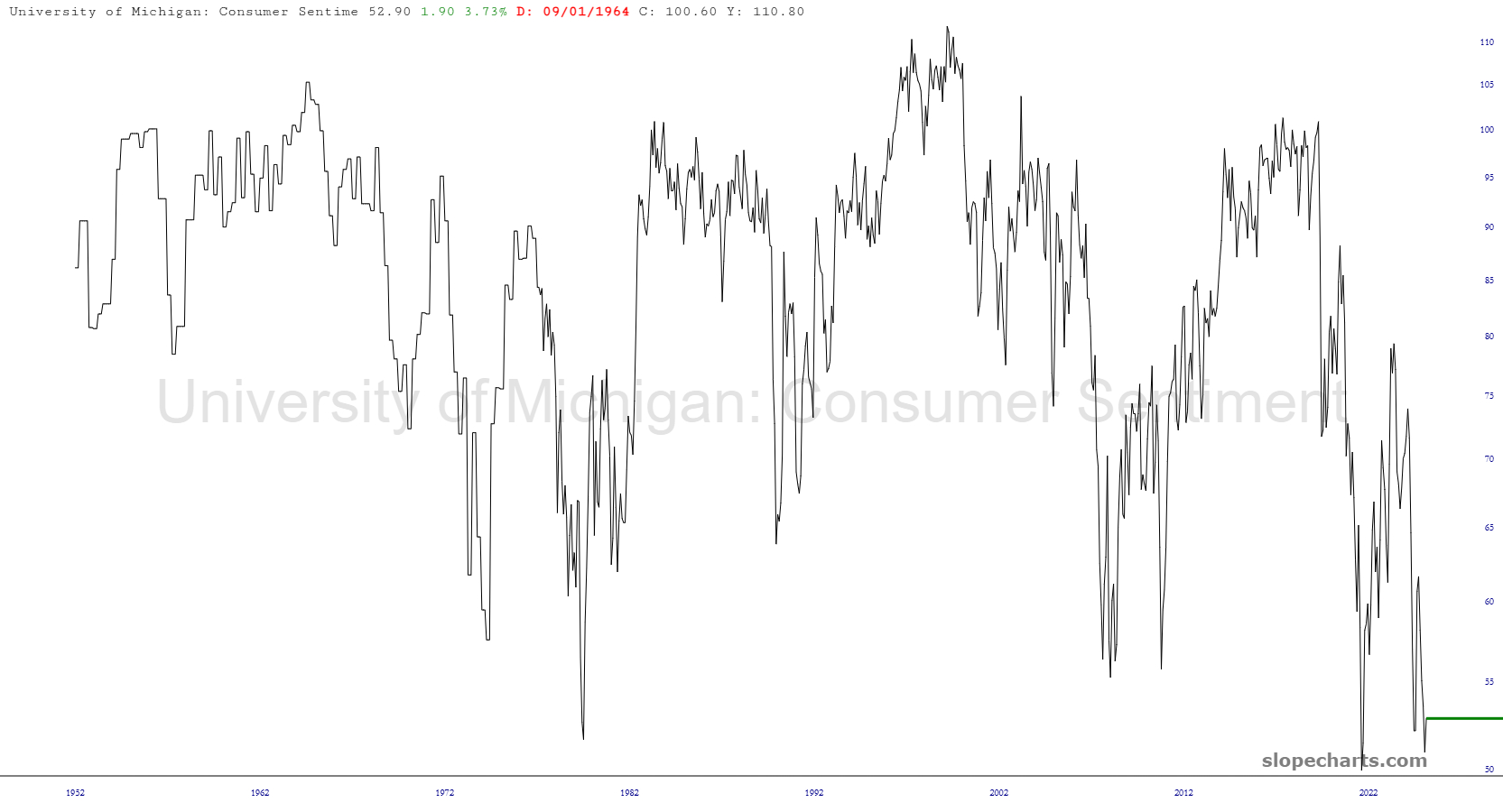
Although we’re told the U.S. is the “hottest” country on the planet, its citizens haven’t’ received the memo. Consumer sentiment is absolutely in the toilet. Perhaps, like the Gallup organization, the University of Michigan will chicken out and simply stop publishing the data, since it makes psycho-boy sad.