One of my favorite songs of all time:
Slope of Hope Blog Posts
Slope initially began as a blog, so this is where most of the website’s content resides. Here we have tens of thousands of posts dating back over a decade. These are listed in reverse chronological order. Click on any category icon below to see posts tagged with that particular subject, or click on a word in the category cloud on the right side of the screen for more specific choices.
Cupid’s Index Charts
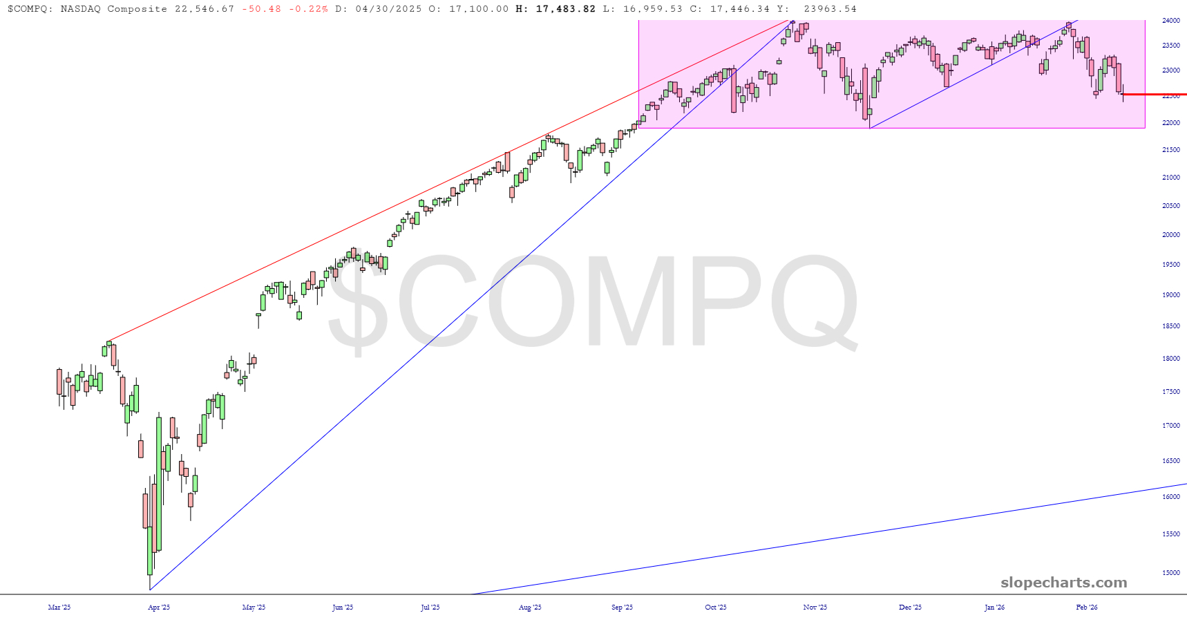
I trust everyone is having a good long weekend. Let’s take a look at some major U.S. cash index charts.
First up is the NASDAQ Composite. My spidey sense is that we are going to break below that range before this month is over, which should set off a handsome sell-offf.
Lovelorn Shorts Two
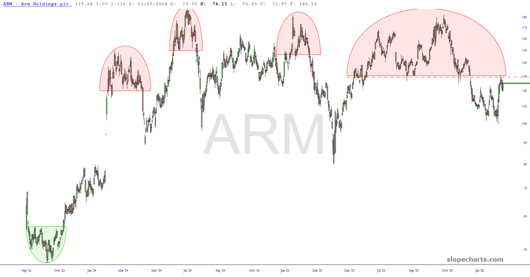
Below are the positions in the second of my two “all shorts” portfolios. As always, click on any chart for a much bigger version, and note that dashed red line represents my stop-loss price.
Arm Holdings should honor its massive topping pattern, since all three prior patterns (puny in comparison) performed great.
Lovelorn Shorts One
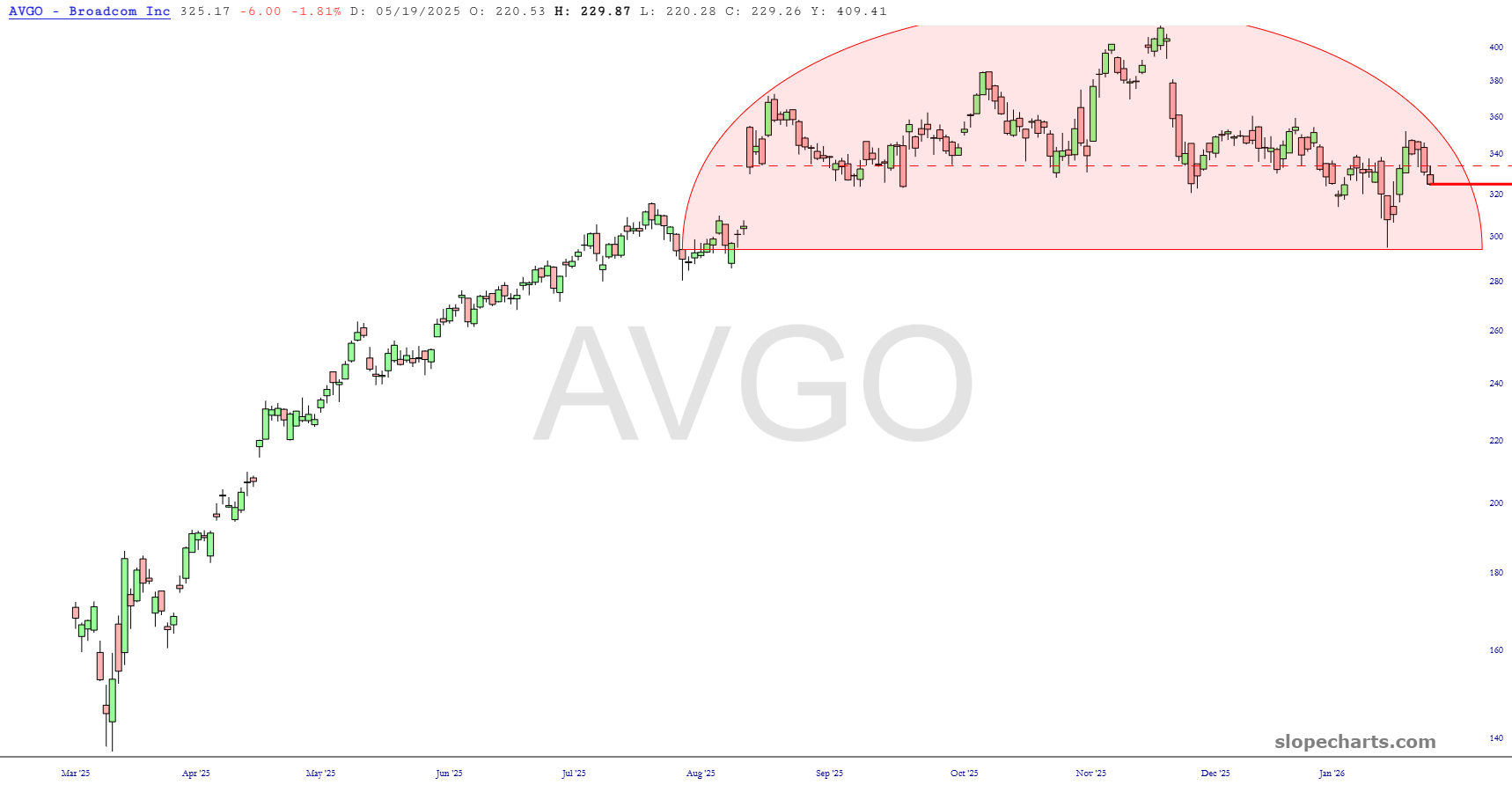
Below are the positions in one of my two “all shorts” portfolios. As always, click on any chart for a much bigger version, and note that dashed red line represents my stop-loss price.
Broadcom’s top is just dynamite, and I hope it completes. It needs to break beneath the pink zone.
Clown Invasion!

