
I can’t help myself! Another cool thing!
It’s called the Volatility Grid, and it’s located here (or via this menu in SlopeCharts🙂
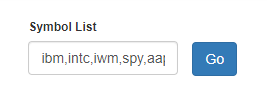
Enter one or more symbols then click Go.
Voila! What is happening behind the scenes is that our system is fetching the implied volatility as well as the IV Rank for every symbol you entered and putting them on a grid. The y-axis is based on the IV Rank (the higher it is, the more volatile it is, relative to itself) and the x-axis is based on the IV alone. What you get is a pretty fascinating representation of prospective trading ideas, or at least a good sense of the volatility landscape.
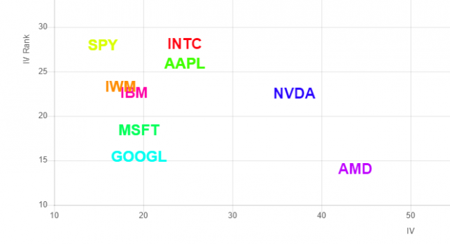
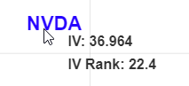
If you mouse over any given symbol, you’ll see the precise values behind it.
Try it out! I’d love to hear how you use it, what other features or improvements you want to see, and any imperfections you might find. Just drop me a line!
