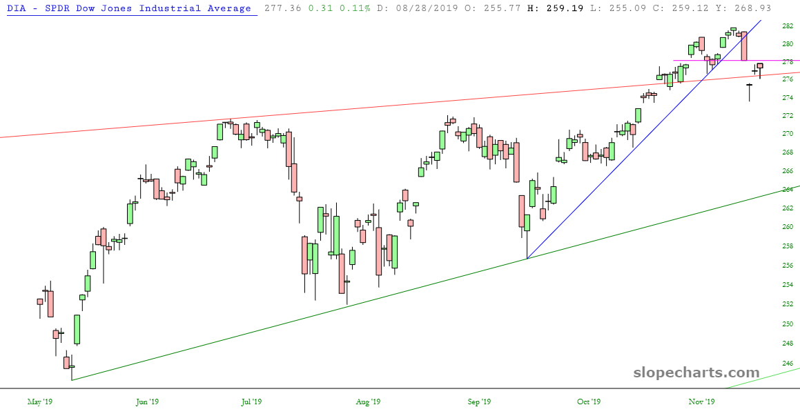
It hasn’t exactly been a newsworthy, awe-inspiring day, so I went through my fifty ETF charts and plucked out eight I thought were worthy of a few words. So here we go (click on any for big version):
Slope initially began as a blog, so this is where most of the website’s content resides. Here we have tens of thousands of posts dating back over a decade. These are listed in reverse chronological order. Click on any category icon below to see posts tagged with that particular subject, or click on a word in the category cloud on the right side of the screen for more specific choices.
It hasn’t exactly been a newsworthy, awe-inspiring day, so I went through my fifty ETF charts and plucked out eight I thought were worthy of a few words. So here we go (click on any for big version):
In case you haven’t heard, Peloton – – just about the only unicorn stock which has been thriving this year – – has stepped in a pile of creosote lately, and all because of this ad:
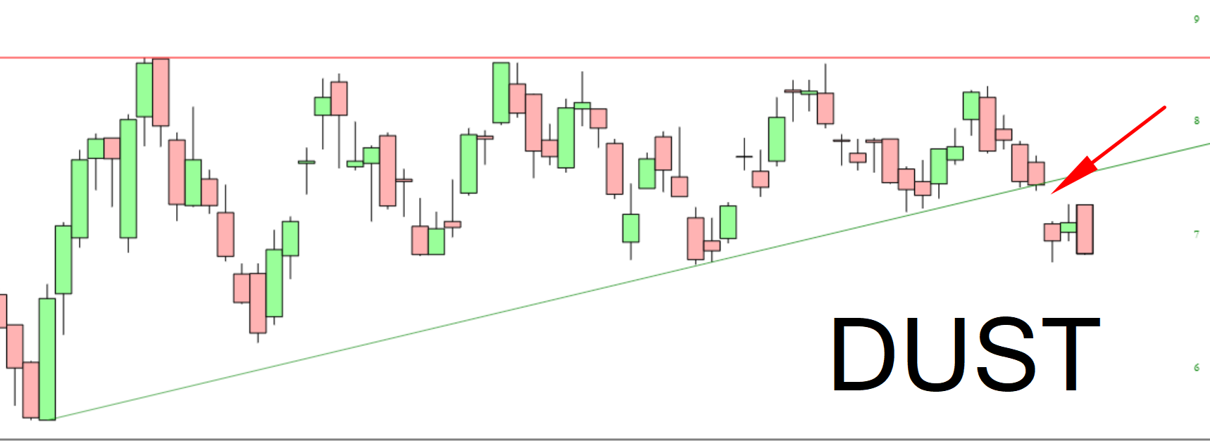
It looks like the precious metals miners have a good shot at success. Look at what has happened to the triple-bearish fund DUST. It had been shaping up to be a potential bullish breakout, but a few days ago, it cut below its ascending trendline. On top of that, it’s got a bearish engulfing pattern today. In other words, the bearishness of this pattern suggests good times ahead for miners.
The time shift is still making my sleep cycle crazy, so I’m getting up at 2 a.m., wondering what to do. Why not………..SlopeCharts? Sure.
Here’s an interesting one. It shows an overlay of the SPY with the S&P 500 earnings. (Click on it for a super-big version). Pretty cool, in my opinion.

