
I look at my 50 ETF charts each day, and I was doing so, something odd occurred to me: the chart of the treasury bonds ultrashort fund (symbol TBT) sure did look similar to, of all things, natural gas (UNG). Just for the hell of it, I put them on top of each other, and my recollection was accurate…….
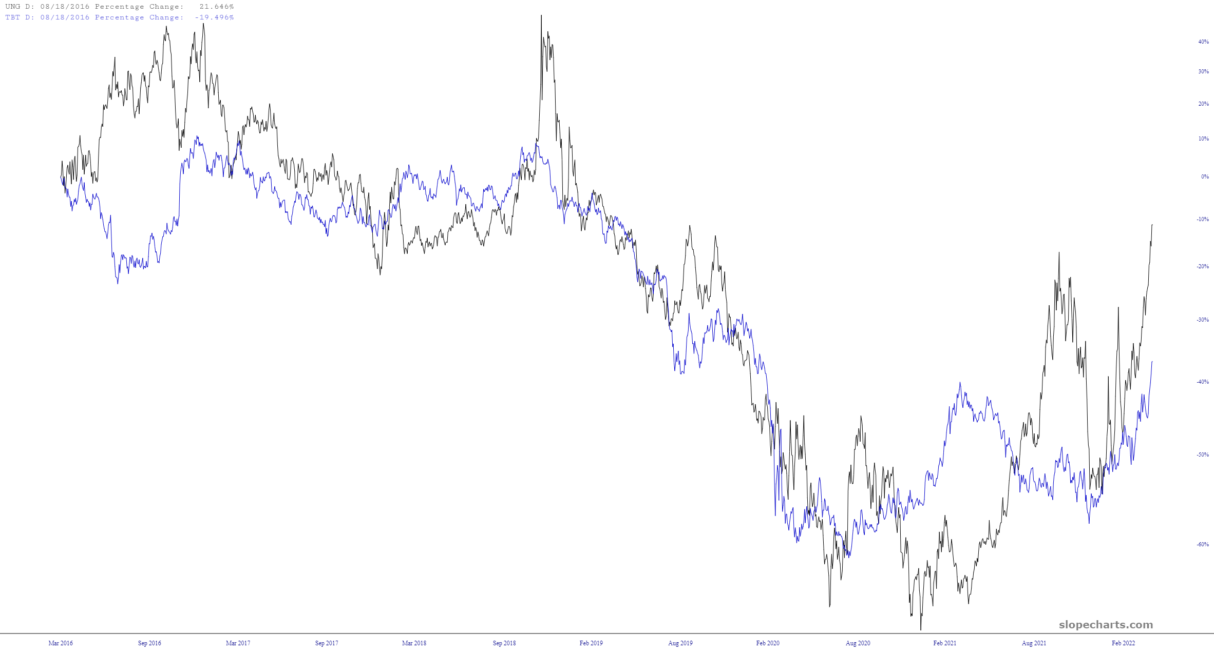
Even looking at years and years of data, this still holds true:
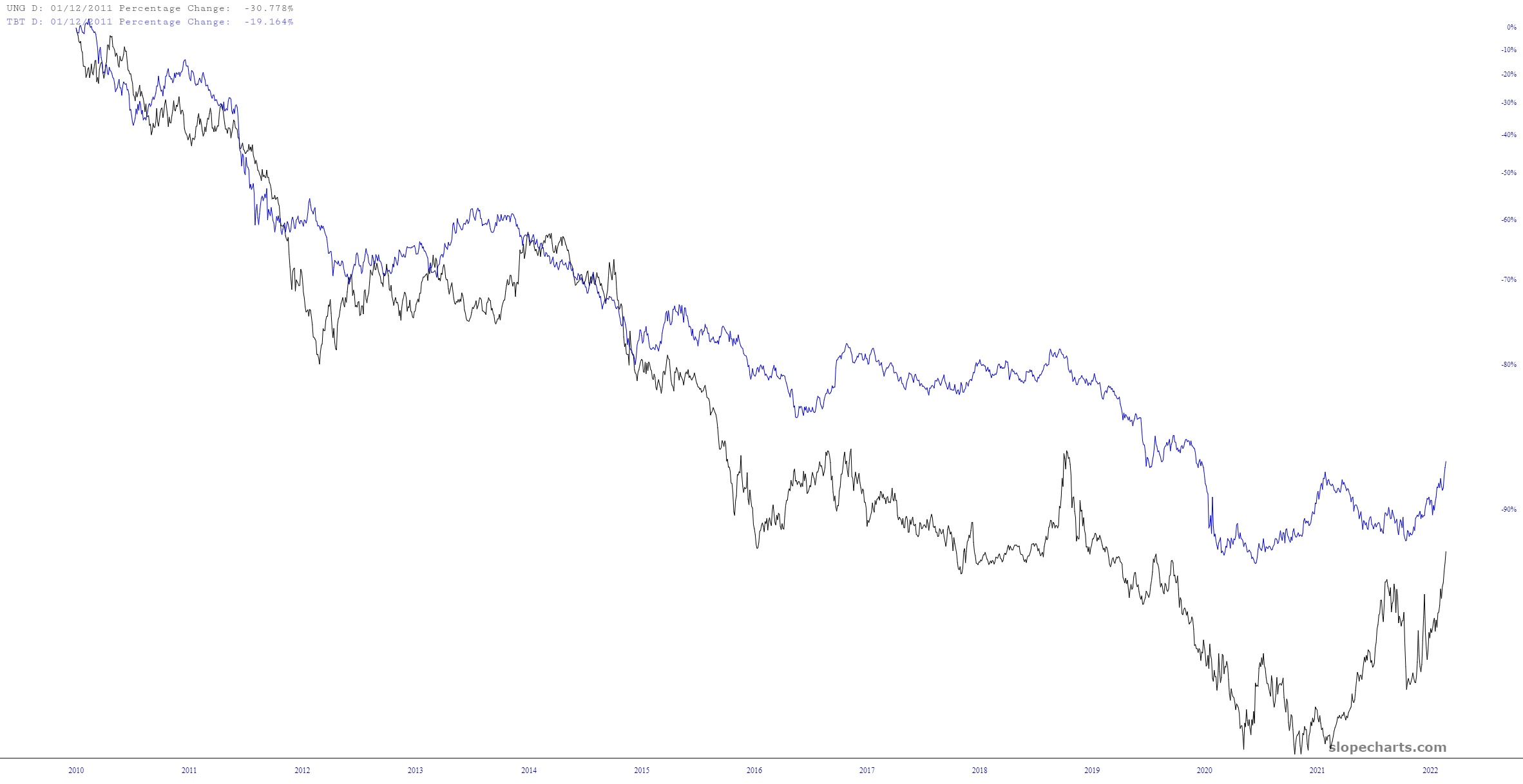
I guess if you think about it, these apparently disparate items kind of are related. If there is an environment of rising interest rates (thus, falling bonds), and rising prices, it makes sense they would move together. But unlike, say, interest rates and real estate, it isn’t an easy link. It was just kind of eye-opening, and if any of you have ideas, please share them.
