Slope of Hope Blog Posts

Slope initially began as a blog, so this is where most of the website’s content resides. Here we have tens of thousands of posts dating back over a decade. These are listed in reverse chronological order. Click on any category icon below to see posts tagged with that particular subject, or click on a word in the category cloud on the right side of the screen for more specific choices.

Divergent Layers

By -

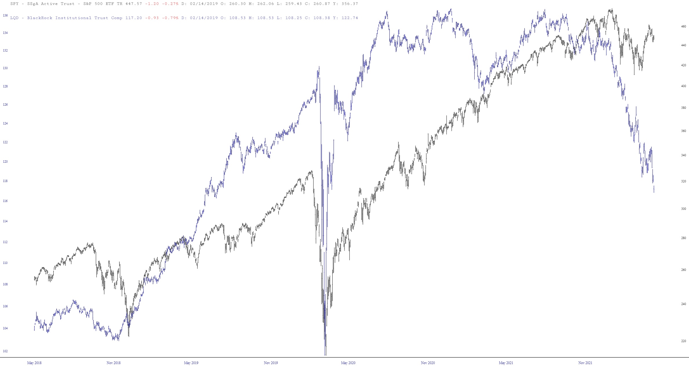
My ceaseless fondness for our Layered Charts feature is well known, and I took the time this weekend to put together a number of them to share with you. They all pretty much say the same thing in one way or another: one important financial instrument is going to drag down another one which hasn’t quite received the memo yet. Here we go……….

SPY and LQD (the latter being corporate bonds)
(more…)

The Yawning Chasm

By -

I read an interesting paragraph on Friday night (click for easier reading):

I decided to fire up a few charts and test that theory, because intuitively it makes a lot of sense. I therefore did percentage performance charts of three major, but differently-constructed, indexes – – the S&P 500, the NASDAQ 100, and the Russell 2000. Below, for instance, is this trio during a broadly healthy market period around 2004-2005. The indexes aren’t identical, of course, but on the whole they are moving with each other, with little in the way of meaningful variance.

(more…)