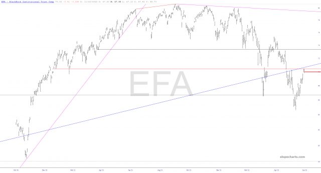
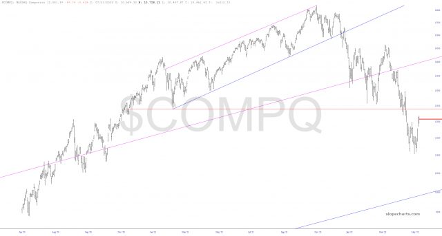
The topping patterns on the major indexes are awfully good looking lately. Below, I’ve put forth my best efforts to figure out the appropriate price level where the definitions of the topping patterns go. Newer Slopers, please note that you can almost always click on a given chart to get a big screen-filling version of it.
(more…)Slope of Hope Blog Posts
Slope initially began as a blog, so this is where most of the website’s content resides. Here we have tens of thousands of posts dating back over a decade. These are listed in reverse chronological order. Click on any category icon below to see posts tagged with that particular subject, or click on a word in the category cloud on the right side of the screen for more specific choices.
By Way of ETFs
Well, folks, since the NASDAQ QQQ moved about one-tenth of a single percentage point, the amount of stuff there is to talk about isn’t much greater than it was on, let’s say, Sunday. Things barely moved at all today (grateful as I am that it was red across the board, albeit barely). So I’ll just share some key ETFs and a few thoughts on each.
Starting with the EFA (worldwide equities, except for North America) we see a picture-perfect gap fill and a price push precisely to the underside of a broken major trendline. This is super clean!
(more…)The Ins and Outs
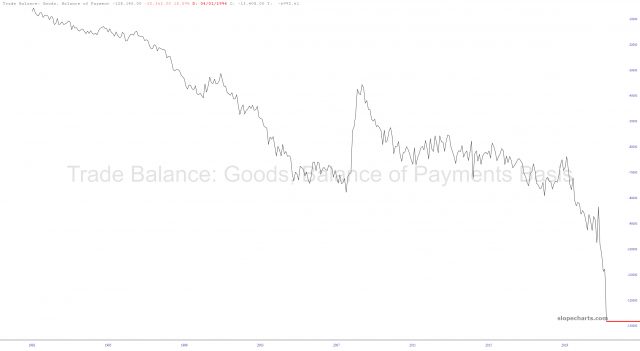
Earlier today, even I was pretty shocked at how much more the U.S. imports than it exports:
(more…)Garbage Gaps Sealed?
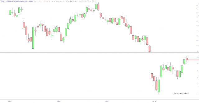
The mega-rally that started two weeks ago has, in the cases of stocks that were particularly badly savaged, been serving to push prices back toward crucial price gaps. We’re getting awfully close on some of these. Here are three concrete examples:
Infected Tattoo
One of the biggest shills in the entire crypto space is Mike Novogratz. Early this year, he decided to get a tattoo on one of his arms celebrating the LUNA “stable” currency, and he proudly tweeted it:
(more…)