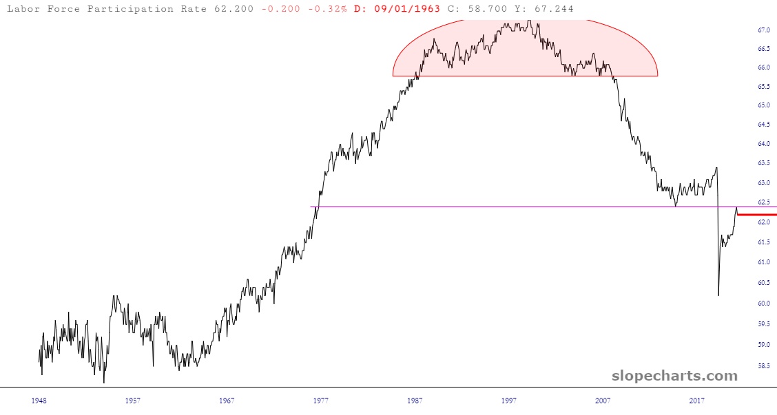
Human nature on a mass scale is fascinating to me. Check out this “just for fun” chart of the Labor Participation Rate in the U.S. over a period of many decades. It is presently at 62.2% (what the other 38% of the country is doing with its time is beyond me; I guess watching the latest Real Housewives series, or maybe The Masked Singer). Anyway, check out what an interesting pattern this data set has, obeying the same rules of charting as might be found in, say, an equity graph.