
You can click here for Part 1 and here for Part 2.
Can Caped Crusaders rescue us?
Another valuation method is the Shiller CAPE 10, which stands for Cyclically Adjusted PE Ratio, with a period of 10 years. This metric is cited quite often when claims are made the market is overvalued.
Resources:
http://www.econ.yale.edu/~shiller/data.htm
https://www.multpl.com/shiller-pe
Shiller’s thesis (literally) was that averaging earnings over a period of several years created a valuation measure that could be used to predict future returns, since the longer period tended to smooth out the ups and downs of the economy and give a more accurate picture of corporate fundamentals. The same data we used in the trendline construction can be used to plot the Shiller CAPE.
Here’s one plot of the Shiller PE.
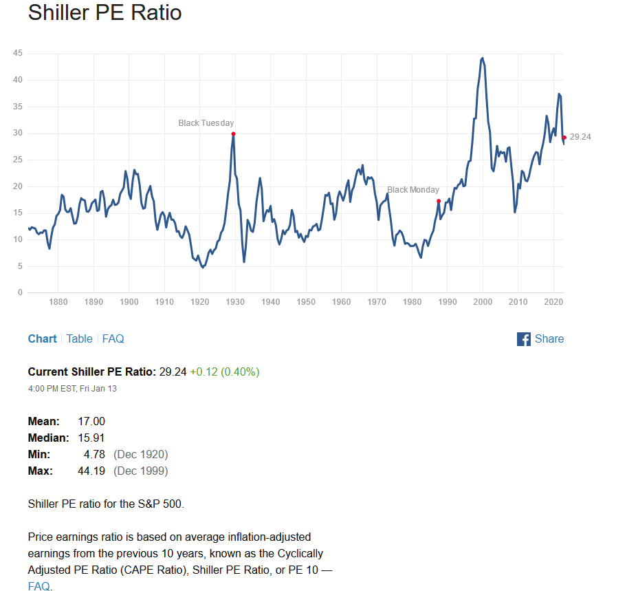
MULTPL Shiller CAPE
We can see that the current CAPE is quite high, although not as high as it was during the 2000 stock market bubble. (We also see more evidence the 2000 to 2009 timeframe should be seen as one long bear market, with valuations dropping the entire time.)
The Philosophical Economics story has a nice plot of the S&P and the regression to the CAPE. Again note that the red line is for 2013, so we’ll need to adjust it to the current 29.24 to find the 10 year potential returns. The author refers to the data fit as “atrocious” but I’ll include it anyway, as it’s so common.
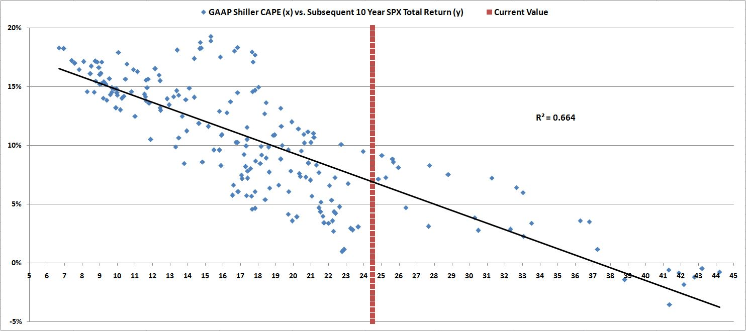
CAPE Regression
When we do that, we find the projected total returns (dividends included) for the next 10 years are as follows:
Best: 8% annualized, about 6% after dividends are subtracted.
Typical: 4.5%, about 2.5% without dividends.
Worst: 0.5%, the annual return is a negative 1.5%.
I’m not mentioning the projected S&P value in 2032, partly because the range is so wide at roughly 3000 to 6000, but also because we’ve already covered more accurate prediction methods.
I’m also not going to sample Buffett’s favorite indicator of “Market Cap to GDP” from the smorgasbord of valuations. He may like Cherry Coke, but he has dissed his “favorite indicator” and doesn’t refer to it anymore. I suspect he doesn’t use it because it doesn’t really have any mean reversion tendencies, which is critical if we want to make any kind of useful predictions.
Sam’s our man
The last method I’ll cover is from Sam Eisenstadt, and it’s a bit more bullish than the other calculations we’ve seen so far.
Resources:
https://dailyspeculations.com/wordpress/?p=12215
The late Sam Eisenstadt (he passed away in 2020) was a highly respected research analyst that spent his career at Value Line funds. He developed several methods of predicting future returns and levels for the S&P. Lots of analysts have made predictions, but he was a relative unknown whose predictions were more accurate than most other analysts. There are a couple of themes here – the first reference is to a proprietary econometric model that had a good track record; unfortunately being proprietary we can’t use it, and he never revealed the secret. I have an archived copy of the Marketwatch story, which I’ll quote a bit from.
“Investors should give up any hope that the stock market will hit a new high within the next six months.
That at least is the latest forecast from Sam Eisenstadt, the former research director at Value Line Inc. Though he retired in 2009 after 63 years at that firm, he continues to update and refine a complex econometric model that generates six-month forecasts for the broader U.S. market. That model’s latest projection is that the S&P 500 will be trading at 2,775 on Sep. 30 of this year — more than 3% below its January all-time high. There are good statistical reasons to take Eisenstadt’s model seriously. But I’ll start by pointing out that his model’s forecast from six months ago was spot on. A column I wrote at the end of September 2017 noted that Eisenstadt’s model projected that the S&P 500 would be trading between 2,620 and 2,640 at the end of March. Its actual value at the end of March: 2,640.87. When it comes to projecting stock market returns, you don’t get much closer than that.“
So how did he do? If we calculate the projected S&P values mentioned, Jan 26 ATH was at 2873. 3% less is 2787. The Sept 30 actual close was 2913 vs the predicted 2775, which is an error of 5%. Well, nobody is perfect.
But we can try another of Sam’s techniques; the second reference points us to a related workable method that uses past gains to predict future gains, when both periods are multiple months long.
A reader of Daily Speculations did the regression and found the relation to be fairly good; here is his plot.
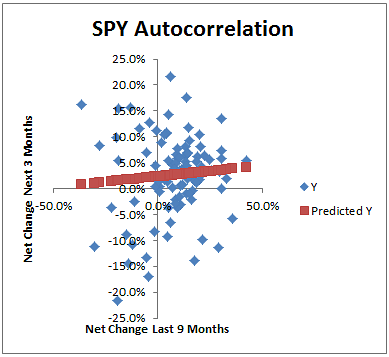
Sam’s regression for past 9 months returns
9 months ago (mid April, about 4400) to today (say 3900) is about a 12% loss. We don’t need high accuracy due to the granularity of the chart. The regression line predicts about a 1.5% gain over the next three months, or 6% for a full year, predicting the 2023 close at 4130. (And to be honest I’m extrapolating where I shouldn’t.) Note there is a lot more scattering on the left side of the chart (previous 9 months show a loss) than on the right, so probably 4130 biased to the downside with higher than normal volatility.
Who’s Next?
Nobody. There are another half dozen valuation methods that are going to show the exact same thing as we’ve just seen. There’s no need to go over all of them just to buttress our case that the market is richly valued. And even if we agree the market is overvalued, the Philosophical Economics paper already said that, and it was written 9 years ago. And what’s happened since then? The market has become even more overvalued. Not a single one of the predictions made by our fancy regression lines was close. The S&P has returned over 10% a year, year after year, in those 9 years, when by all rights it should have done no more than half that. Those few percent added up to over 1000 extra S&P points from 2013 to 2022.
I won’t pretend to know why the market behaved as it did for the past 9 years. It went up and up, way past all reasonable expectations. And I won’t pretend to know if it will keep going, or finally turn around and in 10 years get to where “it should be” which is around 3000 to 4000. Is this time really different? Investors say it is. I say it’s not. I could be wrong, it’s happened many times, so I’m not staking my portfolio on this analysis. Neither should you. But in my defense, extremes in valuation have happened a few times in the past, and I think it’s likely this past decade is one of the outliers. My final chart is again from Philosophical Economics. It tracks the actual S&P versus the predicted S&P.
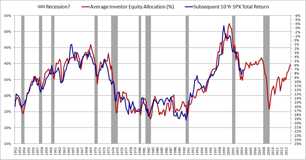
Asset Allocation Prediction vs Reality
The red line is the FRED Asset Allocation plot, while the predicted 10 year returns are shown in blue. They overlay pretty well – they should, the R^2 is over 90%. But those divergences where the lines don’t match hide a lot of sins in future returns. Look at 1993, where the predicted return was 13% but the actual return was about 9%. That’s a 4% annualized shortfall compared to what it should have done – totaling in 10 years a 40%+ miss where the S&P dramatically underperformed expectations.
The underperformance was then corrected within a few years, partially by investors changing their stock preferences, but mostly by the market rising. I think we have the exact opposite situation today – the market has risen far past what is typical, coincidentally by about 4% a year, and we’ll eventually pay the price by the S&P going nowhere for the next decade. In reality, we can predict “going nowhere” probably means lots of ups and downs signifying nothing. Could well be a trader’s paradise, and a buy and holder’s nightmare. I’ll come back in 10 years with an update to see how I did.
