
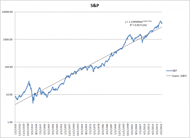
Shiller S&P Trendline from 1871
If we plot all of the data, we see that current fair value for the S&P is around 1373, which gives us a overvaluation factor of 2.8, or 181%. The S&P hasn’t been in the 1300s for more than 10 years, that’s like the Dark Ages for many of today’s traders. In 10 years fair value by that trendline will be 2161. The S&P needs to drop relentlessly, year after year, for 10 years, to get to that 2161 target in the year 2032. Ludicrous, right? Fortunately, we can turn off ludicrous mode very simply. How? Adjust the data. Which takes us to…………
The Best of Times
Let’s throw out the first 50 years of data from 1871 to 1919; stocks were mostly railroads in the 1800s anyway, and only Warren Buffett is interested in railroads, right? By doing that we eliminate all of those pesky low returns from the late 1800s that are skewing the trendline, thereby favoring data from the Roaring 20’s. The Roaring 20s roared in part because stocks had gone nowhere for 50 years, and by 1920 had finally become undervalued and very cheap. (It didn’t hurt that WW I had just ended, leaving the US as clearly the world’s sole superpower.) Think of the trendline as a see-saw, rocking around a pivot somewhere in the middle of the date range. Take away the bad (low return) data from the left, and the right side of the trendline pops up. Magically, most of the overvaluation goes away.
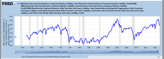
Shiller Trendline 1920
Our revised trendline for today’s fair value is now 2857, more than twice what the first trendline showed, and much closer to the actual S&P. The new overvaluation at the end of 2022 is a mere 35%. There’s even some good news here. With a 10 year target of 5363, the projected growth rate of the S&P is a positive 3% a year. Not bad; add a percent or two for dividends, and a few percent for inflation, and investors might even imagine they’re making progress.
It’s clear that which TL we use is crucial to calculating the overvaluation, and if we want to “cheat” we can basically pick any dataset we wish to justify almost any conclusion. This is pretty common in advertising; choose a dataset that flatters the conclusion you prefer, and exclude data that shows other possibilities. And it’s not really “wrong,” it’s just deceptive. Unfortunately, there’s no real right answer, because modern stock markets have only existed in the US for a bit over 100 years, and we need hundreds of years of data to calculate the real numbers.
Now, for something completely different
We’ve covered the technical analysis approach to valuation; let’s move on to other methods.
The first is a unique way of calculating valuation that doesn’t rely on any notion of price, earnings, or similar fundamentals. It asks the question: “Are Americans comfortable with how much stock they own?”
Show Me Where the Portfolio Makes You Uncomfortable
Our first alternate method is Asset Allocation
I’m going to use a lot of material from this website. It’s written by an anonymous economist and is detailed and thorough. This particular page reviews the writer’s new method for predicting the S&P close 10 years in the future. He also includes a number of other valuation studies that relieves us of the tedium of generating regression lines.
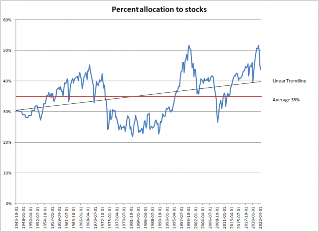
The Federal Reserve tracks the percentage of their portfolio US investors keep in stocks, which is given here.
http://research.stlouisfed.org/fred2/graph/?g=qis
FRED Asset Allocation
The Y-axis is the percentage of stocks Americans have in their portfolios; the other portions are mostly bonds and cash. Yes, for all the talk about how many investors own tons of stocks, the highest it ever got was just over 50%, a bit more than half. The actual stock allocation varies over a wide range, between 23% and 52%, depending a lot on animal spirits and mood. According to the story linked above, this allocation based method provides the best prediction of future returns of all the well known techniques. Note that the stock allocation can change by either:
1) stocks getting cheaper or more expensive, while the owner holds shares through the ups and downs, or
2) stock prices staying the same, while investors collectively buy or sell.
If we use the FRED database to follow investor’s allocations to stocks, we can predict pretty well what future returns will be – either people believe stocks are too expensive and sell, driving down prices, or they believe stocks are cheap and they buy, driving up prices.
Asset Allocation with Trendlines
This plot is an Excel version of the FRED data. I’ve added two lines representing:
1) The average stock holding over the entire date range, which is about 35%.
2) The Excel trendline, which shows Americans have been increasing their stock holdings as time goes on. Intuitively this makes sense, as more people access stock news and younger investors grow up with brokerages like Robinhood. The linear trendline projects closer to 40%.
We don’t know if this series is mean reverting or not, so I’m going to pick the 40% number, which will reduce any possible overvaluation. This is what we believe investors will eventually prefer to own – and remember we’ll probably go past that number, maybe to 35% or even 30% stocks.
I earlier mentioned using regressions to determine the S&P fair value in 2032. Here’s the first one – ignore the red line as the story was written years ago, and things have only gotten more overvalued since then. The line sloping from upper left to lower right tells us what investors historically received in gains by holding the S&P, read off the Y-axis, when average asset allocations matched the percentage on the X-axis. The dots are actual 10 year returns, while the line is the regression.
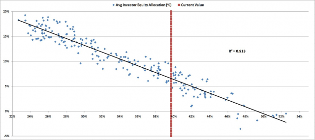
Regression Line for Asset Allocation
The allocation for Q3 2022 (read off the FRED plot above) was 43.6%. That’s awful damn high.
Where are we today? 40%? We don’t know, the data is months behind. But I’ll take a crack at a calculation. I set up an Excel spreadsheet to investigate how well various scenarios of investor behavior matched real world data. We know the average investor had the following allocations to stocks:
1/1/22 49.9%
4/1/22 45.0%
7/1/22 43.6%
10/1/22 ???
1/1/23 ???
My spreadsheet has three categories: stocks, bonds, and cash. For stocks I used the Vanguard stock ETF $VTI, for bonds I used the Vanguard bond ETF $BND, while for cash I simply used a fixed number, since interest rates were still pretty low in 2022. I began 2022 with 49.87% in stocks (from the FRED plot as of 1/1/2022), and split the remaining roughly 50% between $BND at 35% and cash at 15%.
I considered several scenarios and types of investors, and concluded there are two types of investors: those that shoot first and ask questions later, and those that buy and hold. Here’s a plot of one scenario:
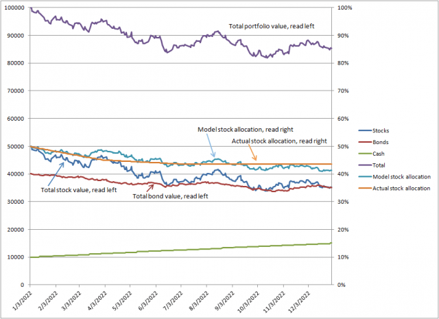
Model Portfolio Allocation
I interpret the model as showing a large group of investors sell their stocks at the first sign of trouble, while most just hold. The buy and hold types do gradually sell stocks, but the “shoot first” ones are the investors that seem to have the biggest effect. Note the investors get hit by a double whammy, as both stocks and bonds fell during 2022. But these investors seemed to sell stocks while holding on to bonds, maybe older investors holding mostly bonds are unwilling to sell for a loss.
To summarize, the model predicts stock holdings have dropped to about 42% as of December 2022, and that’s where we will start our 10 year S&P prediction from. Looking at Figure 6, we can read off the regression line the 10 year S&P return for 42% (X-axis) is 5% (Y-axis). That is a terrible return, given most investors think 10% is more appropriate. And this includes dividends, so actual gains might only be 2 or 3% a year. They better hope inflation is only 2%, or they’ll be thinking hard about that Starbucks latte every morning. OK, it’s not all gloom, we’ve had better returns than 5%, they could be as high as 6.5% over the next 10 years. And we should also consider that there have been worse, with 1.5% happening just as often.
Here’s a handy cheat sheet predicting where the S&P is in 10 years for each scenario:
Best returns at 6.5% annualized, 2% dividend. The 2032 S&P is 5625. Maybe a latte every other day.
Typical returns of 4%, 2% dividend. The 2032 S&P is 4632. The ATH of 4800 is just some long ago memory. A latte a week might be asking a lot. People are decidedly unhappy.
Worst possible returns of 1.5% annualized for 10 years, with a 2% dividend; you don’t even want to consider this.
The 2032 S&P is 3614. You haven’t had a latte in months, especially since the three closest Starbucks closed years ago. The mood of the country is grim, and the D word is mentioned frequently. There’s talk of socialism. Your kids and sister are all back home. Of the five wage earners in the family, only two have jobs, and every penny they make goes to paying bills. College, a new home or new car, those are dreams for rich people, the rich people you have come to hate.
OK, enough gloom and doom, there has to be good news somewhere. Doesn’t there?
