
I’ve shared my pairs charts, or ratio charts if you prefer, many times. The general conclusion from these, going back for a long while, was “bullish precious/bearish equities.” Yes, precious metals have done great, but equities just keep going up anyway. Let’s take a look at three major ratio charts, all of which reach the same conclusion:
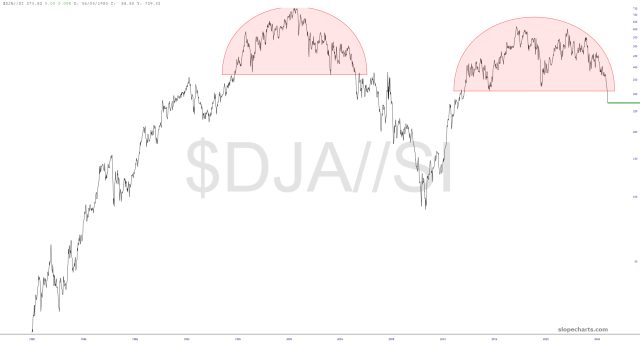
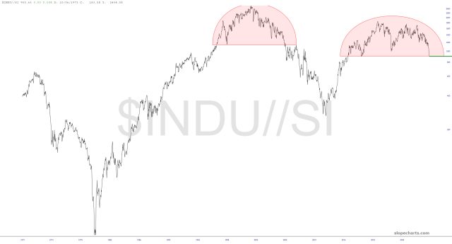
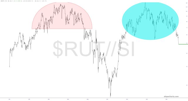
Every one of these has completed its pattern. However, let’s remember – – and I must remind myself – – that even if these all plunge doesn’t necessarily mean equities will go down – – at all! All it means is that precious metals are beating the stuffing out of equities. Thus, if precious goes up 50% and equities go up 20%, it still results in a collapsing chart.
Don’t get me wrong: I still want equities to fall. All I’m saying is that, from a simple arithmetic standpoint, these powerful ratio charts only declare precious will BEAT equities, but not necessarily that stocks will return to sane levels any time in our lifetimes.
