Slope of Hope Blog Posts

Slope initially began as a blog, so this is where most of the website’s content resides. Here we have tens of thousands of posts dating back over a decade. These are listed in reverse chronological order. Click on any category icon below to see posts tagged with that particular subject, or click on a word in the category cloud on the right side of the screen for more specific choices.

2014 World Market Wrap-Up

By -

Happy New Year 2015!

Happy New Year

My World Market Wrap-Up for 2013 can be found here.

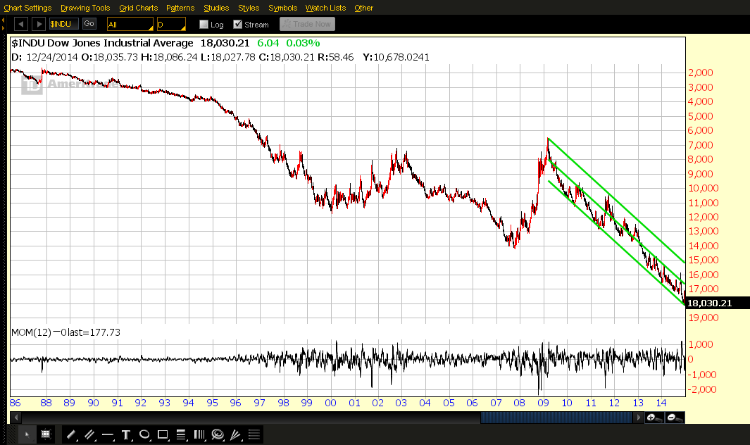
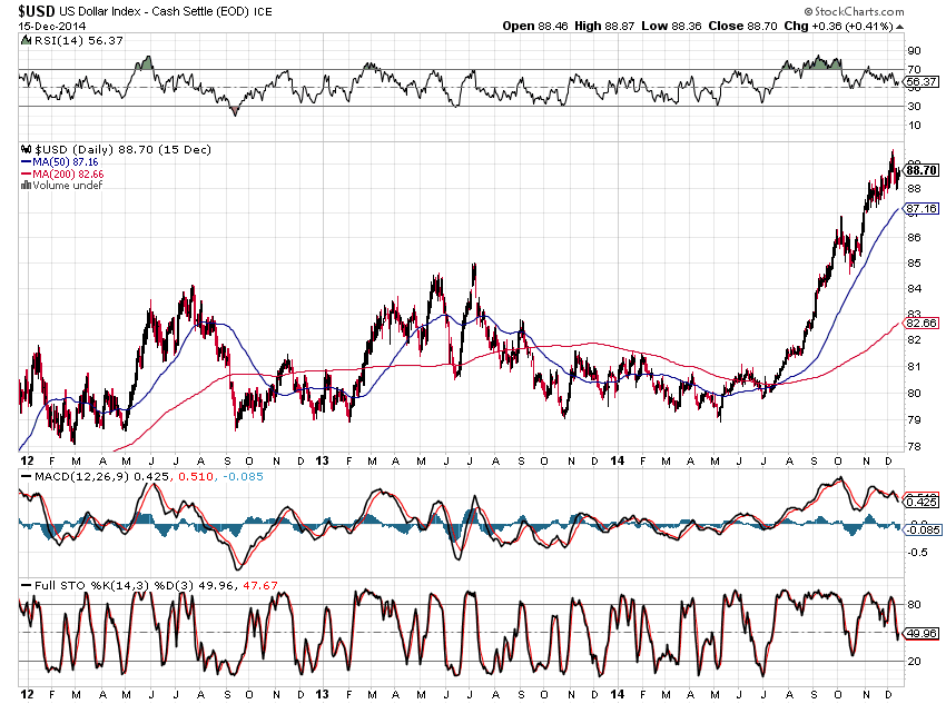
The following charts and graphs show the trends and gains and losses made in a number of world markets for 2014. They will be shown without individual comment, initially, as you can see at a glance where major support and resistance are (50 MA in both cases), and where the outliers are (which ones made the most gains or losses for the year). (more…)

Markets to Add More Risk Into the Year-End?

By -

As you can see from a comparison of the following two percentage gained/lost graphs of the 9 Major Sectors (plus the SPX), (the timeframe on the first graph is year-to-date, and on the second is this past week), market participants ventured into the “riskier” sectors to add more risk this week.

The second graph shows that Energy and Materials contributed substantially to the lift in equities this week…look for that trend to either continue, or reverse, if commodity prices begin to plunge again. (more…)

Update on Fed Monetary Stimulus “Canaries”

By -

I last wrote about the Fed Monetary Stimulus Program “Canaries” in my post of February 6, 2013. As a reminder, I chose six of of them (ETFs) in order to determine their relative strength/weakness against their respective Stock Market Index, since they may have held clues for further accumulation of riskier assets due to respective Central Bank stimulus programs.

So that we can compare their current relative strength/weakness, I’ve provided the following 3-Year Daily ratio charts for each “Canary.”

XLF:SPX ~ U.S. Financials ETF has, basically, traded lock-step with the SPX since my last post. A recent breakout has brought price back to re-test this breakout level. We’ll need to see 0.0120 held if XLF is going to resume an outperformance of the SPX. (more…)

USD Versus Emerging Markets

By -

The USD has been under accumulation since May of this year when it bounced around 3-year major support from late October 2013, as shown on the following Daily chart.

With daily whip-saw action that began in November, we’ve seen the RSI come off its highs, but remains above the 50.00 level. The MACD and Stochastics indicators have also been sliding. These are suggesting that we may see either a slowing in buying of USD, or a rotation into other world currencies.

(more…)