Slope of Hope Blog Posts

Slope initially began as a blog, so this is where most of the website’s content resides. Here we have tens of thousands of posts dating back over a decade. These are listed in reverse chronological order. Click on any category icon below to see posts tagged with that particular subject, or click on a word in the category cloud on the right side of the screen for more specific choices.

Another QE Head Wind (by Ultra Trading)

By -

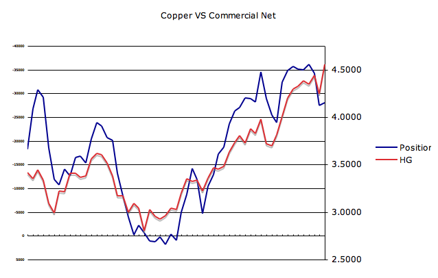
The US equity market may be experiencing low volatility but beyond that HFT driven "market" volatility is rising fast. There are a lot of moving parts right now, each of which on their own could cause a severe shock to an extremely fragile global economy.  It is important to stay focused on what is out there and the risks they present.  Maintaining a false sense of security regarding the future of QE is ignoring the real investment risks that are present today.  One does not know when nor which event will be the tipping point so patience is needed.  It's important though to stay focused and educated so when events surface as investors we are ready to react.

I want to focus on global food prices, primarily the recent price action in rice.  Below is an excerpt from a  2009 USAID Study 

"Approximately 1 billion people—or one sixth of the world’s population—subsist on less than $1 per day. Of this population, 162 million survive on less than $0.50 per day. At the household level, increasing food prices have the greatest effect on poor and food-insecure populations, who spend 50 to 60 percent or more of their income on food, according to the International Food Policy Research Institute (IFPRI). Overall, increased food prices particularly affect developing countries, and the poorest people within those countries, where populations spend a larger proportional share of income on basic food commodities."

Even within the US, food prices affect one in seven Americans.  That is because 15% of the US population does not have the income to pay for the most basic necessity of life and that is food. Rice is one of the largest staples of the global diet and its recent price action is signaling yet another threat.  

This heat map of rice consumption per capita shows Asia as the most at risk to rising rice prices


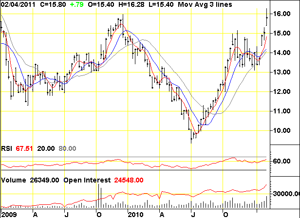
Rice prices in 2010 relative to the 2007-08 highs are relatively low but as the chart shows, price can accelerate very quickly. 


The chart below shows just how fast prices have begun to move since 2009.  In fact the prior resistance level has already been taken out and a massive melt up is not only possible but also probable.  We are in a yield chasing environment right now.  Those who missed the move up in sugar and cotton, etc will pile in to the rice trade and accelerate this move.  


 "It's really very simple Governor, when people are hungry they die…"  Bob Geldoff

 Submitted by Ultra Trading.  If you would like to read more, please visit m blog - Ultra Trading

COT Report Week Ending 2/1 (by Ultra Trading)

By -

Some mixed messages come out of this week's CFTC Commitment of Traders Report. Below are six charts with my best estimate of what the data is telling us.  The three key takeaways are


  • Commercial traders appear positioned for further bond weakness
  • Commercial traders are reducing net short positions implying copper weakness 
  • Retail traders are positioned for further USD weakness, implying USD strength


Bonds

Looking purely at the relationship to 30 year yield and the SPX, this chart implies that further bond weakness (lower price higher yield) would be a positive for the SPX.  This cannot be taken purely at face value though.  There are many implications to a weakening bond market beyond this chart.  Still, the data below would imply continued equity strength.


Bonds – Commercial Net

Commercial positions continue to move towards a more net long in the face of 30 year weakness.  At face value this chart would imply further bond weakness to come.  It's important to note though that commercial positions are approaching a 52 week high.


USD – Commercial Net

This is a tough one to read.  The commercial trader position is net long and matches that of the prior 52 week high.  It is very possible their net long position grows but considering this position relative to the prior 52 weeks, it is quite possible they begin getting more short which would imply USD strength.  The USD has bounced off key support which would further argue for a reversal to a more short commercial net position.


USD – Commercial VS Retail Net

This next chart is that of the non reporting positions versus commercial positions.  Non reporting (retail) are relatively short versus prior times in the year so there is fuel for a short squeeze in the USD.  Hard to make any definitive call though.


Copper – Commercial Net

This is a rather interesting chart.  Copper caught a nice bid the past week yet the commercial traders are not buying it (literally).  They appear to be getting more net long (this  chart is inverted for comparison sake) which would imply pending copper weakness.


Copper – SPX VS Commercial

Nothing too definitive can be drawn here other than a word of caution for the SPX as commercial positions appear to becoming more net long (chart is inverted for comparison sake).


Submitted by Ultra Trading. If you would like to read more, please visit my blog - Ultra Trading


QE Headwinds (by Ultra Trading)

By -

QE is a mighty force.  In ordinary times, global food riots and contraction in the labor force (36,000 jobs added does not cover the 150,000 needed for population growth) would cause a fierce sell off in equities. Not in these abnormal times where the perceived deep pockets of the Fed keep a perpetual bid in the market.   

The day QE ends there is a very high probability the race to the exits will be swift and fierce.  Investors are asking themselves how long can this go on.  The vast majority are saying QE2 will not end in June but rather continue indefinitely.  Perhaps the majority are correct although group think rarely works. The Fed's ultimate goal with QE was to drive demand back into the economy.  Whether it be perceived inflation (x will cost more tomorrow so I'll buy it today) or perceived wealth the theory is growth in demand causes growth in the economy thus causing more demand until finally the economy is self-sustaining.  

In the process the banking system is generating income by playing the role of broker between the Fed and Treasury.  So on the surface, from an academic standpoint it sounds good.  Like everything in life though there are unintended consequences.  These miscalculations or unforeseen problems can negate the benefit of the original plan.   One such problem is surfacing rapidly and if not addressed will create another shock to an already fragile banking system.

An economy grows through the creation of credit and the banking system is the heart of credit formation. The US economy is held hostage right now as the banking system, conservative in nature, takes its time to return to health.  The banking system has a balance sheet with vast exposure to residential and commercial real estate.  Should there be another leg down in that sector of the economy, the banking system will be challenged as it was in 2008.   

Unfortunately for the banking system, home prices began their second leg down once the final tax credits wore off in October 2010.  This new leg down could experience a rather vicious  cycle.  Studies have shown a strong correlation between the level of negative equity in a home and one's decision to strategically default.  The industry is currently working through a massive shadow inventory that will cause pricing pressure for years.   The more prices fall, the more the shadow inventory grows due to strategic defaults and thus the problem grows. 

The last thing the industry needs right now is anything that puts additional downward pressure on price. Unfortunately, due to the Fed's QE monetary policy and horrific US fiscal policy, a very real threat has risen in the form of higher interest rates.  

Here's an example.  The debt service on a $300,000 mortgage at 4.75% for 30 years is $1,564 per month. The debt service on the same mortgage at 5.00% is $1,610.  In other words that buyer in a 5.00% interest rate environment can now afford a home 3% lower in price.  Over the past three months, the ten year treasury has risen 100 basis points in yield.  That's four times the example above.

Should this trend continue the bank balance sheet risk and reduction in wealth affect from one's home will have massive implications to an already fragile economy.  The economy will be faced with a reduction in demand and in the formation of credit.  Two very strong headwinds and two which easily can outweigh the benefits of the original goals of QE.  

Submitted by Ultra Trading.  If you would like to read more, please visit my blog at - Ultra Trading

QE Interim Scorecard (by Ultra Trading)

By -

So let's see how QE is doing so far.  The goal of QE was to drive down yields thus inflating the economy and stirring job growth.  The bar has moved though as certain goals saw the opposite happen so the next bar was to increase the wealth effect through rising asset prices.  It should be noted housing represents a larger portion of one's wealth versus stocks.

Jobs

This is three months in a row now of huge misses.  Even in the face of reports showing a growing manufacturing and services sector, job growth is contracting.  I say contracting because it cannot even keep up with the 150,000 jobs needed to match population growth.  QE has been in place for almost two years now.  Other than census, there has been zero job growth.


Yields

Yields have risen dramatically since QE2 was hinted at and then announced.  The Fed spun rising rates as a positive that the economy was expanding so fast that the bond market was forecasting rising rates.  If that is the case then why has today's horrid jobs report caused yields to spike even higher and in many instances take out key support levels.  The other component of yields is the damage it is doing to housing.  There is a direct relationship with the 10 year treasury and home prices and in this distressed market, housing needs all the help it can get.  The impacts on wealth affect are indeed negative.


USD

The dollar has indeed tanked and has resulted in higher exports for US manufacturers.  It has also increased input costs which is simply going to choke off an economy that cannot afford higher prices. Employers will manage the bottom line and one way to do it is further layoffs and delays on any immediate expansion.  So the vicious cycle is this. Lower corporate profits due to higher input costs and lower demand results in higher layoffs and thus even lower demand.


The Fed has failed miserably so far.  Even the Russell 2000 as Banana Ben has hyped of late has begun to rollover.

Submitted by Ultra Trading.  If you would like to follow my blog, please visit - Ultra Trading

AAII Sentiment Survey – Week Ending 2/1 (by Runedge)

By -

The divergence continues yet again.  The most recent AAII investor survey is out and has reversed its bullish although more neutral position of last week.  Bulls rose to 51.5%, from 42.0% last week.  Bears dropped to 26.9% from 34.3% the prior week.  There are now two bulls for every one bear out there. Below are two charts showing the comparison with the SPX.


Submitted by Runedge.  If you would like to follow my blog, please visit - Ultra Trading