Slope of Hope Blog Posts

Slope initially began as a blog, so this is where most of the website’s content resides. Here we have tens of thousands of posts dating back over a decade. These are listed in reverse chronological order. Click on any category icon below to see posts tagged with that particular subject, or click on a word in the category cloud on the right side of the screen for more specific choices.

The US Dollar (by Runedge)

By -

The USD cannot catch a bid.  No one seems to want it these days.  Below is a three year weekly chart of the DXY which has traded nicely within a narrowing range.  When QE2 was announced at Jackson Hole in August the USD continued its slide and then caught a bounce.  The bounce appears to be purely technical.  

That technical bounce though for the first time did pierce the trend line.  Granted it recovered the next day and moved back up but it looks to be a true "dead cat" bounce.  So here it is now ready to test the trend line again.  Literally by the time I finish this post it may break through.  Seems the only thing that can save the USD right now is either an end to QE, highly unlikely or some geopolitical risk that lasts beyond a day.  

If the trend line breaks then there is some near term support for perhaps another bounce at 76, then 74 then 70.  A true break though of this trend would be very bearish though.  It's rather concerning.  I saw a report today that extrapolated the prices paid component to the ISM manufacturing data to CPI 12 months out.  It forecasts 6.2% CPI.   How do people on fixed incomes, people struggling to make ends meet right now budget for such an increase?  How do companies manage margins for discretionary products where passing price along is almost impossible?  In the words of Larry Kudlow, inflation is a tax on the consumer.


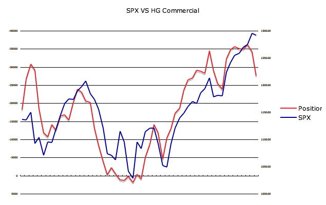
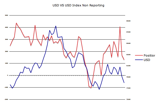
To get a sense of how traders are positioned the weekly CFTC COT report can be very useful.   Below are two charts comparing commercial net positions and non reporting net positions versus the USD.   The correlations are not very tight but I do think you can look at relative positions to get a sense of directional change.  

Commercial net positions per the chart below are at prior maximum net long positions where they have reversed in the past.  Over the past seven months this chart has had an inverse correlation so a decrease in net long positions implies USD strength.   Again, it's not very clear how to interpret this data other than to look at the relative net positions the past 14 months as charted below.


Non reporting net positions have moved very net short in a very brief period of time.  Knowing how the market likes to fade this group, it's quite possible a USD reversal occurs  purely to squeeze these positions. This group had been going more net long while the USD traded within a tight range and has been slow in getting net short as the USD has declined.


At some point, USD weakness will not be good for risk assets.  It already is not good for the American consumer.  Makes manufacturing reports look pretty in the short term until margin compression further hits employment causing even weaker demand.   

Submitted by Runedge. If you would like to follow my blog, please visit - Ultra Trading

Q4 GDP – A Look Inside (by Runedge)

By -

GDP missed with a 3.2% read versus the estimates of 3.5%.  Looking purely at the highlights, two things stood out.  First, the drawdown in inventory for the first time in five quarters.  Inventory was a net drag on GDP by 3.70%.  The second and probably more eye catching stat was the Final Sales figure which showed a solid rise to 6.87% from a prior read of .94%.  So at the headline level although a miss, the report showed some positives.

Like anything though you need to read behind the headline to find the true story.  Without making GDP to confusing, let's break it down to the simple formula

GDP = Consumer (C) + Investment (I) + Government (G) + Trade Balance (T)

The chart below shows how each component of GDP have changed over the past eight quarters.   The two areas that standout are the changes in (I) investment and (T) trade.  We did notice (G) government begin to turn down and become a net drag on GDP and we also saw (C) consumer tick up adding more to GDP growth. For the most part though (I) & (T) were the largest fluctuations.  

The Trade component was a little confusing as it showed an increase in exports which makes sense considering the dollar debasement, but a substantial decrease in import growth by 2.40%.   The drawdown in inventories would be offset partially by the drawdown in imports but the amount was larger than would be expected considering the fact that the consumer showed strength this holiday.  GDP is quoted in real terms (inflation adjusted) from nominal values.  The BEA uses different price deflators in this adjustment and the deflator for imports is much larger than that of GDP as a whole (.3% for GDP and 21.8% for imports).  So part of this trade benefit to GDP was purely using an uneven price deflator that favored GDP versus imports.

The Investment component which is where inventory resides, showed the first drawdown in inventory levels in five quarters.  Odds are this is not a blip but rather a trend where inventory will continue to be a drag on GDP.  Until real demand comes back into the economy the desire to build GDP to higher levels will not be there.   So as inventory levels stagnate or reduce further based on sales, the (I) investment component of GDP should put more downward pressure on GDP.


The table below shows the past eight quarters and a breakdown of GDP by various components.  


Another way of calculating GDP is using final sales and changes in inventory. 

GDP = Final Sales + Changes in Inventory

In other words, Final Sales = GDP – Changes in Inventory.  As a result the big drawdown in inventory resulted in a big rise in final sales.   The graph below shows final sales over the past eight quarters. Seems rather hard to have full faith in this GDP calculation method with final sales going up in one quarter from .94% to 6.87% (that's quite a trajectory).   Graph of final sales over the past eight quarters is below.


So on the surface GDP was a miss but looked OK.  Behind the headlines though questions do arise.  It's also important to note that this is the first of three more revisions to GDP.  For most of the report there are only two months of data (October and November) with December being more of an estimate.

Submitted by Runedge.  If you would like to follow my blog, please visit - Ultra Trading 

For The Sake Of Tim’s Sanity (by Runedge)

By -

This is a somewhat redundant post considering what a few have put up the past few days but it's worth staying focused on where we are right now versus where we were back in April right at the highs.  This post I wrote on Sunday night so ignore the comment on ES futures.  It's interesting to note that oil caught a bid today while equities caught yet another low volume bid.

The current market action is eerily similar to that of the April 2010 highs and subsequent correction. Granted Fed QE is still in operation unlike April, yet POMO is beginning to show less ability to move markets.  The key comparisons are as follows:

  • + In both run ups to the high, the middle bollinger band was not tested until just before the top was in.   
  • + Both runs up did not touch the lower bollinger band at all during the move up.
  • + Both tops showed massive divergence on the MACD
  • + The move that pierced the middle bollinger band in both run ups was a massive red candle down. The candle on Friday was more powerful than the similar candle in April for it set a new high, failed to hold that high and closed on the low.   Both candles also found support at the prior low where the middle bollinger was first tested.
  • + This is the key in understanding where we go from here.  After the big red candle back in April, the next two days did move up, yet failed to make new highs before finally rolling over.  Looking at the Asian markets right now and the ES futures, we may be in a similar attempted move up.

Personally, I think enough damage has been done from a technical standpoint, combined with questionable macro news (UK starting a new recession for example, US missing GDP on Friday, etc). I think many are not fully understanding what is happening in Egypt.  To me it's not an Egypt story.  No, I think it's a global revolution story.  People have been oppressed for years and have finally had enough. Bears may be emboldened again should the market attempt to move up.  It sets up a great trade with your stops at the prior highs should the market experience a move up the next few days.

The majority are expecting the market to move down on Monday, I would imagine and we know how that never works out.  Even with the Fed and POMO and a market that always seems to catch a bid, the risk reward here favors the short trade to purely cash trade in my opinion.  I remain short and hedged via credit call spreads but until a clear direction is shown, I won't be adding to my current position.


Submitted by Runedge.  If you want to follow my blog please visit - Ultra Trading

COT Report Week Ending 1/25 (by Runedge)

By -

Some interesting divergences with the SPX and the commercial positions on oil and copper in the most recent Commitment Of Traders report.  Leaving my bias out, looking purely at the charts, the SPX appears ready to finally correct.  So without any further commentary, here's what we have.  For those new to the COT report there are three categories of traders (1) Commercial – don't fade these people, (2) Non Commercial (3) Non Reporting – fade these people.


SPX versus Copper Commercial Net


SPX versus Crude Commercial Net - the only "color" I will add here is notice how about six weeks ago the SPX popped above the position line when the prior sixty weeks it was below, all while the rate of change of the CL position has slowed.  


SPX versus Nymex Light Sweet Crude - This chart is as of 1/25 (Tuesday) before oil prices spiked with the protests in Egypt.  So if I were to draw the chart as of Friday 1/28 the divergence would be far less but "this time it's different."  This time the spike in oil is purely on fear and we know how fear is supposed to affect risk assets.


I have a proprietary trade signal which has correlated nicely with the SPX and also showing divergence.


Submitted by Runedge.  If you would like to follow my blog, please visit - Ultra Trading

AAII Sentiment Survey – Week Ending 1/25 (by Runedge)

By -

Well, quite a change in sentiment this past week.  Bullish sentiment dropped from 50.7% last week to currently 42.0%.  Meanwhile bearish sentiment rose from 29.1% to currently at 34.3%.  I present two charts below comparing the SPX to bullish sentiment and SPX to Bull / Bear spread.  As you can see below, both have correlated very well.  Two thoughts I have is that (a) this market is truly set for a decent correction and (b) the correction will be fast and if you blink you may miss it.  The reason I say it may be fast is the fact that bearish sentiment has moved up so fast and the market still makes new highs.  Regardless of my view / interpretations, the data speaks for itself.

Screen shot 2011-01-26 at 11.18.07 PM

Screen shot 2011-01-26 at 11.18.22 PM

Submitted by Runedge.  If you would like to follow my blog, please visit - Ultra Trading