As I’m working with my team on New Slope, I’ve been reviewing our videos to see which are still useful and which need to be tossed. One of them was about analogs, and even though it was recorded over five years ago, it worked out great. Here it is:
Slope of Hope Blog Posts
Slope initially began as a blog, so this is where most of the website’s content resides. Here we have tens of thousands of posts dating back over a decade. These are listed in reverse chronological order. Click on any category icon below to see posts tagged with that particular subject, or click on a word in the category cloud on the right side of the screen for more specific choices.
Is Crypto The Only Truth?
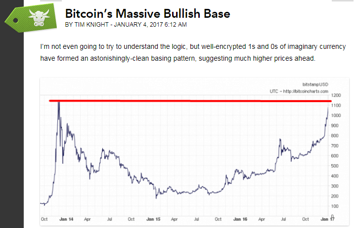
In the nearly thirteen years that I’ve been writing Slope of Hope, perhaps the most ironic post (out of over 20,000) was one I did last January called Bitcoin’s Massive Bullish Base. The reason it’s ironic is because Slope is largely dedicated to seeking out short-selling ideas for stocks, whereas the post was about going long a cryptocurrency. Only ten months and eight-hundred percent later, It turned out to be the greatest trade idea in the blog’s history, which actually doesn’t feel that great for the reason just cited.
Selected Shorts: Analogs
Preface to chart posts for this weekend: Instead of doing a bunch of videos, I decided to show static charts created, of course, with SlopeCharts (which you should use – – hint, hint). I am allocating most of these ideas to my Slope Plus subscribers. What these charts all have in common is (1) they are all “live” short positions in my portfolio (2) the patterns should be fairly self-explanatory. What’s unique about this particular set is that they are all based on analogs:
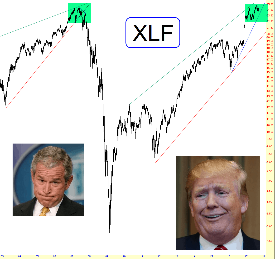
Financial Parallel?
The one consistent theme I’m reading about these days……..and I’m certainly inclined to agree with it……..is the puzzlement about the complacency with respect to a forthcoming change in Fed policy. In other words, the “great unwind” of $4.5 trillion in assets the Fed has gorged upon during the past eight years. Tomorrow is the big day, and as I suggested yesterday, things are going to be boring until then (as we collectively observed the changes of a few hundredths of a point across our computer monitors).
Anyway, in an effort to make a silk purse out of a sow’s ear, I offer you the chart below (which, as always, you can click for a bigger version). It offers up a parallel, or analog, if you like, with respect to financial stocks. I’ve got November puts against the XLF. It will be interesting, to say the least, to see what effect the Fed’s big announcement on Wednesday at 2 p.m. has on equities in general and financials in particular.