Food, Glorious Food
Slope initially began as a blog, so this is where most of the website’s content resides. Here we have tens of thousands of posts dating back over a decade. These are listed in reverse chronological order. Click on any category icon below to see posts tagged with that particular subject, or click on a word in the category cloud on the right side of the screen for more specific choices.
With Treasury bonds firming up lately, it is time to review the game plan NFTRH has been working to since 2023. After the macro not so subtlety obliterated its decades-long trend of disinflationary signaling in favor of inflationary signaling by the Treasury bond market, a cool down was in order.
To review, our “Continuum” chart was primary in keeping NFTRH, its writer, and its subscribers on the right side of the macro since the service was born in September, 2008 (into the teeth of a major macro liquidity event).
For example, you may recall the “Great Rotation” hype of 2013. That was when a bond market bear was supposedly brewing and a rotation into stocks would be at hand. Well, that second thing happened, but it was not at the expense of the bond market, as the 30yr Treasury yield rose to the EMAs 100 & 120, smashed against them, and reversed. That was one of several instances over 4 decades that the Continuum was tested, but remained in disinflationary lockdown.
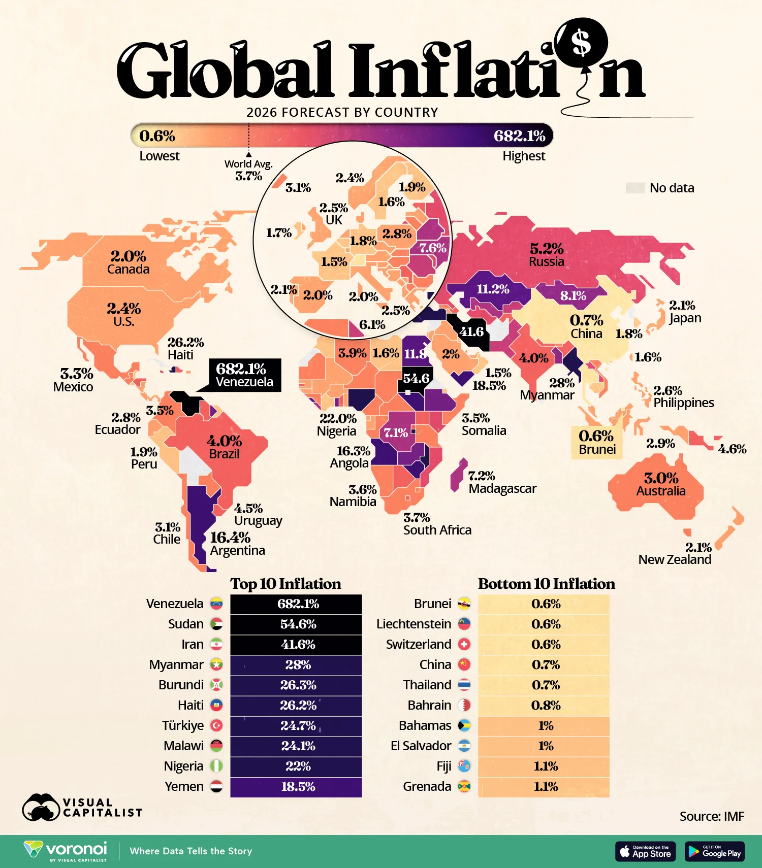
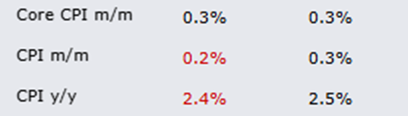
(more…)Well, the latest purported inflation data came out, and, surprise, surprise, it was a little milder than even modest expectations.
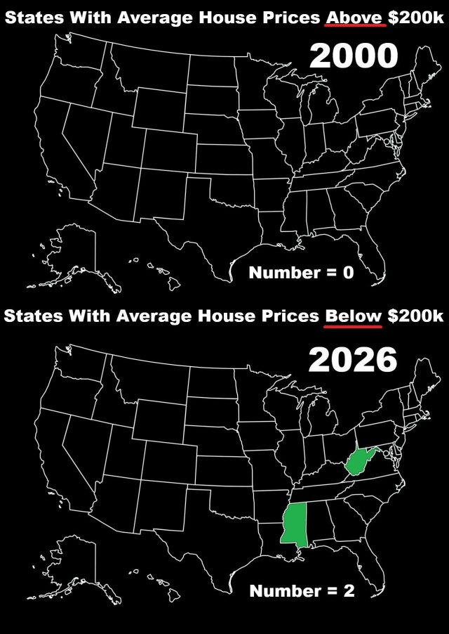
What the vast majority of dumbkopfs fail to understand is that even if inflation is already dead (it isn’t), the swollen prices are still with us! Just yesterday, I went to Whole Foods to get a couple pounds of beef for a stew I was making. I made a point of getting the beef which was on sale. The price? Over $50! So, yeah, Mister Prezident, the schtick about low prices is yet another lie.