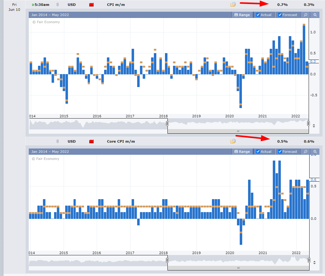
This is such an ungodly dry spell for any market-moving events, I have to drag out the ONLY event this entire week and share it with you. It’s going to be the release of CPI pre-market on Friday. Fingers crossed that the numbers come in red-hot!
Slope initially began as a blog, so this is where most of the website’s content resides. Here we have tens of thousands of posts dating back over a decade. These are listed in reverse chronological order. Click on any category icon below to see posts tagged with that particular subject, or click on a word in the category cloud on the right side of the screen for more specific choices.
This is such an ungodly dry spell for any market-moving events, I have to drag out the ONLY event this entire week and share it with you. It’s going to be the release of CPI pre-market on Friday. Fingers crossed that the numbers come in red-hot!
The Fed is starting to play catch-up with inflation signals from the bond market as evidenced by the Fed Funds Rate finally being pulled upward by the implications of the rising 3 month T-bill yield, among other more obvious signals like the long since rising 2yr Treasury yield and ongoing inflation headlines we read about every day.

Whether a bounce or something more extended, a bear market rally was bound to get off the ground sooner or later. It was a matter of time, with stock market sentiment this over-bearish.
Here is how the US Stock Market segment led off last weekend in NFTRH 706:


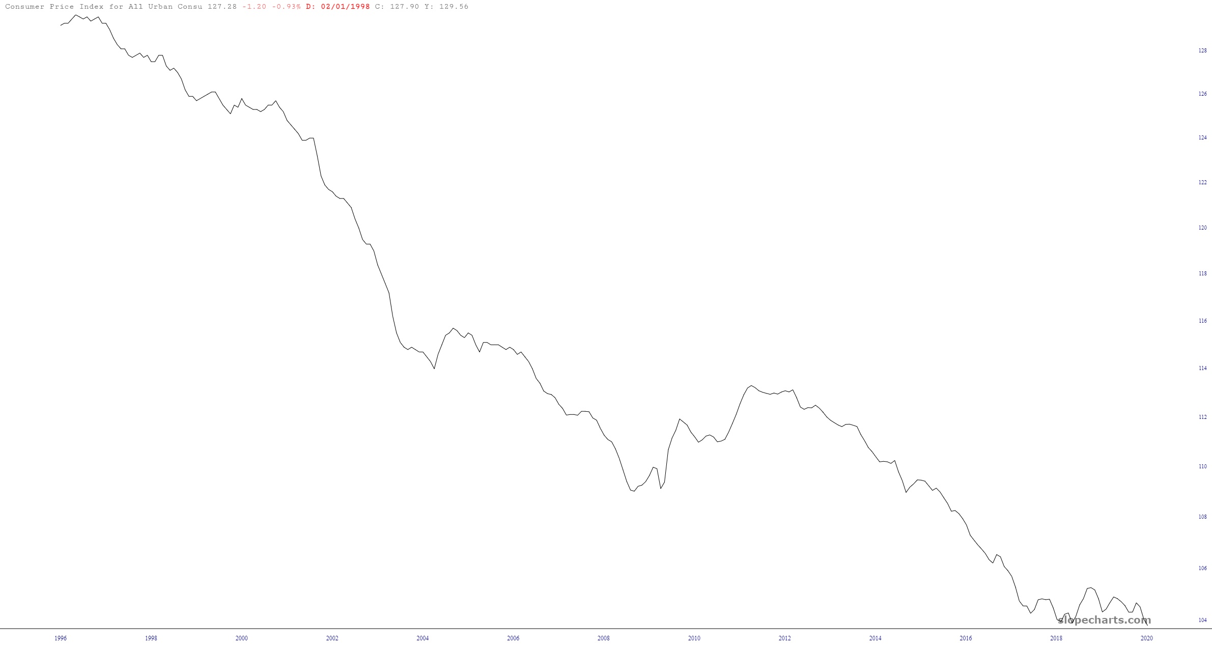
As I pop out my VHS of Hervé Villechaize Gone Wild Volume VII, I’ll offer this interesting perspective of the wonderful era of prices-always-going-down we enjoyed (thanks mostly to China) back in the day. I always marveled, for example, at how checking out Ikea yielded a crazy-low price. It’s like stuff was free!