Slope of Hope Blog Posts

Slope initially began as a blog, so this is where most of the website’s content resides. Here we have tens of thousands of posts dating back over a decade. These are listed in reverse chronological order. Click on any category icon below to see posts tagged with that particular subject, or click on a word in the category cloud on the right side of the screen for more specific choices.

Hedging Against a Dollar Drop

By -

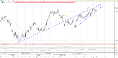
Chafing at the world's reserve currency

After the excitement of the U.S. debt ceiling negotiations going down to the wire, Russian Prime Minister Vladimir Putin offered these comments about the U.S. and its dollar:

They are living like parasites off the global economy and their monopoly of the dollar.

[…]

If over there (in America) there is a systemic malfunction, this will affect everyone," Putin told the young Russians. "Countries like Russia and China hold a significant part of their reserves in American securities … There should be other reserve currencies.

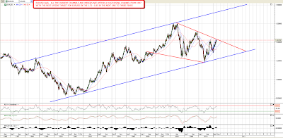
With Putin's sentiments in mind, let's look at a way to hedge against a further drop in the dollar

Hedging the dollar

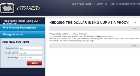
The steps below show how to hedge the dollar by buying optimal puts on the PowerShares DB USD Index (UUP) as a proxy for it. First a quick reminder about what optimal puts mean in this context.

About optimal puts

Optimal puts are the ones that will give you the level of protection you want at the lowest possible cost. As University of Maine finance professor Dr. Robert Strong, CFA has noted, picking the most economical puts can be a complicated task. With Portfolio Armor (available on the web and as an Apple iOS app), you just enter the symbol of the stock or ETF you're looking to hedge, the number of shares you own, and the maximum decline you're willing to risk (your threshold). Then the app uses an algorithm developed by a finance Ph.D to sort through and analyze all of the available puts for your position, scanning for the optimal ones.

A step by step example

Step 1: Enter a ticker symbol

In this case, we're using UUP as a proxy for the dollar we've entered UUP in the Ticker Symbol field below.

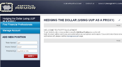
Step 2: Enter a number of shares

For the purposes of this example, let's assume an investor has a $1 million portfolio, all in dollar-denominated assets.  So, since we're using UUP as a proxy, the number of shares we'll enter will be $1,000,000 / the most recent share price of UUP ($21.17, as of after hours Monday) = 47,236.7. We've rounded that up to 47,237 and entered that number in the "Shares Owned" field in the screen cap below.

Step 3: Enter a decline threshold

You can enter any percentage you like for a threshold when using Portfolio Armor (the higher the percentage though, the greater the chance you will find optimal puts for your position). I've entered 15% in the "Threshold" field below.

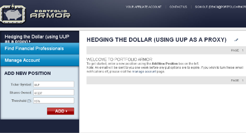
Step 4: Click the red button

A moment after clicking the red button, you'd see the screen cap below, which shows the optimal put option contracts to buy to hedge against a >15% drop in UUP between now and March 16, 2012. The cost of this protection on a $1 million position would be $6,608, or about 0.66% of the position value.1, 2

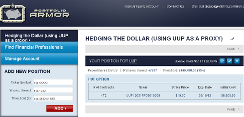
1Note that, in this case, Portfolio Armor rounded down the number of shares of UUP we entered to the nearest hundred (since one put option contract represents the right to sell one hundred shares of the underlying security), and then presented us with 472 of the put option contracts that would slightly over-hedge the 47,200 shares of UUP they cover, so that the total value of our 47,237 shares of UUP would be protected against a greater-than-15% decline.

2To be conservative, Portfolio Armor quoted that cost based on the ask price of the optimal puts. In practice, an investor can often purchase puts for a lower price, i.e., some price between the bid and the ask.

QE Correlation

By -

Springheel Jack’s post yesterday (UUP Breaks Up) got me thinking about the correlation between the dollar (UUP) and the S&P.  Apparently, Tim was thinking along the same lines this morning with his Forex post (The Euro and the ES).  I am trying to look at the long-term picture of what/how the various Fed “efforts” have moved the market.  The story of [Ben turns on the presses = goosed market] is already known, but I’m looking to determine the extent of the correlation during the different periods.

Quick history: In late November 2008, the Fed started buying $600 billion in Mortgage-backed securities.  By March 2009, it held $1.75 trillion of bank debt, MBS, and Treasury notes, and reached a peak of $2.1 trillion in June 2010.  After a relatively short break and a coincidental 20% drop in the market as QE1 ended, the Fed decided to renew quantitative easing because “the economy wasn't growing robustly”. Its goal was to keep holdings at the $2.054 trillion level by replacing maturing debt. To maintain that level, the Fed bought $30 billion in 2-10 year Treasury notes a month. In November 2010, the Fed announced it would increase quantitative easing, buying an additional $600 billion of Treasury securities by the end of the second quarter of 2011.

UUPSPX 

The correlation between UUP and the SPX since March 2007 is -.35; not exactly investment-worthy in my book.  However, I broke out the correlation during the aforementioned periods:

Pre-QE                       -.27

Since QE1 started      -.83

During QE1          -.68

Between 1&2       -.94

During QE2          -.67

A couple things jumped out at me here… First, that since QEs started, the market now dances to the Fed’s tune (duh); but more importantly, the correlation data says it is by a significant- and therefore investable- amount.  Second, the -.94 is a surprisingly extreme number… it was only for a 4 month period, but I cannot say with any certainty why.  I would imagine that by not knowing if there was going to be a QE2, traders followed Forex more closely.  On the other hand, the Forex and equity markets could have been reacting to, as I recall, a tremendous amount of chatter back then speculating that QE2 was coming.

Now that QE2 has “ended,” I bring up these points because in a speech to Congress, Bernanke said the Fed is preparing for another round of Treasury bond buying (y’know- just in case this “soft patch” isn’t as temporary as Washington would like voters to believe) and the QE3 chatter seems to have increased (e.g., Why Bernanke And Pals Will Soon Need a New Pair of Pants, Stocks Rise Amid Hopes for Further Stimulus). 

I’m neither an economist nor a political commentator, but with an election next year, I think they will throw everything they have at keeping the market propped-up… including some creative way to implement QE3.  So, if recent history is any indication, we should now be in a period similar to the one between QE1 and QE2; where there is a high inverse-correlation between the dollar and the market.

Goldbug Headlines

By -

Actual headlines from a popular internet site.  Don't take this the wrong way, because I highly respect a couple of the names below.  But if you think this is bullish… think again.

Rick Rule – Silver Will Trade Like an Internet Stock to the Upside

Turk – Gold & Silver Have Bottomed, Summer explosion Ahead

Embry – System Wide Meltdown as US to Enter Hyperinflation

Eric Sprott – We're Headed off a Cliff, be Wary of Paper Assets

Hathaway Confirms Gold to Trade in the 5 Digits

Jim Sinclair – Gold to Exceed $12,500 to Balance US Debt

The problem with deep thinkers in the gold 'community' is that their subject matter is very dynamic and usually flat out scary.  So how does one get one's deep thoughts out to the greater world in an organized and strategic way so as to minimize stirring the herd up and getting their emotions all in an uproar (and panties in a bunch)?  Answer, it's impossible.  These sites get a lot of traffic and new gold bugs – complete with new Gold 101 manuals from which they read and lecture – are minted every day.

It's just that in its interim swings, the markets sometimes fail to get and play by the memo.

http://www.biiwii.blogspot.com
http://www.biiwii.com

Hedging Update

By -

Hey Fellow Slopers,

In the table below, I've updated the costs (as of Thursday's close) of hedging the Dow-, NASDAQ 100-, and S&P 500-tracking ETFs against greater-than-20% declines over the next several months, using the optimal puts, along with the costs of similarly hedging a handful of their most widely-traded components. In addition, this week I added five precious metals ETFs to the table. First, a reminder about why I've used 20% as a decline threshold, and what I mean by "optimal puts".

As I mentioned last time, the threshold I usually use when I hedge is 20% (i.e., I want protection against any decline worse than that). The idea for a 20% threshold came from a comment fund manager (and Stanford finance Ph.D.) John Hussman made in October 2008:

An intolerable loss, in my view, is one that requires a heroic recovery simply to break even… a short-term loss of 20%, particularly after the market has become severely depressed, should not be at all intolerable to long-term investors because such losses are generally reversed in the first few months of an advance (or even a powerful bear market rally).

"Optimal puts" are the ones that will give you the level of protection you want at the lowest possible cost. With Portfolio Armor (available as a web app, and an iOS app) you just enter the symbol of the stock or ETF you’re looking to hedge, the number of shares you own, and the maximum decline you’re willing to risk, (your threshold). Then the app uses an algorithm developed by a finance Ph.D. candidate to sort through and analyze all of the available puts for your position, scanning for the optimal ones.

What jumped out at me in putting together this table was the cost of hedging GLD against a greater-than-20% decline over the next several months: 0.31%. With the cost of downside protection this low, if you're long GLD, you might want to consider hedging it here, even if you're bullish on it in the mid- to long-term.

Symbol

Name

Cost of Protection (as % of Position value)

Widely-Traded Stocks

INTC

Intel

3.06%**

CSCO

Cisco Systems

3.09%**

MSFT

Microsoft

2.%**

ORCL

Oracle

2.07%*

BAC

Bank of America

6.02%***

F

Ford

4.32%*

GE

GE

2.35%*

PFE

Pfizer

1.51%*

WFC

Wells Fargo

4.71%**

T

AT&T

1.55%**

AA

Alcoa

3.57% **

Major Index ETFs

QQQ

PowerShares QQQ Trust

1.48%*

SPY

SPDR S&P 500

1.04%*

DIA

SPDR Dow Jones Industrial Average

0.82%*

Precious Metals ETFs

GLD

SPDR Gold Trust

0.31%*

SLV

iShares Silver Trust

4.48%**

DBP

PowerShares DB Precious Metals

1.4%**

SGOL

ETFS Physical Swiss Gold Shares

1.09%*

SIVR

ETFS Physical Silver Shares

3.82%*

*Based on optimal puts expiring in September, 2011

**Based on optimal puts expiring in October, 2011

***Based on optimal puts expiring in November, 2011

Disclosure: I'm holding some puts on DIA.

Peeling the EUR USD Onion (by Springheel Jack)

By -

I've been meaning to do a dedicated post on EURUSD for a few days but have been struggling to find the time. Given that EURUSD has now reached a critical test in the 1.428 – 1.43 area overnight however, it will wait no longer, so I'm doing this as a second post before the open today. All charts were prepared last weekend but the technical situation hasn't changed much other than the small move up into the key test that I've been expecting.

In the short term, EURUSD is within a rising wedge. That's bearish though it would be much more bearish if the upper trendline for a break up to evolve into a rising channel hadn't already been established. There's a similar rising wedge on AUDUSD with resistance now in the 1.05 area. As with EURUSD, AUDUSD is still well short of testing the upper wedge trendline:

The context for the current rising wedge is within a greater rising channel from the summer lows last year:

The reason the 1.428 – 1.43 level is interesting however is because of declining resistance from the all time high on the 5 year chart. That trendline is the resistance trendline on a (bullish) falling wedge indicating to the 1.60 area on a break up. If wedge resistance holds on the current move up then there is a technical target in the 1.10 for a move down on EURUSD here, though for reasons that become obvious on the next chart, it seems unlikely that EURUSD could make that downside target:

To get the true big picture on EURUSD though, we have to look back into the 1990s, where the support trendline on EURUSD that first hit in 2002 is matched by an upper channel trendline dating back to 1997. The sharper eyed observers among you will note that the Euro was only launched in 1999, but the currency mix within the Euro was already long established, and the chart therefore goes back before the launch.

The current area is key because of the five year falling wedge and declining resistance from the 2008 high, and a break above will look extremely bullish to my eye. If EURUSD breaks above the falling wedge then the shorter term rising wedge is the pattern to watch for long entries, but the overall picture will be looking towards first a test of the all time high just over 1.60, then a break above to channel resistance in the 1.75 to 1.85 area over a likely timescale of the next one to three years.

As I'm writing EURUSD is trading slightly over 1.43, but I'm waiting to see a break of 1.43 with confidence and the daily close.  If we see that break then rising wedge resistance should be hit next in the 1.4375 – 1.439 area, and that could well be an important short term high, though I'd then be inclined to buy any dips on EURUSD on the longer term picture.

Will EURUSD reverse here? It may well. EURUSD made the last major high in November 2009, four months before the end of QE1, so the timing looks promising. We could well see an important high here followed by a several month retracement into the announcement of QE3, just as we saw last year.  The DX chart is looking promising for a reversal, though a conviction break below support would negate the current bullish setup:

I'll be watching for that retracement, but it's hard to be optimistic about the US dollar's longer term prospects here. Dollar bulls are fighting the Fed in just the same way that equity bears are fighting the Fed. The Fed's strategy is to flood the world with newly printed dollars to create strong asset inflation. It's hard to argue with the results of that strategy so far, and the laws of supply and demand argue for a big fall in the value of the US dollar in response. That large rising channel shows the likely shape of that decline in my view, and if EURUSD reverses here I'll be watching carefully to identify the next big low, which should be a good multi-year long play.