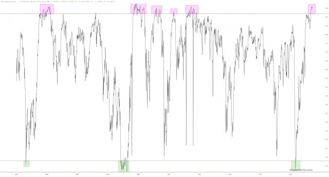
If you look at the Fundamentals Data Panel in SlopeCharts, you can find some real treasures. Below, for example, is a chart of the quantity of stocks above their own 200-day moving average. The chart is, naturally, rather cyclic, and I’ve drawn two horizontals at the 8% and 92% marks. I’ve also taken the time and trouble to tint the zones above and below these levels.