Slope of Hope Blog Posts
Slope initially began as a blog, so this is where most of the website’s content resides. Here we have tens of thousands of posts dating back over a decade. These are listed in reverse chronological order. Click on any category icon below to see posts tagged with that particular subject, or click on a word in the category cloud on the right side of the screen for more specific choices.
What Friday Meant
I’ve been waiting for the Powell Pivot for a long, long time. On Friday morning, it finally arrived.

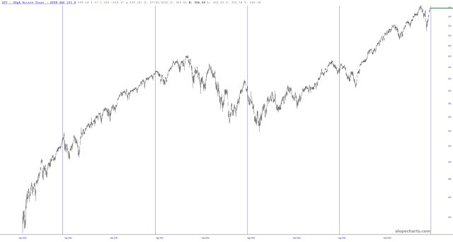
Fetishizing Jackson Hole
Since the Jackson Hole shindig is this week, I thought I’d brush off the Event Markers feature and see how the past few years have been with respect to this big speech. Folks assume that, oh boy, things will be so great once Powell gets up to the microphone. Don’t be so sure. Below each vertical line marks Jackson Hole and, umm, it isn’t exactly a straight line up from there.
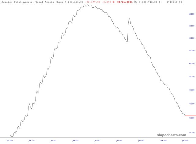
Latest Liquidity
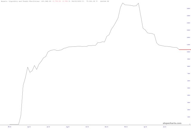
Liquidity Look-See
As we amble into what is bound to be a languorous trading environment until next Monday morning, here are the updated charts from the Fed. QT continues apace, with Fed Assets approaching the levels of four years ago: