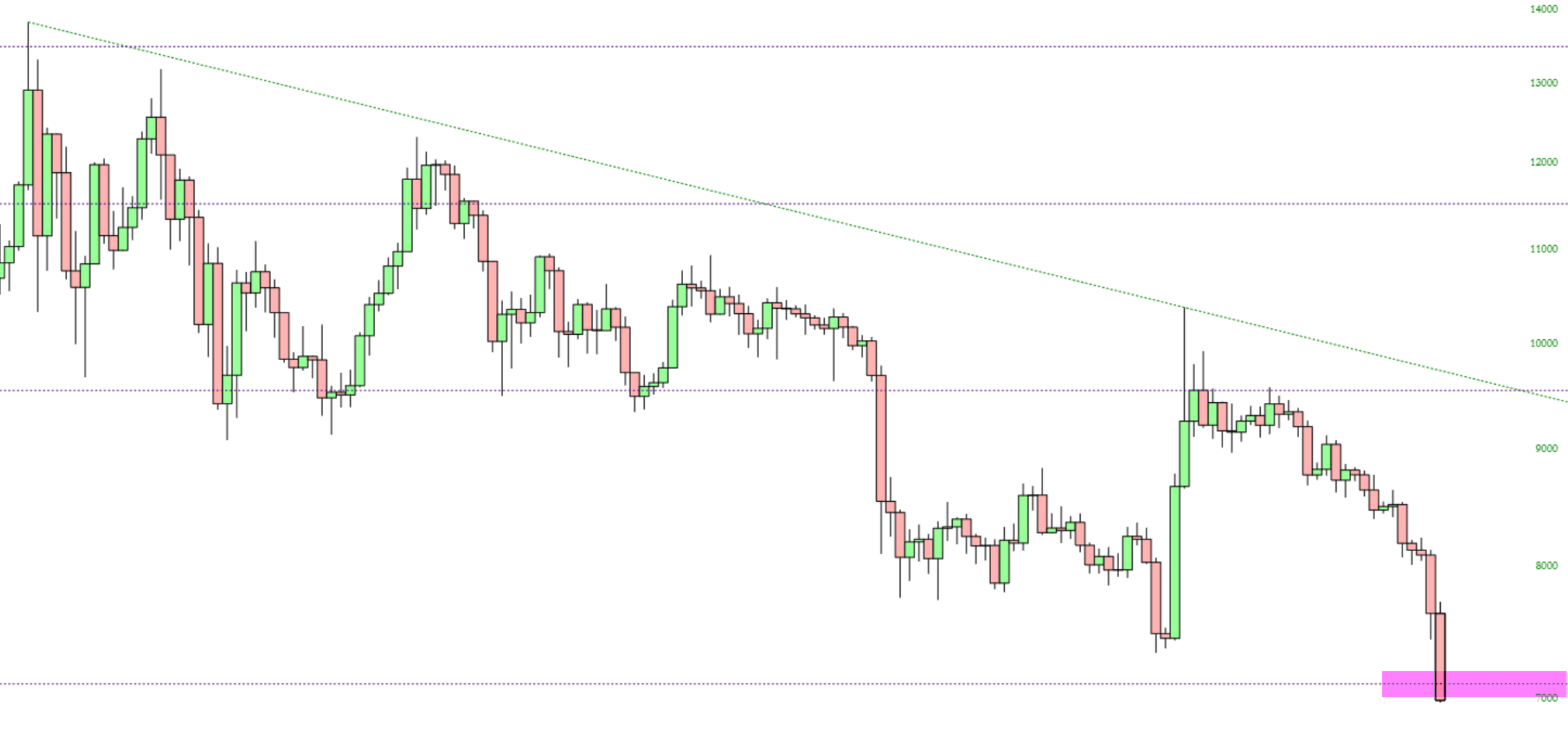
Try as it might to escape, Bitcoin is clinging steadfastly to its Fibonacci retracement. It’s actually quite remarkable.

Slope initially began as a blog, so this is where most of the website’s content resides. Here we have tens of thousands of posts dating back over a decade. These are listed in reverse chronological order. Click on any category icon below to see posts tagged with that particular subject, or click on a word in the category cloud on the right side of the screen for more specific choices.
Try as it might to escape, Bitcoin is clinging steadfastly to its Fibonacci retracement. It’s actually quite remarkable.
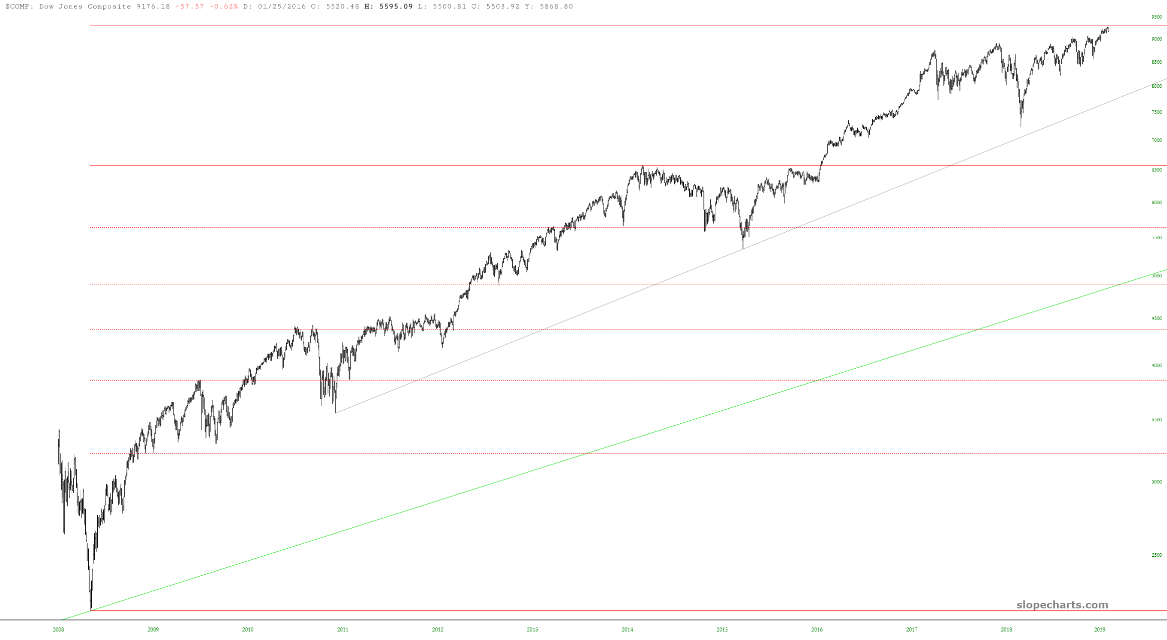
I wanted to share a couple of major U.S. equity index charts with Fibonaccis, since I think they are kind of interesting. Here is the Dow Jones Composite, with anchor points at the bottom of the financial crisis and at the December 2014 peak. Take note of the 161.8% projection (dashed line) and its relationship to recent price activity.
Happy pre-Thanksgiving to Slopers. To be clear, today is a full trading day, and Friday is a shortened day, closing three hours before normal.
I wanted to thumb through a few big cash index charts. In most of these cases, they have blown right past their Fibonacci extension targets (thanks to Powell’s QE4). These extensions are based on major high/low anchor points, and are represented by horizontal lines. Here is the Dow Composite:
(more…)And here we are, as our Fibonacci Friend suggested. So the question now is whether Bitcoin actually finds stability at this key level, or if begins an entirely new journey lower. If it does, that target would be $3170.
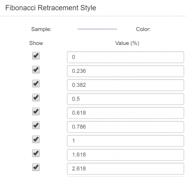
I’m not sure what you did on Friday night, but it was probably different than how I spent mine: looking at charts and, in particular, Fibonacci extensions. In other words, this dialog box in SlopeCharts: