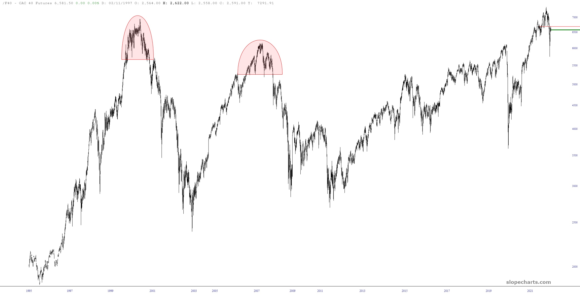
Uh-oh, Tim’s got the layered charts out again.
Anyway, here is the long-term continuous contract of France’s CAC-40 Index.
Slope initially began as a blog, so this is where most of the website’s content resides. Here we have tens of thousands of posts dating back over a decade. These are listed in reverse chronological order. Click on any category icon below to see posts tagged with that particular subject, or click on a word in the category cloud on the right side of the screen for more specific choices.
Uh-oh, Tim’s got the layered charts out again.
Anyway, here is the long-term continuous contract of France’s CAC-40 Index.
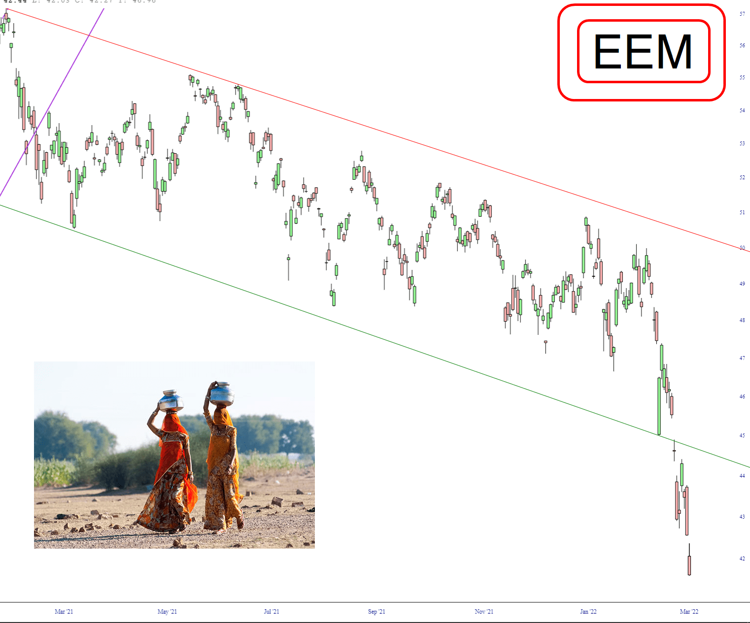
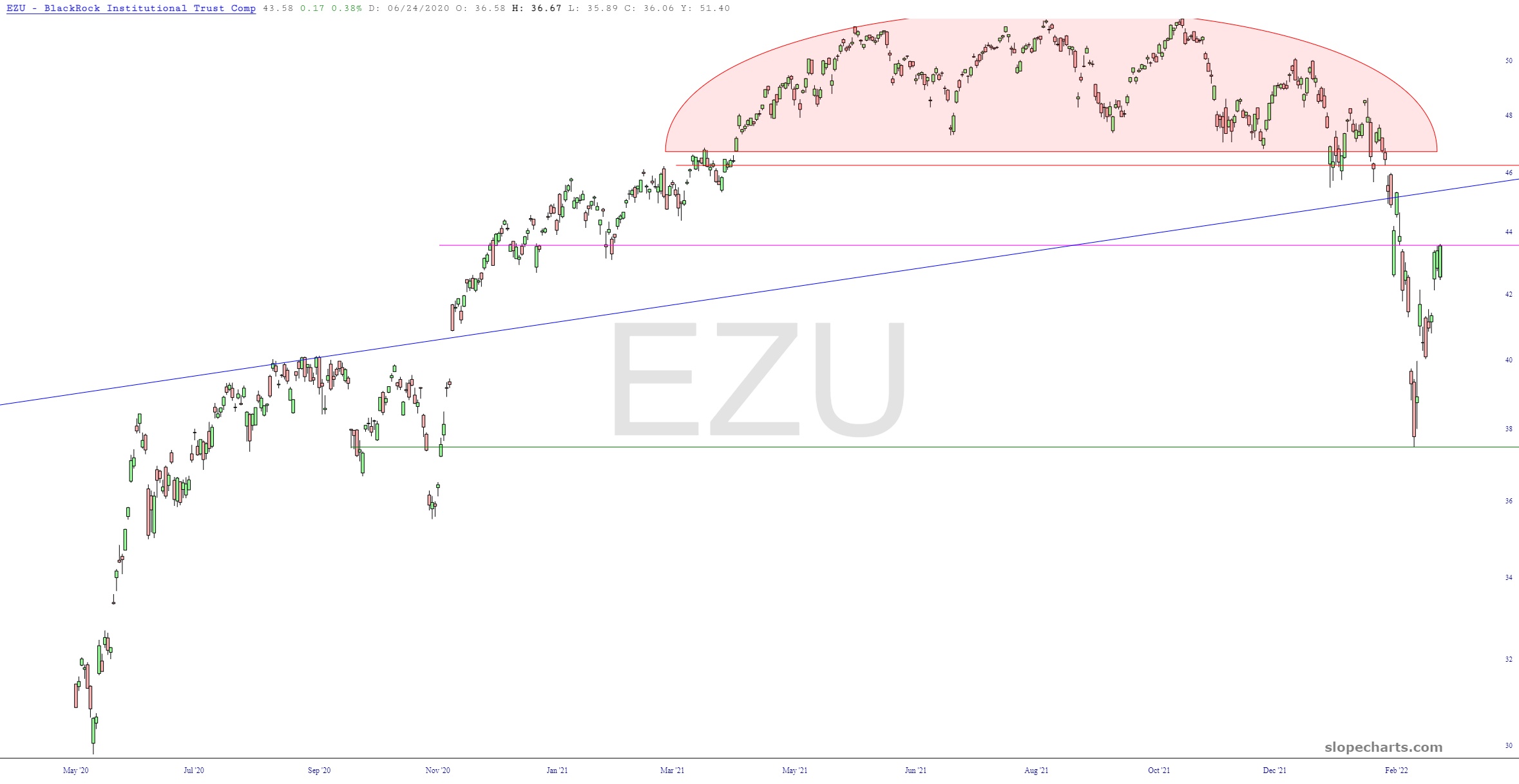
Let’s jump overseas and look at a few interesting outside-the-US ETF charts.
First up is the Eurozone, which is sporting a massive rounded top pattern. The monster question has to do with those two horizontal lines – – has the bounce stopped, or is it going to keep pushing to the higher line? There’s precious little activity between those two lines, so if this peculiar dose of optimism keeps flowing, we could well ascend to the next horizontal (at which time things would more than likely cease climbing).
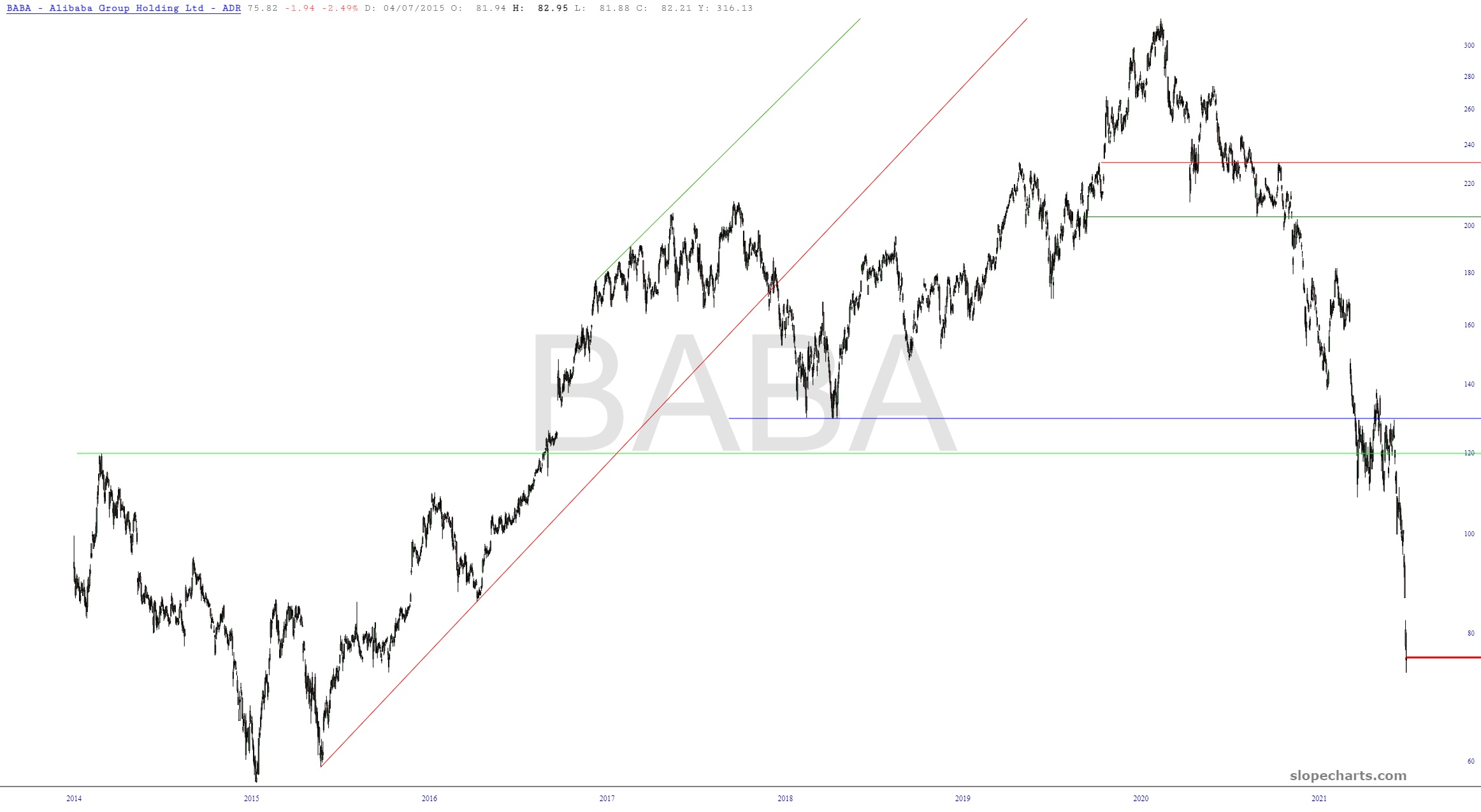
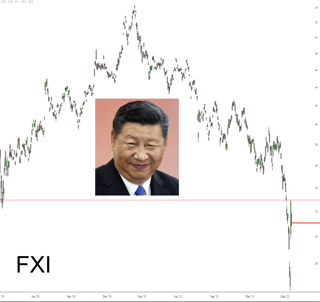
Thanks to a tidal wave of completely-made-up economic “data” from the central planning committee of the Chinese Communist Party, the China stock ETF symbol FXI went up almost 30% from just Tuesday’s low to Wednesday’s high, with many single stocks going up much more. Well, that’s all well and good, but their bull market is totally dead and buried, and Communist lies are not going to fool anyone for too terribly long.
As you know, the Chinese stock market (and property market, for that matter) has been a complete fiasco. To give you a taste of what’s been going on, I present to you a quantity of stocks (ironically, eight of them, which I deliberately chose since it’s a lucky number in Asian culture).