Slope of Hope Blog Posts

Slope initially began as a blog, so this is where most of the website’s content resides. Here we have tens of thousands of posts dating back over a decade. These are listed in reverse chronological order. Click on any category icon below to see posts tagged with that particular subject, or click on a word in the category cloud on the right side of the screen for more specific choices.

The Credit Recoupling

By -

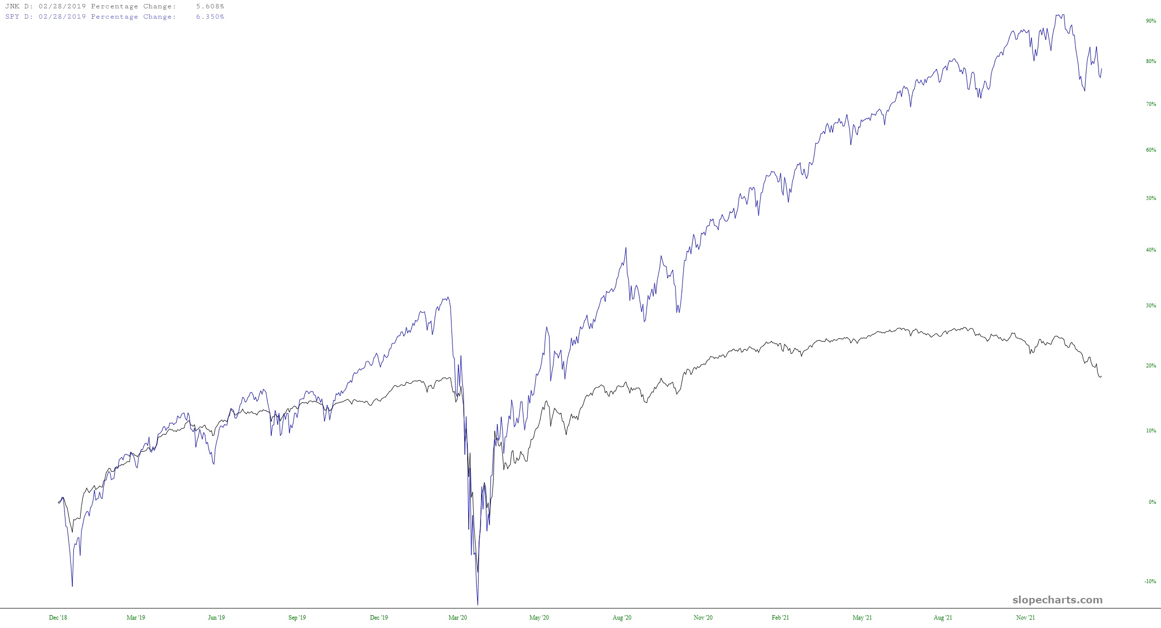
The graph below shows the stock market (in blue, by way of the SPY) and the junk bond market (by way of JNK, although you just as easily look at SJNK, HYG, EMB, or a variety of other debt-sensitive instruments). My view is that credit will lead the way (lower) and that, sooner or later, the gravitational bull of the bonder market is going to bring equities down to levels that many people find unexpected.

slopechart JNKSPY

At Any Rate

By -

I have a watch list called Rates (note to Gold and Platinum members: you can access this at any time with the Shared Watchlists feature in SlopeCharts and see all my lists as well as my mark-ups), and this list contains a variety of very weird-looking ticker symbols that represent important interest rates. Here are a couple of them I thought were worth sharing. First is this chart of Treasury Rates. Take a look at how artificially suppressed they became, and they have “snapped back” to the underside of that now-broken basing pattern. It’s pretty cool how prices are interacting with at pattern (which I haven’t touched in months).

slopechart FR DGS
(more…)